Home / Blog Menu ↓

Blog: #working-in-public

16 posts / tag feed / about the blog / archive / tags

Update on Press (the PDF compiler). I haven’t worked on it at all lately, but I wanted to document its current state for history’s sake, and as part of working in public. (I’ve also been sitting on this post for over a year.)

Back in 2017 I did end up re-architecting Press to use Low Ink as an intermediate page description language. In the process, Low Ink changed from a JSON-based idea to this:

:page 11x8.5in
:bleedbox x=0.125in y=0.125in w=5.75in h=8.75in
:fontmap family=helv weight=regular style=normal standard=Helvetica
:yinvert
:push
:translate x=72 y=72

# ascender
:push
:translate x=0 y=1040
:strokecolor hex=#999
:linewidth 0.25pt
:line x1=0 y1=0 x2=1080 y2=0
:stroke
:push
:fillcolor hex=#999
:font family=helv size=14pt
:text x=1085 y=-3 text="ascender"
:pop
:pop

# filled glyph
:push
:translate x=1320 y=240
:fillcolor hex=#000
:moveto x=0 y=0
:pathto x=400 y=300 cx1=120 cy1=300 cx2=140 cy2=300
:pathto x=320 y=200 cx1=540 cy1=300 cx2=320 cy2=180
:lineto x=350 y=350
:lineto x=450 y=250
:lineto x=150 y=0
:moveto x=200 y=200
:lineto x=200 y=250
:lineto x=250 y=250
:lineto x=250 y=200
:lineto x=200 y=200
:fill
:pop

It was intended to be a fairly low-level wrapper on the PDF format, with the idea being that other libraries/apps would provide more ergonomic abstractions on top of it.

I initially used Python because Press started out as a library, but with the pivot to a compiler model, I think Go or Rust would probably end up being a better choice (Rust would make integrating HarfBuzz a bit easier, at any rate).

Potential improvements

To my 2021 eyes, the language design isn’t particularly elegant. I like that the parameters are named (clarity), but for most of the commands there aren’t actually that many parameters, because many of the settings that would normally be parameters are separate commands. For parameters that are clearly unambiguous, the names hamper readability. For example, I think something like this might be better:

:line 0,0 to 1080,0
:fillcolor #345

I’ve also thought that push and pop could potentially be clearer as curly braces, and that the initial colons aren’t really necessary:

{
  translate 0,1040
  strokecolor #999
  linewidth 0.25pt
  line 0,0 to 1080,0
  stroke

  {
    fillcolor #999
    font 14pt helv
    text 1085,-3 "ascender"
  }
}

The future

My initial reason for building Press was to have an easy, programmable cross-platform way to create language chart PDFs (so I could move away from PlotDevice/DrawBot), and what I’ve realized (acknowledging that I haven’t really been making language charts in recent years) is that there are some other, better options now.

One that seems decent is SVG, converted to PDF by way of Inkscape. Initial tests here seem like it would probably work fine.

Another promising option that I admittedly haven’t looked into very much yet is Paged.js. HTML and CSS are already great for declarative typesetting, and the more I’ve thought about programmatic typesetting, the more this model seems to be the future I’d want to work with (and not just because of parity with web, though that makes it much more compelling).

tl;dr I don’t see myself continuing on with Press, so we may as well call a mortem on it.

Reply via email or office hours

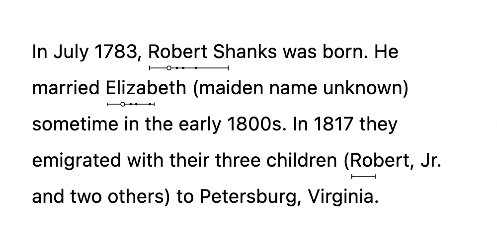
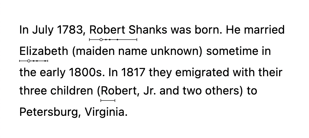
Lately I’ve been playing around with implementing genealogy sparklines on the web. Still very much a work in progress, but I’m trying to do more working in public, so here’s the messy current status (and at some point I’ll post the actual HTML/CSS):

Ruby test

sparkline-test-002.png

Implementation notes:

  • The sparklines use inline SVG
  • This test uses the <ruby> and <rt> tags, with ruby-position set to under and ruby-align set to start (though only Firefox supports it so it’s not sadly viable for actual use yet)
  • I don’t really like that it makes the leading uneven (lines that have ruby vs. lines that don’t)

Design notes:

  • Rather than having solid squares at the births and deaths, I’ve gone for vertical lines so they’re less obtrusive (and have also considered just getting rid of the vertical lines, though I haven’t tried it out yet)
  • Circles are simple so I went with them for marriages and children

Absolute positioning test

sparkline-test-003.png

Implementation notes:

  • The names are wrapped in span tags with position: relative set, and the SVG gets position: absolute. Fairly simple.
  • Even leading!
  • There’s some wonkiness right now when the span is at the beginning of a line (the sparkline shows up at the end of the previous line), haven’t tried very hard to fix it yet

Reply via email or office hours

Blog-driven productivity

New experiment: blog-driven productivity.

Ordinarily I work on projects and then, when they’re done, I post about them. Occasionally I post about work in progress (something I’m trying to do better at as part of working in public). In both cases, though, the project work comes first.

This idea flips that around: start writing the blog post first, from the perspective of your future self after you’ve already finished the project. Then do whatever backfill work is needed to turn the post from optimistic lie to settled truth. (And when the work is actually done, publish the post.)

My brain tends to think of it as an extremely loose analog to test-driven development in software engineering.

It’s not anything particularly novel, but it intrigues me and who knows, maybe there’s something there. (In some cases, for some people, your mileage may vary, etc.)


Reply via email or office hours

Release bundles reborn

Starting now, I’m going to batch releases of my art/writing/etc., posting things only at the beginning of each month. I did this back in 2014–2015 for four or five months, and I think it’s a good fit for me again.

Arbitrary reasons for doing it (acknowledging that it would be just as easy to argue convincingly in the other direction):

  • To focus more. By not thinking as often about posting work (speaking mainly of art here since that’s primarily what I’ve been doing lately), I’ll hopefully be able to focus more on the work itself and less on its reception.
  • To slow down. Being able to release finished work immediately is a magical and wonderful part of the Internet, but I think some detachment can be helpful, giving ample time to assess and reassess the work and to polish it further before finally posting it. (I have regrets. Not many, but I do have some.)
  • I don’t know that batching will actually make this happen, but: to work more on somewhat larger projects that take more time. My current working theory, however, is that immediate release cycles encourage me to optimize toward projects I can finish as quickly as possible. The experiment is to see if slowing the release cycle down makes an actual difference there or not. It may not. I may just be lazy and ill-suited for large projects.
  • To write more blog posts that aren’t just release posts. Or, failing that, to at least make the blog feel less like a neverending train of releases and navel-gazing meta posts. (I do believe I’m yearning for the old days, when I wrote “real” posts. We’ll see if the essayist in me still lives.)

Rules I’m arbitrarily giving myself in this experiment, and other tacked-on miscellaneous thoughts that I didn’t want to start a new list for:

  • I’ll post each bundle on the first day of each month, or the second day if the first is a Sunday. (I’m calling these batches “release bundles,” by the way.)
  • A project has to have been finished for at least a week before I can release it — so anything finished during the last week of the month will go out a month later.
  • There’s no set end date for now. If it works well, I’ll hopefully keep doing it for a long time. If it inhibits the old creativity, I’ll stop.
  • I’m not sure yet whether I’ll write about in-progress projects during the month. Lately I’ve found myself harboring some misgivings about working in public, or at least some parts of it, and I need to soul search and figure out what I’m comfortable with and what makes the most sense for me and my introvert self.

Here we go. Next releases will be on March 1.


Reply via email or office hours

As I’ve been toiling away on my design portfolio, I realized that a) I haven’t been working in public on this project and b) that ought to change. Which it will. Starting now.

My plan at this point (subject to change) is to design the portfolio site itself first, then post each case study project as I finish it.

The portfolio site

Note: the following is effectively an initial draft of a case study documenting the design of the portfolio itself. It’s a little meta, sure, and I expect to replace it in the portfolio as soon as I have enough other projects, but it’ll do for now. And if reading case studies isn’t your thing, stop here!

Problem definition

The goal: to design a site showing what I do as a designer, both in the case studies showcased as well as the design of the portfolio itself.

The main users of the portfolio will be hiring managers and recruiters, who will be evaluating my work to determine whether they should interview me. From what I’ve read, they’re primarily interested in seeing my design process—how I tackle a project, how I solve problems—and secondarily interested in the quality of the final designs. (There’s more to it than that, but you get the idea.)

Research

I began by doing some lightweight competitor analysis, looking at thirty or so portfolios for UX/product designers, and watching a handful of critique videos. By that point I had a good idea of what ought to be involved—initial text describing what I do and what my experience is, case studies documenting my process, a link to my resume, my contact info—and I felt that the site was small enough that I didn’t need to do more formal research at this point. (On other projects, though, this is where I’d do surveys, interviews, card sorting, tree tests, empathy maps, personas, usability tests, etc., depending on what makes the most sense for the project.)

Sketches

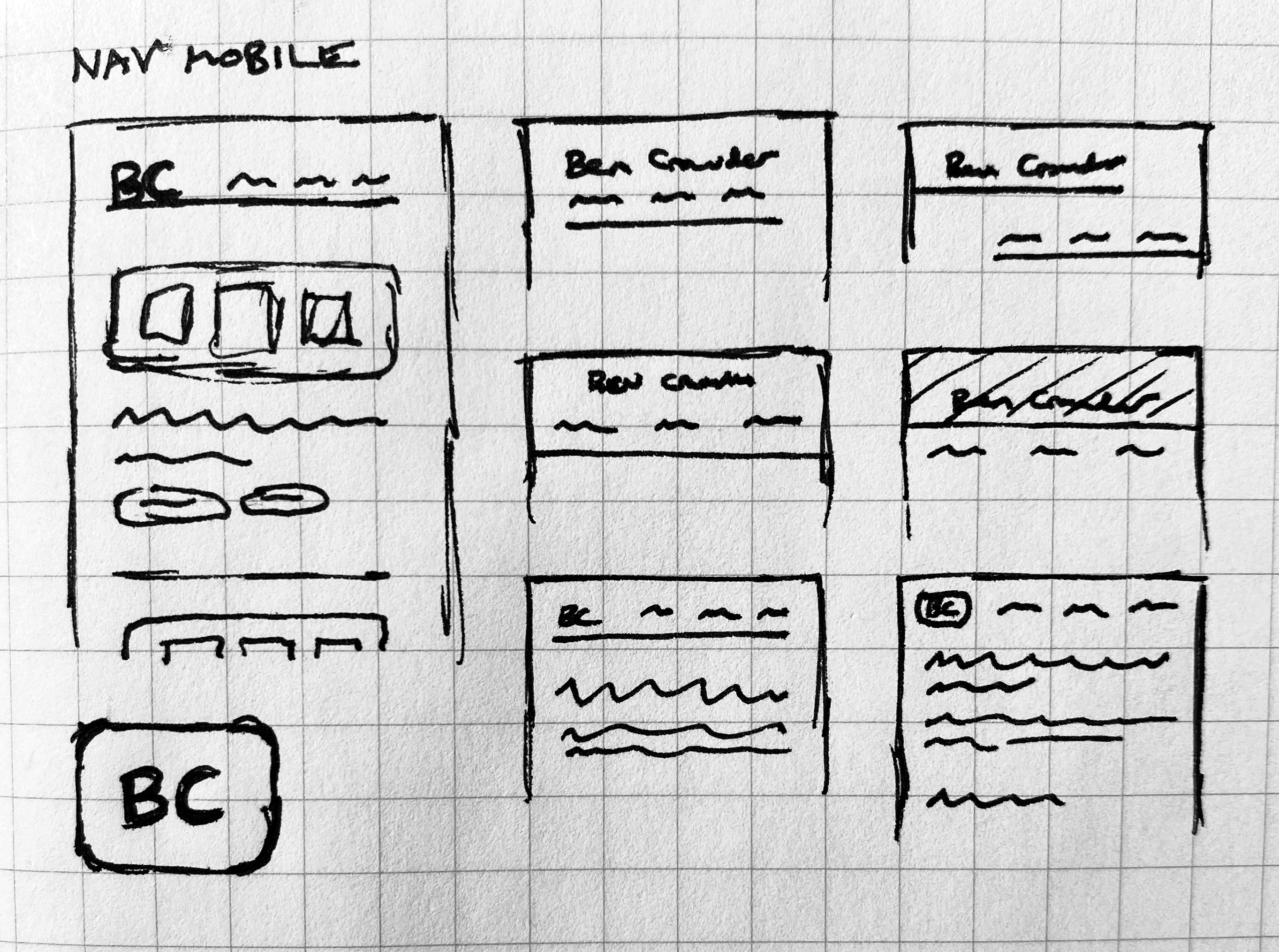
I sketched out some ideas for the nav, starting with mobile first since it’s easier to begin there and scale up to desktop:

portfolio-sketch.jpg

I also sketched out some rough layout ideas, with the main focus on the list of case studies on the home page and the case study detail pages.

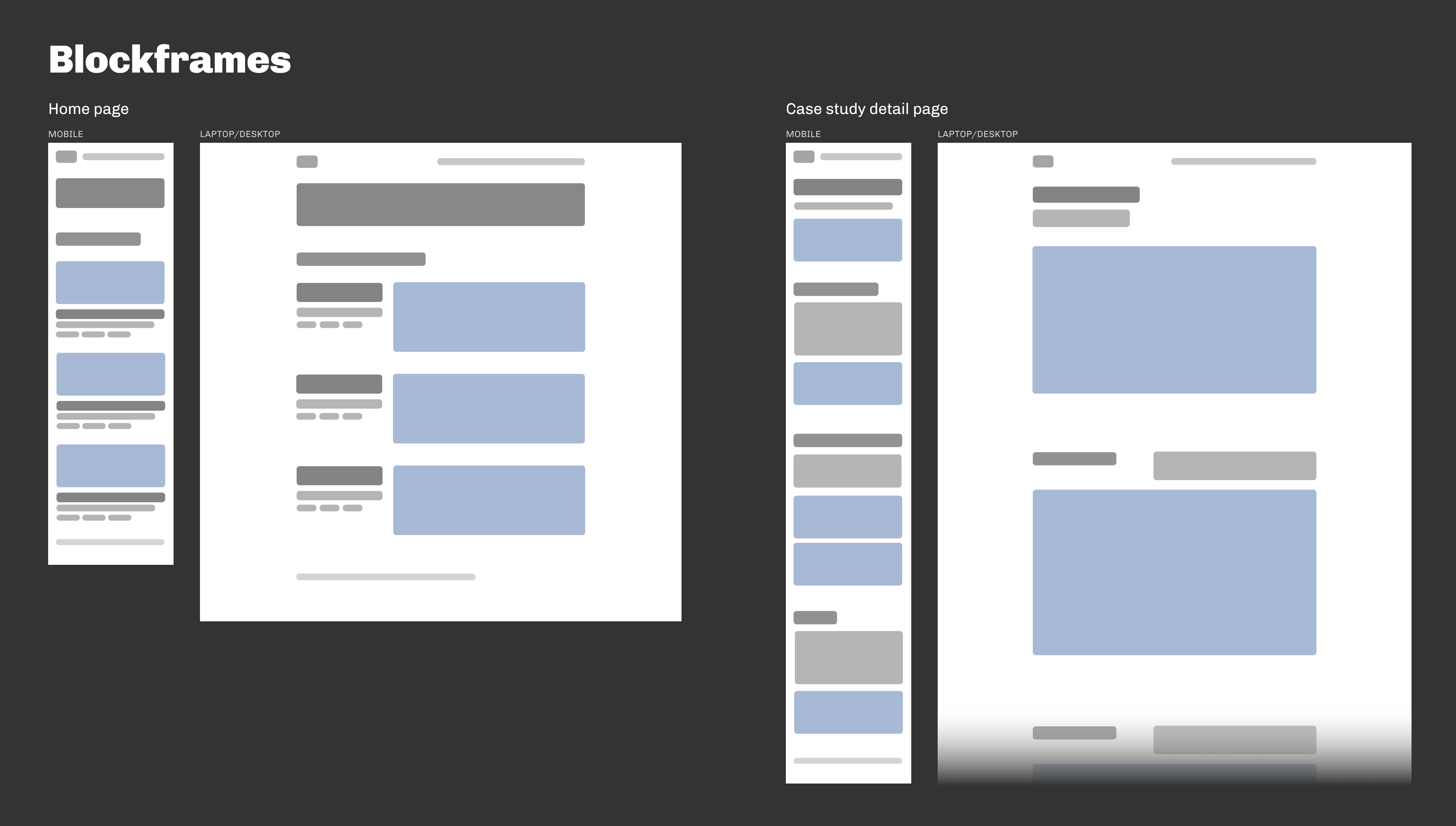
Blockframes

Last week I was reading about blockframing and have been itching to try it out, so I did:

portfolio-blockframes.png

It’s great. Easier to work with than wireframes, which helps in the earlier stages. Definitely planning to continue using it. (I should also mention here—for curiosity’s sake if nothing else—that I used Figma for everything past the point of sketching.)

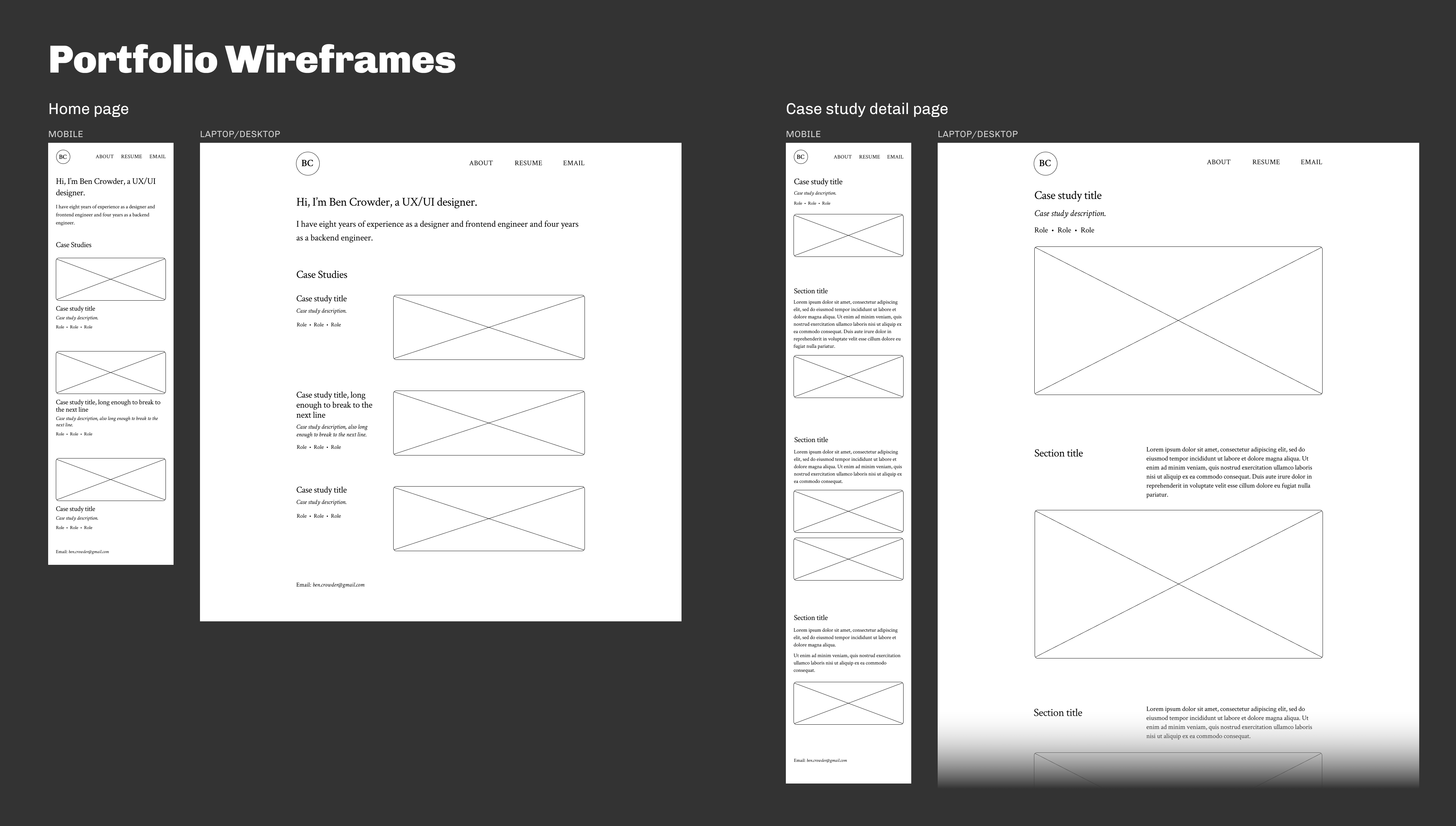
Wireframes

I continued with wireframes, to flesh out the ideas with actual text (placeholder text, anyway):

portfolio-wireframes.png

Crimson Text is the primary font (indeed the only font), which I chose because a humanist (old style) serif seemed like the best fit for my personality and the type of design I do.

Color palette

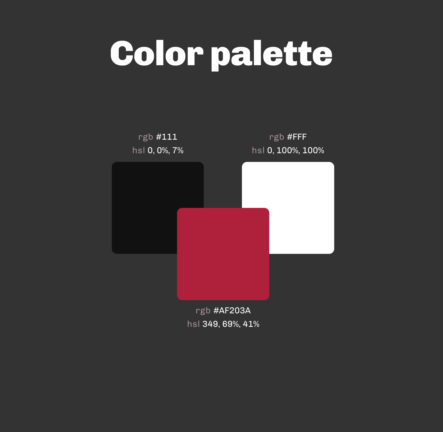
Next I chose a (very) simple palette:

portfolio-colorpalette.png

Ordinarily, though, I’d need a more complex, organized color scheme.

High-fidelity mockups

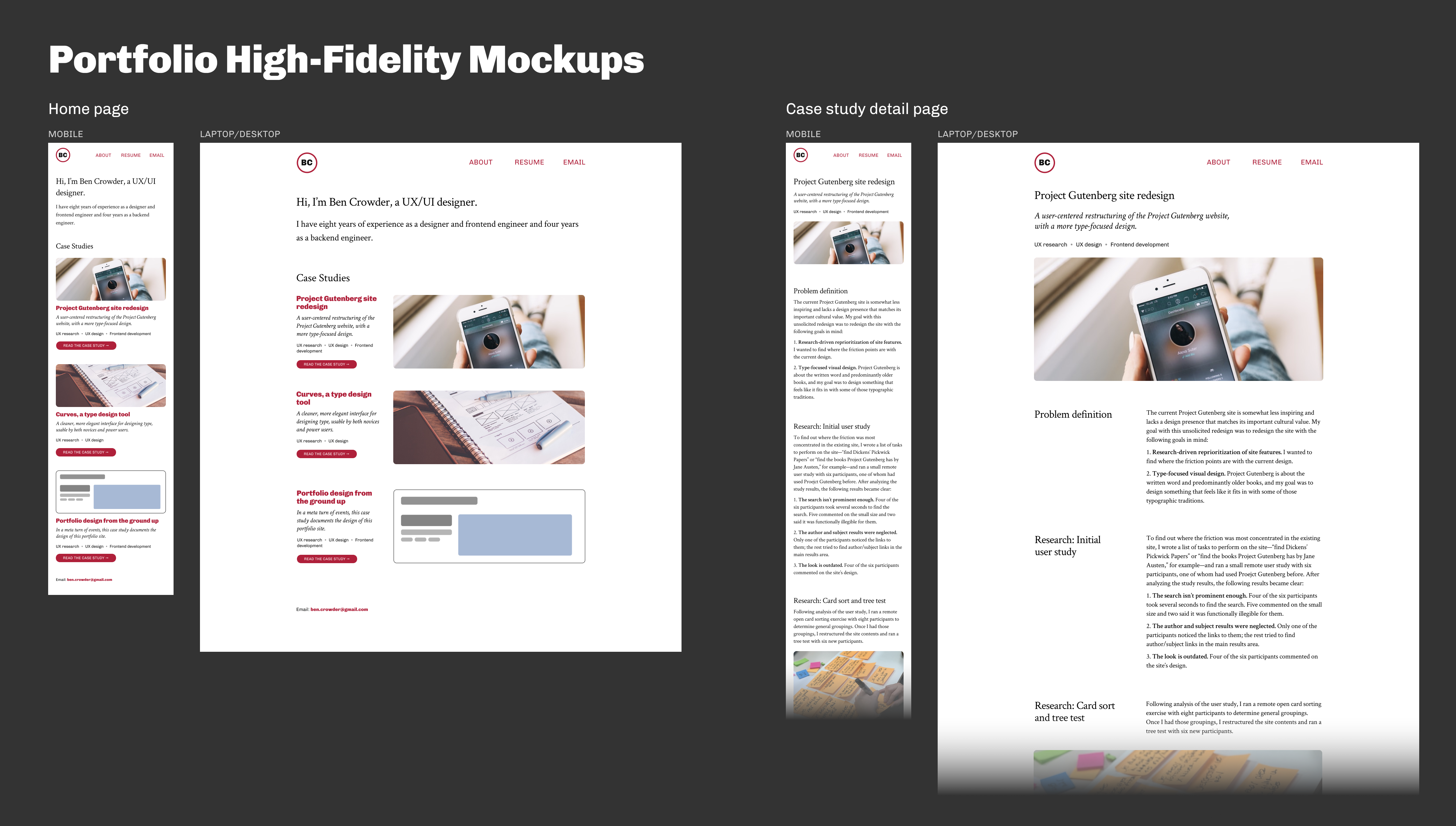
And then we come to the high-fidelity mockups (in which the photos are all from Unsplash or Pexels, and the case study text is made up):

portfolio-highfidelity.png

As I applied color, it became clear that the design would benefit from a secondary font, so I added Chivo as a compatible sans-serif. I also added clearer call-to-action links to the individual case study sections on the home page.

What’s next

Doing some small usability tests to make sure the design works, then straight to implementation. I’m planning to skip prototyping for this project because a) it’s so, so small and there’s not much to prototype beyond dead simple link behavior, and b) with this being a personal project, I’ll be doing the frontend development, and the initial implementation there will be a fairly effective prototype.


Reply via email or office hours

Links #30


Reply via email or office hours

After twelve years at the library, I’ve realized it’s time for a change and have started looking for another job. Doing this during a global pandemic is a little daunting, but it feels like the right time.

As part of this, I’m experimenting with what I’m calling a more humane resume. It’s basically a short list of relevant data points, with room to explain a little more about what I do and what I’m looking for. My hope is that it makes it easier for potential employers to see whether I’d be a good fit.


Reply via email or office hours

As a spur to get myself writing more, I’ve put up a new writing statistics page. There you can see in all its wilted glory how little I’ve written over the years.

Or how little I’ve finished, I should say — and that’s the main change here. By tracking actual published words, I’m hoping this sparks much more finishing and publishing. And by “publish” I still mean publishing here on this site. I imagine down the road I may submit pieces elsewhere, but for now I’m content with the small scale.

This brain hack is already working. Last week I hardly worked on the novel at all, but after putting this page up I’ve found myself fully back in the throes of editing, since finishing and publishing a 65,000-word novel — the first draft of which is already complete — seems the best way right now to push 2020’s zero up to a more impressive number. And now I have compelling motivation to make sure I get this thing edited before the end of the year.

Also, inspired by the colophon in Cory Doctorow’s Pluralist newsletter, I’ll probably add daily or weekly drafting word counts to the page soon, as further motivation to keep writing each day. Public shaming works wonders! (More seriously: while the idea of posting these kinds of metrics would have mortified me a year or two ago, I’m glad I’ve gotten round that obstacle. Working in public has been wonderfully freeing.)


Reply via email or office hours

Links #17


Reply via email or office hours

My subconscious seems to be on a quest to turn this blog into more of a magazine, with regular columns and all. (Watch out, before you know it I’ll be calling myself editor-in-chief of this rag.)

In that vein, I’ve been thinking about starting a recurring (if infrequent, speaking realistically) Q&A section. This’ll be another experiment, of course, like office hours, and again in the spirit of working in public.

So: if you have any questions you’d like to see me answer here in public, email me your question with “Q&A” in the subject, and also let me know whether you’re okay with your first name accompanying the question.


Reply via email or office hours