Lately I’ve been thinking about small VMs, thanks to Uxn. Long-term sustainability and portability interests me, and doing something similar (a small VM for the tools I’ve written) is intriguing.
At the same time, I’m not sure a VM would be a good enough fit for my tools (particularly the web frontends), so if I do anything in this space, it’ll probably be either just for fun or a more-specific VM (focusing on something like generative art).
In this time of being thankful, and in close connection with what I wrote yesterday, I see now that a habit of gratitude has a sister: a habit of noticing.
(Sidenote: my current take on noticing is that it’s a way of pulling off the abstractions that cover my attention like a film, freeing me to focus on what’s really there.)
Looking, listening, attending. These carve out space for appreciation; it’s hard for me to appreciate something I’m unaware of.
On my walk early this morning I looked up and noticed to my surprise that stars twinkle.
I once knew this, of course, but somewhere along the way I apparently stopped paying attention to the stars and replaced my mental model of the night sky with a static, dead husk.
Reminder to self: Look! Observe! Get out of your head! Abstractions are useful in their place but don’t forget to pay attention to the delicious, detailed, vibrant mess of reality around you.
I’ve adopted a new rule for myself: create before consume.
Each day, I have to do creative work for a set amount of time before I allow myself to consume (which I’m defining as reading books, since that’s what I care about).
It’s a gimmick, of course, but it’s working. It gets me past the “I’m tired and my back hurts and I don’t feel like doing anything except reading” that I’ve been struggling with this year.
Dan McKinley on boring technology. I’ve also been thinking about this a lot, primarily with respect to the technologies I use to build my personal projects.
Robin Sloan on permacomputing. The long-term durability of our current technologies — or lack thereof — is also something I think about fairly often. Nice to see movement in that direction.
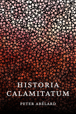
After what feels like a long absence from bookmaking, I’ve gotten back into it and have a new release: Historia Calamitatum, available as a PDF.
The book is a medieval autobiography by Peter Abélard, a Catholic philosopher who lived in the eleventh and twelfth centuries in France.
Some notes on the making, for those who like that sort of thing:
I used paged.js for the typesetting, so I was editing HTML and CSS files instead of wrangling InDesign or Affinity Publisher or LaTeX. It’s a different workflow, to be sure (lots of reloading in Chrome and then finding my spot again), but overall I love having the source files be plain text.
The line-breaking algorithm isn’t as nice as InDesign’s. Had to finagle the word-spacing and letter-spacing properties a bit to fix some more egregious spots. (At the same time, I wasn’t fixated on making the spacing perfect. Nor did I fix the hyphenation stacks, because they don’t bother me. I’m clearly becoming a bit more relaxed about typesetting rules as I get older.)
For the typeface I went with IM Fell DW Pica, which is no doubt anachronistic but I like the feeling it gives the book.
I proofed the PDFs in the Documents app on my iPad. Much nicer than printing the whole thing out (which I used to do, years ago).
I made the cover using Cirque with textures applied in Affinity Photo.
Today was my last day at Cedar (formerly OODA Health before the acquisition), and on Monday I start a new job at Hologram.
I’m finally getting around to writing Cast, the new backend engine for this site. The plan is to go full static and deploy via Render. Also planning to move my personal apps over. While I’m still probably a couple months away from having everything migrated, I’m so, so looking forward to not maintaining a personal server anymore. (It’s fun, sure, and I’ve learned a lot, but it’s stressful — yesterday’s Let’s Encrypt root certificate expiration bit me thanks to an old OpenSSL version, for example — and it’s no longer something I want to spend time on for personal projects.)