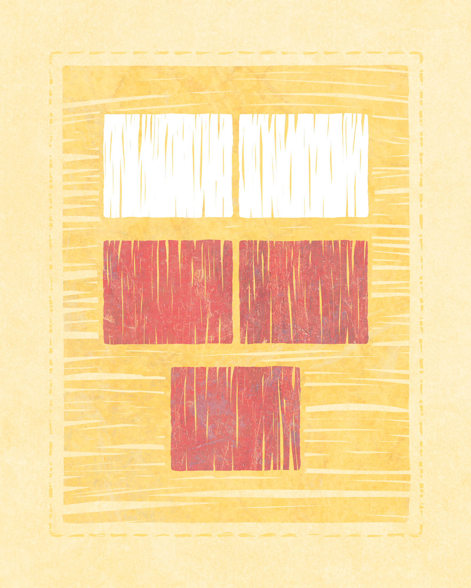
New artwork: I Am a Child of God V. A reference to the Primary song. The rectangles represent (bottom to top), a child, its mortal parents, and our Heavenly Parents. (Figured it was time to do a more abstract version of this idea. It ended up also alluding to Hearts of the Children IV and Hearts of the Children V.)
My process for this style, for what it’s worth: mock up the design in Figma, export an SVG, open it in Inkscape, use the roughen and simplify filters, export a PNG, open it in Procreate, select the rectangles, paint the streaks within the rectangles, export a PNG, texture in Affinity Photo as usual.
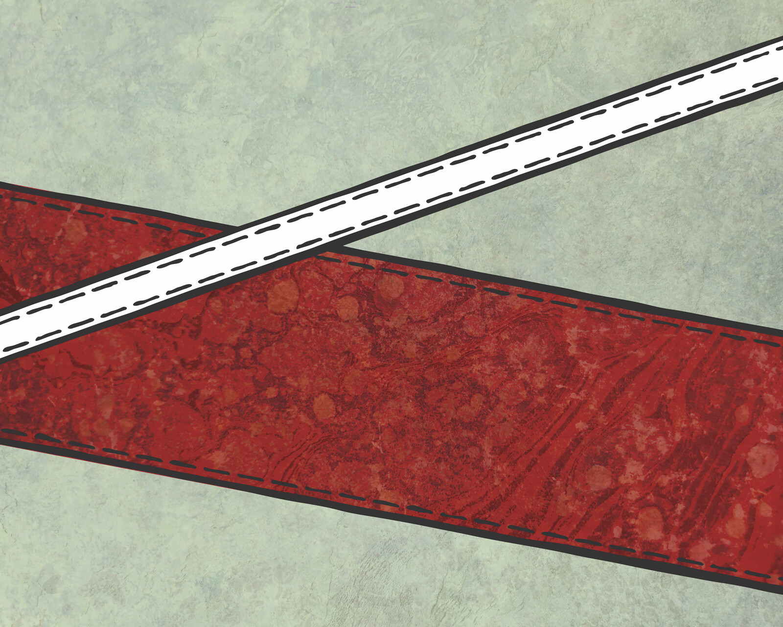
New artwork: Strait Is the Gate. A new take on Narrow Is the Way. Also, Inkscape’s roughen and simplify filters are nicer to work with than SVG filters (which often have some weird rendering issues in the bottom right of shapes, at least when using Inkscape to render them).
Some dinky pixel art experiments, exploring what it looks like when you add texture and make them look kind of like mosaic tiles. (I’m sure someone else has already done this, but I haven’t, so here we are.) Also, this isn’t great pixel art, just to be clear.
For this first experiment, I made the squares in Figma and set the colors there, which was pretty laborious. Exported to SVG and added turbulence/displacement filters to get some variation. When exporting to PNG via Inkscape, I ran into the perennial issue where the filters sometimes only work on the top and left sides of the shape. (Someday I’ll figure out what’s going on there, since the filters look fine in Finder via Quick Look. In this case, from a distance, it still kind of looks okay.) Finally, I added some textures in Affinity Photo with opacity set to around 20% and blend mode set to soft light or overlay.
Second experiment: making things easier. I made a 48x48 image in Procreate Pocket on my phone and painted the scene using the oil paint brush. (Which is why the eyes are crazy and there isn’t a ton of definition on the characters. Like I said, not great pixel art.) I then wrote a quick command-line script (JS/Node) to take a PNG and export an SVG where each pixel of the PNG is a <rect> in SVG. Way faster than making the squares in Figma. The script shrinks each square a little and adds some jitter to the points as well. And I changed the background color to be more ground-like. Exported to PNG and textured as in the first experiment.
Some ideas for future exploration:
More subdivision on the tiles, for a little more geometric variety
Programmatically export masks from the SVG so that each tile can look more different from its neighbors, texturally (a masked tile would be next to an unmasked one, basically, with some randomness thrown in)
Rounding the edges of the tiles a little
Rendering the tiles in Blender (either with heightfields or by generating actual geometry with Python), ideally with some procedural texturing
New artwork: Peace, Be Still. I dialed up the SVG turbulence filters to get the effect on the left. Also used the erode operator throughout (with the feMorphology filter primitive). I couldn’t get Inkscape to show the lines with the filters applied, though, so I ended up screenshotting the piece via QuickLook and then upscaling in Photoshop (hacky, but hopefully not too obvious).
New artwork: The Night Shall Not Be Darkened. On this one I used an erosion filter along with turbulence and displacement; the effect is most clear on the two vertical lines.
For a while I’ve wanted to explore using black and white for my art. Tell Me the Stories of Jesus was the initial step in that direction, but these latest four pieces are more like what I envisioned (a little more like ink on paper, to some degree). I’m looking forward to doing more work in this style.
I used the same circle packing technique to generate the circles, constraining them this time to be inside a larger circle. Initially I was going to have the tree visible as that larger circle — dark on a light background — but it ended up looking better to me with just the small white circles. (After that I used SVG filters and Inkscape and Photoshop as usual.)
Brief backstory: when I’m doing my minimalist religious art, I usually sketch an idea out first by hand or in Paper on my phone, then mock them up in Illustrator to iterate on the concept. Once it’s satisfactory, I move to execution, either painting the piece in Procreate or using some of the brushes in Illustrator to get a more organic look. And finally I texture the image in Photoshop.
A couple months ago I got interested in exploring alternatives to Illustrator and Photoshop for both execution and texturing processes. And me being me, I wanted to try doing it in code, just to see what it was like. (Some things are easier in code, though I don’t know how often that would actually be the case with these.)
Note: this is still very much a WIP, and who knows if I’ll end up using any of it or not. But here’s the current state of things.
SVG
After reading somewhere that SVG has turbulence and displacement filters, I realized I could potentially use those for the execution part of the process, to distress the edges enough to make things more interesting. (And hopefully to be less repetitious than the Illustrator brushes I use.)
I put together an initial test using a few different settings, and it turned out a bit better than I expected. A sample of the code:
The background rectangle, the red figure, and the white figure all have different turbulence and displacement values. The red figure uses two sets of turbulence and displacement filters, which worked out fairly well, I think.
I used Inkscape render it out to a high-res PNG, since Illustrator wasn’t able to handle the filters. Eventually, if I keep going down this path, I’d hopefully be able to find a command-line tool that can do the rendering. (Maybe Inkscape has a headless option.)
Overall, this path seems promising. I don’t know that I’d use it all the time, but for certain things it may be handy. I still need to look into sane ways to round corners, and it seems that the other filters (dilation/erosion, convolution, etc.) may be helpful, too.
Grain
I’ve begun writing a Python script called Grain for texturing the final art image. The goal here is to see if I can streamline the process at all, and to see if this idea even works. Grain takes as input a text-based input file that looks like this:
Each block is a layer. Grain starts with the bottom layer (the executed base image) and goes up from there, adding each layer on top with the specified blending mode and opacity.
The :pattern roughdots command would generate procedural dots (not implemented yet), and the textures# bit in the :image command calls is a shortcut to my folder with texture photos.
So far, the results are disappointing. While the layering does currently work, it isn’t yet producing anything remotely publishable. I think there might be some discrepancies between blending modes in pyvips and in Photoshop. Hard to tell.
And, less importantly, it’s a little slow — partially from using high-res images, partially from Python. If the idea ends up working, I’ll most likely port this to Rust or Go, and probably also have scale things down for the exploration phase of texturing (with a final high-res export at the end).
I’ll keep tinkering with it from time to time and we’ll see how it goes.