Home / Blog Menu ↓

Blog: #wip

Family source list WIP part 1

In the interest of working more with the garage door up, I’m going to write this as I work on this project, starting at the beginning. (Rather than just posting about it when it’s done.)

The idea is to have some kind of list (chart isn’t the right word) where I can put what I know about a family (genealogy-wise) and how I know it (which sources provide evidence). I want the output format to be PDF so it’s easily printable/archivable.

At this point I have a rough picture in my head of what it might look like:

  • Headings (one for each person, probably some more general groups too), and then under each heading a list of facts (birth date, place, marriage, kids, etc.) with the sources for each.
  • Some sources are used more than once, so having some way to simplify that (a table of sources, maybe) would be good.
  • Also, some way to mark a fact as less sure (more of a supposition). This makes me think that “fact” is probably the wrong word to use here. “Assertion” makes sense but also feels a bit much. “Point,” maybe? This is almost certainly only going to be used internally (I’m not planning to put the word on the list itself), but I try to get the nomenclature right for my own sake. A person has a list of points? “Attribute” feels more correct but also too technical.
  • As far as the supposition aspect goes, I don’t know yet if I want a binary (unproven, proven) or a gradient (0% sure, 50% sure, 100% sure, for example). Probably going to start with a binary to keep things simpler.

While it’s very tempting right now to get the code environment set up and start mocking things up directly in HTML (since that’s what I’m using to go to PDF), I’m going to make myself write some mocks by hand first instead. And then maybe do a quick iteration in Google Docs.

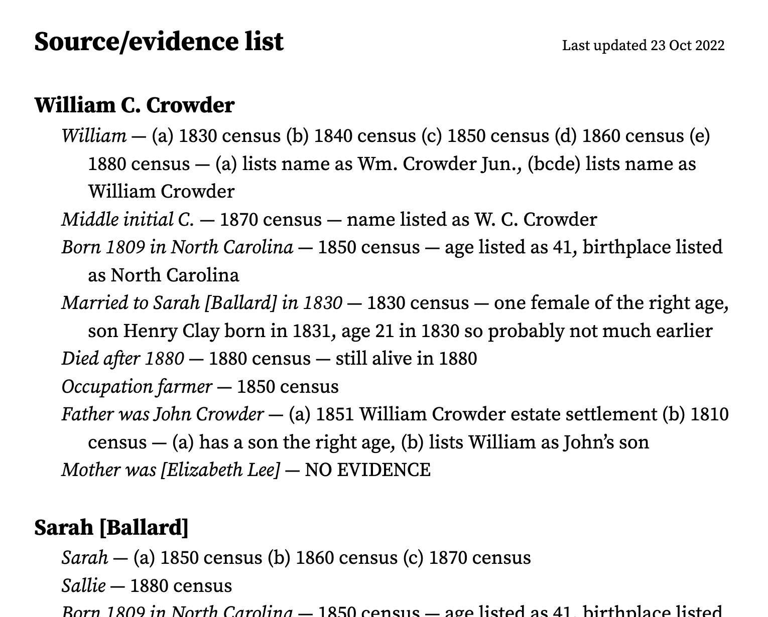
Okay, I ended up going straight to Google Docs, which worked out well since I went through seven or eight iterations and I’m still not there yet. Current status (keeping in mind that this is more about sussing out how to lay out the information and is far from a finished design):

https://cdn.bencrowder.net/blog/2022/10/family-source-list-01.png

Notes:

  • The format right now for each line is “fact/supposition/point — sources — reasoning”.
  • If there’s more than one source, we apply the abcde etc. naming so we can easily and succinctly distinguish between them in the reasoning section.
  • The reasoning section is optional if it’s straightforward based on the source
  • I initially had a table of sources included at the end but it felt like overkill. At the point/line level, it seems better to have the actual source description (“1850 census”) rather than some cryptic reference to the table like “[12]”. Then the user doesn’t have to keep going back and forth to figure out what the sources are.
  • I’m thinking of grouping things better when I do the final design, but I’m not worrying about that any more for now.
  • I haven’t yet gotten to the suppositions/assertions.

Also, I’ve decided to call this a family source list. More to come!


Reply via email or office hours

Some WIP experimentation with art.

Brief backstory: when I’m doing my minimalist religious art, I usually sketch an idea out first by hand or in Paper on my phone, then mock them up in Illustrator to iterate on the concept. Once it’s satisfactory, I move to execution, either painting the piece in Procreate or using some of the brushes in Illustrator to get a more organic look. And finally I texture the image in Photoshop.

A couple months ago I got interested in exploring alternatives to Illustrator and Photoshop for both execution and texturing processes. And me being me, I wanted to try doing it in code, just to see what it was like. (Some things are easier in code, though I don’t know how often that would actually be the case with these.)

Note: this is still very much a WIP, and who knows if I’ll end up using any of it or not. But here’s the current state of things.

SVG

After reading somewhere that SVG has turbulence and displacement filters, I realized I could potentially use those for the execution part of the process, to distress the edges enough to make things more interesting. (And hopefully to be less repetitious than the Illustrator brushes I use.)

I put together an initial test using a few different settings, and it turned out a bit better than I expected. A sample of the code:

<filter id="person1Filter">
    <feTurbulence type="turbulence" baseFrequency="0.5" numOctaves="2" result="turb1" />
    <feDisplacementMap in2="turb1" in="SourceGraphic" scale="3" xChannelSelector="R" yChannelSelector="G" result="result1" />
    <feTurbulence type="turbulence" baseFrequency="0.05" numOctaves="2" result="turb2" />
    <feDisplacementMap in2="turb2" in="result1" scale="3" xChannelSelector="R" yChannelSelector="G" />
</filter>

<style type="text/css">
    .person1 {
        fill: #a34130;
        filter: url(#person1Filter);
    }
</style>

<g id="person-1">
    <circle class="person1" cx="200" cy="250" r="30" />
    <polygon class="person1" points="225,270 205,500 350,500" />
</g>

And this is what it looks like:

svg-test.png

The background rectangle, the red figure, and the white figure all have different turbulence and displacement values. The red figure uses two sets of turbulence and displacement filters, which worked out fairly well, I think.

I used Inkscape render it out to a high-res PNG, since Illustrator wasn’t able to handle the filters. Eventually, if I keep going down this path, I’d hopefully be able to find a command-line tool that can do the rendering. (Maybe Inkscape has a headless option.)

Overall, this path seems promising. I don’t know that I’d use it all the time, but for certain things it may be handy. I still need to look into sane ways to round corners, and it seems that the other filters (dilation/erosion, convolution, etc.) may be helpful, too.

Grain

I’ve begun writing a Python script called Grain for texturing the final art image. The goal here is to see if I can streamline the process at all, and to see if this idea even works. Grain takes as input a text-based input file that looks like this:

:image test1-texture.jpg
:blend screen
:opacity 0.05
:x -100

:image textures#random
:blend soft-light
:opacity 0.1

:pattern roughdots
:blend soft-light
:opacity 0.2

:image textures#2019-05-21 17.28.14.jpg
:blend soft-light
:opacity 0.01

:image test1-base.png

Each block is a layer. Grain starts with the bottom layer (the executed base image) and goes up from there, adding each layer on top with the specified blending mode and opacity.

The :pattern roughdots command would generate procedural dots (not implemented yet), and the textures# bit in the :image command calls is a shortcut to my folder with texture photos.

So far, the results are disappointing. While the layering does currently work, it isn’t yet producing anything remotely publishable. I think there might be some discrepancies between blending modes in pyvips and in Photoshop. Hard to tell.

And, less importantly, it’s a little slow — partially from using high-res images, partially from Python. If the idea ends up working, I’ll most likely port this to Rust or Go, and probably also have scale things down for the exploration phase of texturing (with a final high-res export at the end).

I’ll keep tinkering with it from time to time and we’ll see how it goes.


Reply via email or office hours