For the past couple months I’ve been wrangling some artist’s block. (Thus the lack of new work.) I’ve come up with a decent number of ideas, but whenever I start working on one, it begins to rot and slough off before my inner eye. (Uncomfortably visceral metaphor in preparation for Halloween: check.)
I hope I’m near the end of this particular hiatus, but part of me can’t help but wonder if I’ve stumbled into the final block, the one that never goes away, the end of making art for me. And yes, I wonder this every time I get blocked. A precarious path, this is.
I see myself as building a corpus of work, not as guaranteeing a constant stream of new things. I care about stock; flow is incidental. So in a sense I’m okay with projects coming to an end (as we’ve seen with Mormon Artist, Mormon Texts Project, etc.). I’m a seasonal maker. And perhaps this season — the artmaking one — has concluded, making way for something else, something new.
But maybe it isn’t over yet. Maybe I just need to work harder and push through the block like a professional. Or maybe I need to change style or process or subject. Or maybe all I need is another month off to let my brain finish recharging or healing or whatever it does in these fallow periods.
Brain dump time. These are some of the things I think about re: art, specifically the type of art I’ve been doing these past few years (which admittedly has some quirks that other types of art wouldn’t necessarily have). These are in no particular order:
Concept. With this kind of minimalist religious art, the question is always: “How can I convey this idea in as few lines/shapes/colors/etc. as possible?” I usually mull over an idea, sketch something out until I feel loosely satisfied with it, then send it to my wife and we do a few rounds of feedback and revision. I also find myself thinking about other ways to represent things minimally, beyond just the circles, triangles, and rectangles I’ve used. (Yesterday’s Peace, Be Still felt like a nice change, for example.)
Process. The main question is usually: “What’s the fastest way to execute this idea without a drop in quality?” And, close on its heels: “What style do I feel like working in right now?” At the moment, the process I tend to use most is this: refine the idea in Illustrator, then export to SVG, open the file in Vim and add in the filters (turbulence, displacement, erosion, etc.), using Quicklook to preview my work, then open it in Inkscape and export to a 6500×6500 PNG (or thereabouts), which I then texture in Photoshop. Writing it out like that makes it seem fairly time-consuming, but it’s usually not too bad. (On average, I think I spend a total of perhaps an hour per piece, though it’s usually broken up over several days.) Lately I’ve been itching to simplify my texturing process, or perhaps to try wildly different textures. (With this type of art, I’ve found that it’s the idea that matters most. As long as it’s adequately conveyed, the rest — which tools I use, what style I do it in, etc. — doesn’t matter nearly as much.)
Releasing. I often think about whether I should care what time of day I post pieces (and usually decide that I don’t care), whether I should only post one piece per day max (I go back and forth here but usually post whatever pieces are finished regardless), and how much explanation I should give in the captions. I also think about how checking Instagram and Facebook for likes and comments feels a little like a soul-sucking death trap. Sometimes I think about ditching both platforms and posting art only to my site, but I’m not quite ready yet.
Storage. Last and probably least, I find myself frequently thinking about how much storage all these original image files are taking up. It’s a bit silly since it’s peanuts compared to video and I have plenty of disk space, but the part of my brain that loves plain text often points out that a novel takes up a mere few hundred KB while these original image files are usually a much larger 50–80 MB each (full-resolution lossless PNG; I’ve thought about JPEG but I don’t think I want to go down that road). And then I tell that part of my brain to hush, since it’s not a real problem.
I realized (this is the very small breakthrough I mentioned yesterday) that I could use Blender to add 3D texture to my pieces. Verisimilitude has been the goal all along, and using an actual 3D renderer brings so much to the table that it boggles my mind that I didn’t think of this much earlier.
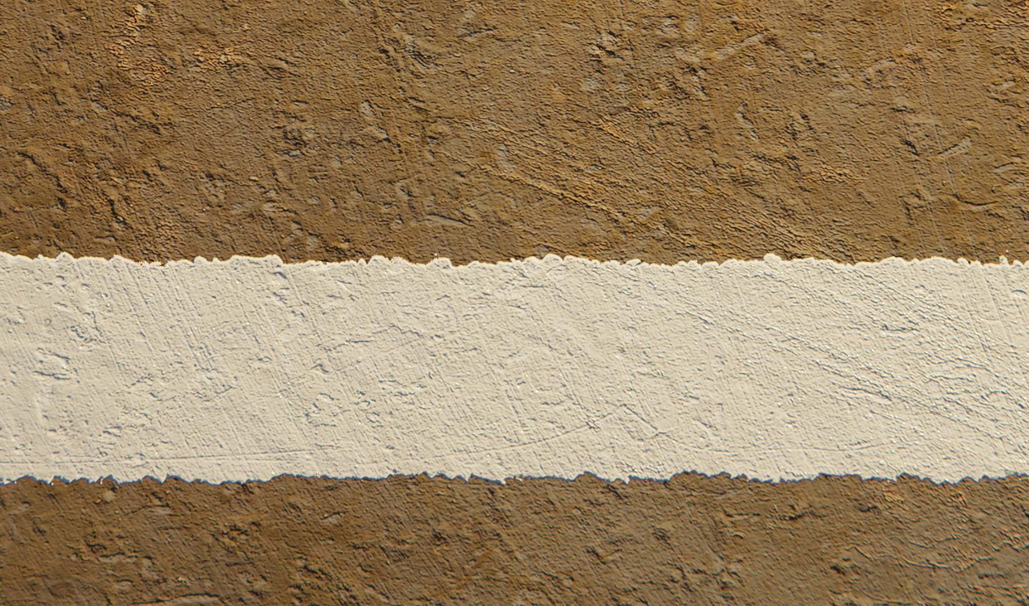
A closeup of the texture:
How I made this piece: I mocked it up in Illustrator, then exported it to SVG where I manually added the turbulence and displacement filters (in Vim) to distress the edges of the white square, which you can see in that closeup. I used Inkscape to export the SVG to a 6500×6500 PNG.
Then, in Blender, I created a plane and went to town on the shading, using a combination of procedural and image textures to mix the colors together and displace the geometry of the plane. There’s a key light and a dim fill light. And in the compositor I added a little chromatic aberration around the edges with the lens distortion filter.
Rendered it at 5200×5200, which took about two hours on my 16″ MacBook Pro. I tend to work a little smaller and then upscale to 6500×6500 (for square pieces), since Photoshop’s upscaling is fairly decent these days. After upscaling, I added my signature thingie, which I’ll add in Blender in the future so it fits in better.
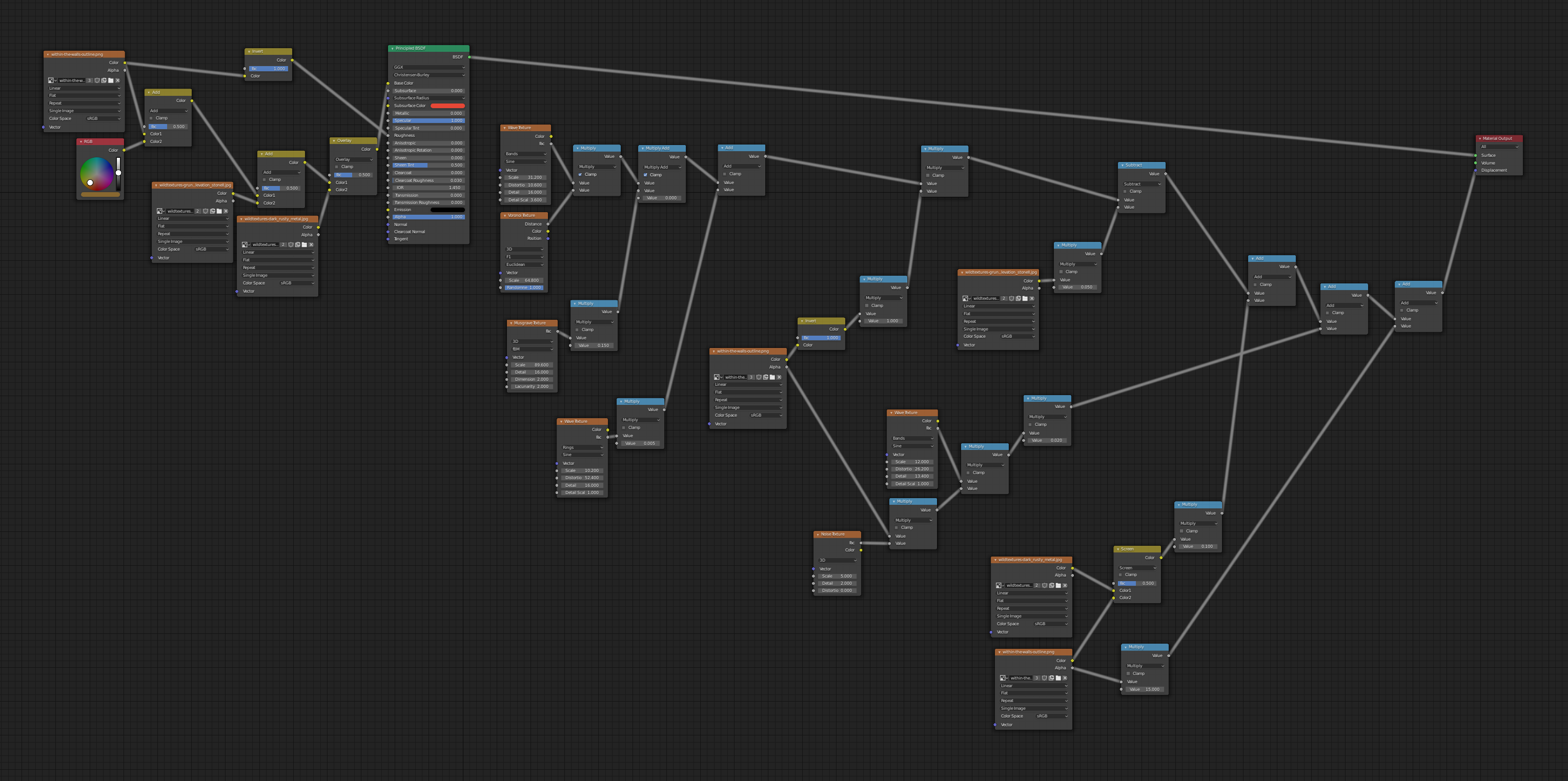
Here’s the node setup on the plane (and in the future I’ll use groups to make things more manageable):
Overall, I’m happy with this technique. It’s more time-consuming than painting textures in Photoshop, but I can do other things while it’s rendering, and the result looks much better to me. Working in 3D is more fun, too. Most importantly, using Blender gives me loads of new options that would have been harder to do well with my old technique — shiny paint, glowing materials, etc.
Brief backstory: when I’m doing my minimalist religious art, I usually sketch an idea out first by hand or in Paper on my phone, then mock them up in Illustrator to iterate on the concept. Once it’s satisfactory, I move to execution, either painting the piece in Procreate or using some of the brushes in Illustrator to get a more organic look. And finally I texture the image in Photoshop.
A couple months ago I got interested in exploring alternatives to Illustrator and Photoshop for both execution and texturing processes. And me being me, I wanted to try doing it in code, just to see what it was like. (Some things are easier in code, though I don’t know how often that would actually be the case with these.)
Note: this is still very much a WIP, and who knows if I’ll end up using any of it or not. But here’s the current state of things.
SVG
After reading somewhere that SVG has turbulence and displacement filters, I realized I could potentially use those for the execution part of the process, to distress the edges enough to make things more interesting. (And hopefully to be less repetitious than the Illustrator brushes I use.)
I put together an initial test using a few different settings, and it turned out a bit better than I expected. A sample of the code:
The background rectangle, the red figure, and the white figure all have different turbulence and displacement values. The red figure uses two sets of turbulence and displacement filters, which worked out fairly well, I think.
I used Inkscape render it out to a high-res PNG, since Illustrator wasn’t able to handle the filters. Eventually, if I keep going down this path, I’d hopefully be able to find a command-line tool that can do the rendering. (Maybe Inkscape has a headless option.)
Overall, this path seems promising. I don’t know that I’d use it all the time, but for certain things it may be handy. I still need to look into sane ways to round corners, and it seems that the other filters (dilation/erosion, convolution, etc.) may be helpful, too.
Grain
I’ve begun writing a Python script called Grain for texturing the final art image. The goal here is to see if I can streamline the process at all, and to see if this idea even works. Grain takes as input a text-based input file that looks like this:
Each block is a layer. Grain starts with the bottom layer (the executed base image) and goes up from there, adding each layer on top with the specified blending mode and opacity.
The :pattern roughdots command would generate procedural dots (not implemented yet), and the textures# bit in the :image command calls is a shortcut to my folder with texture photos.
So far, the results are disappointing. While the layering does currently work, it isn’t yet producing anything remotely publishable. I think there might be some discrepancies between blending modes in pyvips and in Photoshop. Hard to tell.
And, less importantly, it’s a little slow — partially from using high-res images, partially from Python. If the idea ends up working, I’ll most likely port this to Rust or Go, and probably also have scale things down for the exploration phase of texturing (with a final high-res export at the end).
I’ll keep tinkering with it from time to time and we’ll see how it goes.
Lately I’ve felt a bit stuck with the minimalist religious art. Ideas aren’t coming as easily as they used to. Over the last month or so I’ve iterated on a lot of mockups that haven’t gone anywhere, and while that’s normal, usually there are more ideas that make it through.
I’ll keep plugging away at it, though — I feel reasonably confident that there are still many gospel concepts and stories that would work in this format. (And many more that wouldn’t. Some things seem impossible to abstract away into simple shapes.)
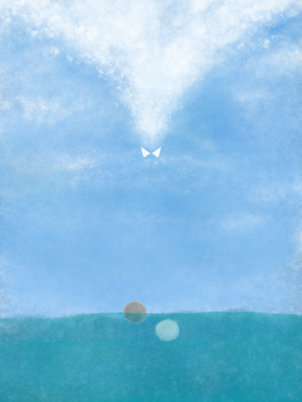
I’ve been working on a piece called “To Fulfil All Righteousness,” on the baptism of Christ. My initial attempt ended up a little too representational:
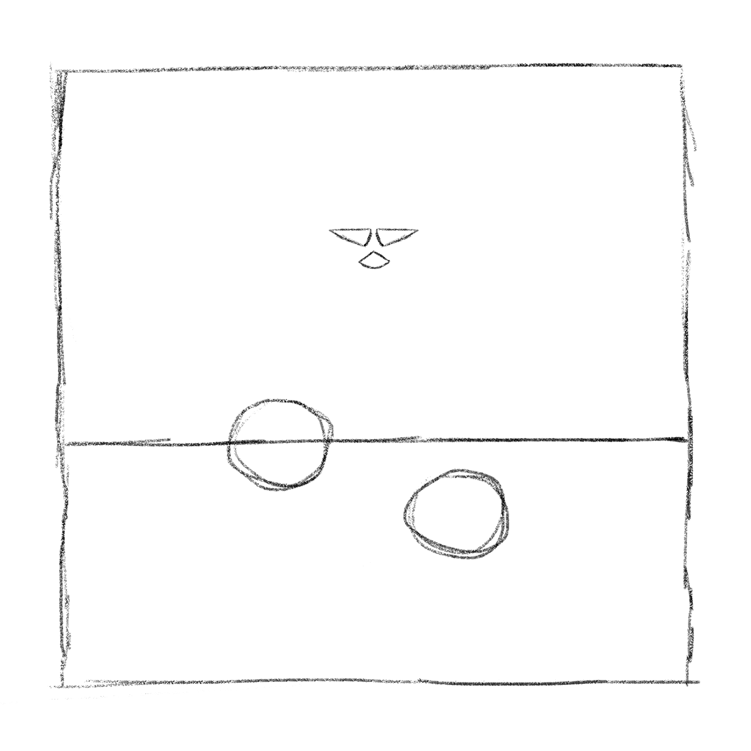
I decided to reframe the painting, ditch the windows of heaven (simpler is better here), and redo the dove shape. Here’s the current sketch, which I’ll paint soon:
(Using Kyle Webster’s Pencil 4H Photoshop brush, from the Ultimate Megapack.)