I enjoyed Kenneth Ormandy’s essay on efficient web type circa 1556.
Blog: #web
Unicode Inspector
I’ve lately had the need to find what the code points are for some Unicode text, so I wrote a little web app:
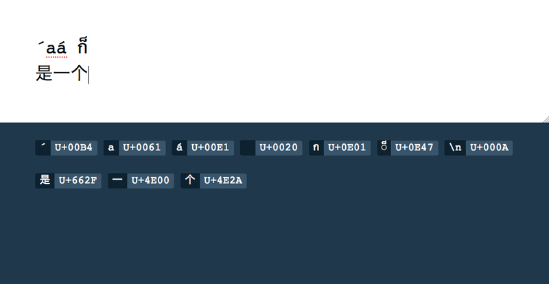
Basically, you type in text and it tells you what the Unicode hex codes are. Pretty simple. There’s a live version on GitHub.
Nerdy notes
- I’m using punycode.js to do the conversion.
- I haven’t yet tested it with anything above
U+FFFF. - Firefox shows the dotted circle for combining marks, but Chrome sadly doesn’t. (Which is why I used Firefox for the screenshot.)
- At some point I’d like to add more information about the characters — Unicode name, classification, link to chart, etc.
Genealogy notebook proof of concept
Ever since seeing the IPython notebook, I’ve been thinking about how its notebook idea would be great for genealogical research. So I put together a (very rough) proof of concept:
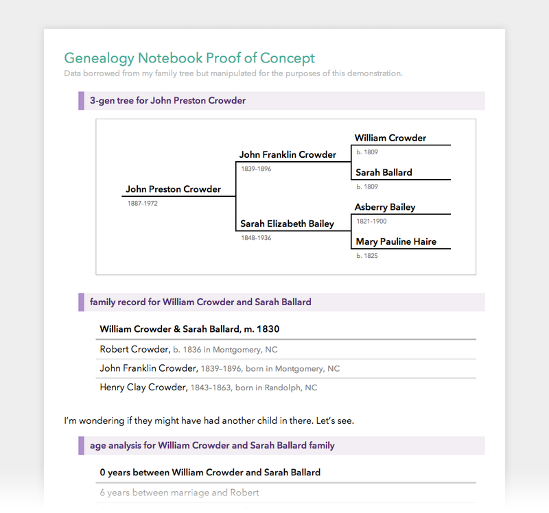
Some notes:
- A text-based query interface (the queries are in purple) to get information from a database. I don’t know that the best query language would be natural language like this — it’s more just to get the idea across — but the important thing is being able to easily do these types of queries against the genealogical information you’ve stored, enabling all sorts of analysis. “Who in my tree is born more than nine months after their father died?” “Who got married when they were younger than 12 years old?” “Who are all the children who died when they were younger than eight years old?” And so on.
- Interleaving queries, their results, and other text (using Markdown, of course). This is the core notebook idea. Or you can look at it as an annotated transcript of a query session. Rather than just having a list of queries and their results, you sort of embed them in between your writing about the research. (Similar to literate programming.) For me, writing things out helps me to see what I think and wrap my head around the research.
- There’s a lot of room for data visualization here. I’ve only shown pedigree charts and some basic tables, but it’d be easy enough to have a query return any other type of chart — bar, pie, fan, you name it. Including interactive things like the family analysis tool.
- I didn’t include this in the mockup (because I, uh, just barely thought of it), but you could extend the query language to support hypotheticals. “Show me what William Crowder’s family would look like if he and Sarah got married in 1820” or “From now on, pretend Samuel Shinn was born in 1860.” And then following queries would act as if that were true. It’s nice to be able to establish a few suppositions and then see what the ramifications would be, whether they’re plausible, etc. Or to compare two different hypotheses.
- Which brings us to the purpose of all this: to have a good place to do the rough, messy side of genealogical research. Thinking through things, seeing what comes of it, and keeping a record of the journey, basically.
- Since the information in the database would be subject to change (as you do more research), it would probably be good to cache the results. Or maybe highlight the queries whose results have changed when you reload a notebook. Personally, I lean more towards caching, so that the notebook accurately represents the database at the time it was written (making it a valuable historical record of your research), but you could also look at it as a living document that updates automatically when the background data is updated.
Anyway, the proof of concept is just a static HTML page. I’m not planning to do anything more with it, but I wanted to get the idea out there.
Alphabet app
Our toddler loves looking at letters and saying their names. A while ago we printed the alphabet out onto cardstock and have been using that with her, which is great, but I’ve also wanted to write a small web app that does the same thing — mostly for when we’re in another room, but also to make the randomization a little better. And because I can’t seem to stop writing little apps.
So this morning I threw together Alphabet:
Super simple. Click, tap, or hit a key to move to the next letter. It works on phones and tablets as well.
Typlate
I’m starting to get more into typeface design, and so I put together a little web app to generate PDF templates for sketching type out (with guides for the ascender, baseline, x-height, etc.). It’s called Typlate:
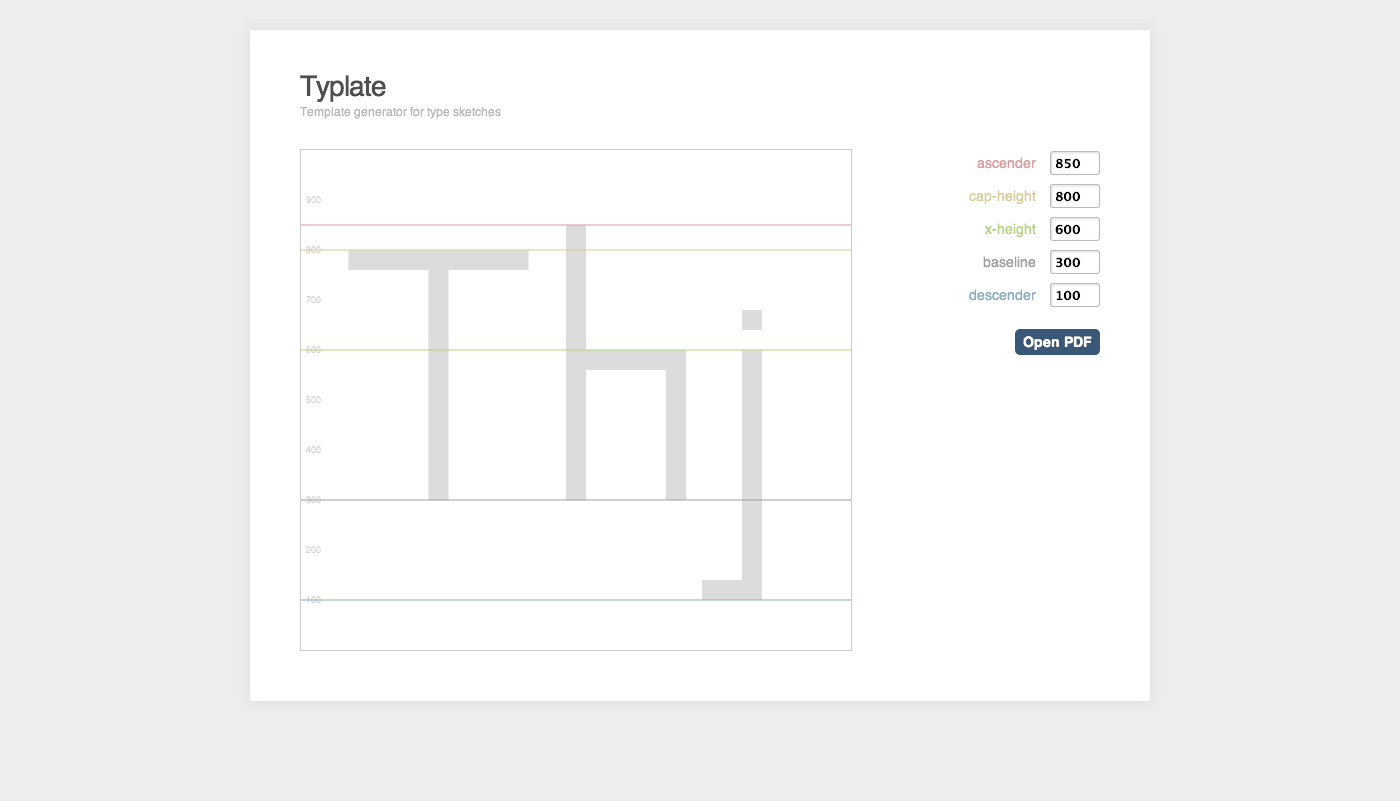
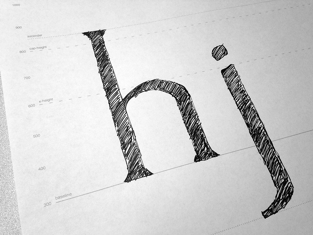
You twiddle with the numbers till you get proportions you like, then print out the PDF and start drawing:
Technical note: I’m using jsPDF to generate the PDF in-browser. In fact, there’s no server-side code at all. It’s amazing what you can do with JavaScript these days.
Spin
Introducing Spin, a game I threw together hastily for a little game jam I did with some friends.
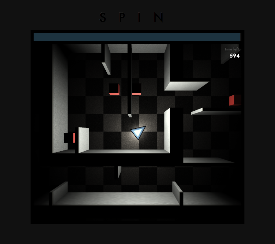
Basically, you’re in a maze and have to get out before the timer runs out (ten minutes, which I display as 600 seconds because hey, I didn’t have much time) (pun not intended?). The world rotates 90° every five seconds with gravity changing as well, and the walls and obstacles hurt you if you touch them. And that’s about it. I threw most of the level together in, oh, about twenty minutes, so gameplay may end up being more frustrating than fun. But there is an exit, I promise. It may just take several rounds to find it without dying.
Technology-wise, Spin uses Box2D for the physics and THREE.js (WebGL) for rendering. I recommend playing it in Chrome, since Firefox’s WebGL wasn’t hardware accelerated (at least on my Mac) and was dog slow. (Safari works fine, but you have to enable the developer menu and then enable WebGL.)
Update: I realized this morning that it would be fairly trivial to add a first-person mode, since all I’d need to do is change the camera. So I did. It’s more boring of a game — with the gravity and world-rotation gone, it’s just maze exploration — but it’s kind of cool that WebGL makes it easy to do both kinds. The README has more info on how to activate the first-person mode.
Responsive sheet music
First, a couple premises:
- The web is now the best document delivery platform, and that will become even more true as time goes on.
- Documents need to be flexible so you can view them on any size device — desktop, tablet, mobile, anything.
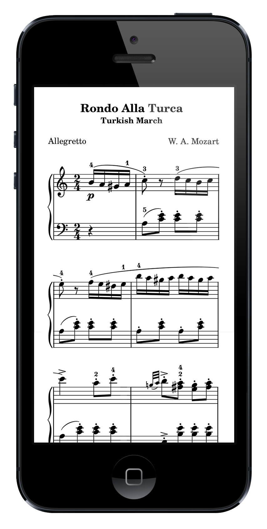
As I’ve been doing more responsive web design, I’ve been thinking that this principle of reflowable content could apply to sheet music. For example, here’s a normal page of sheet music (from the Mutopia project):
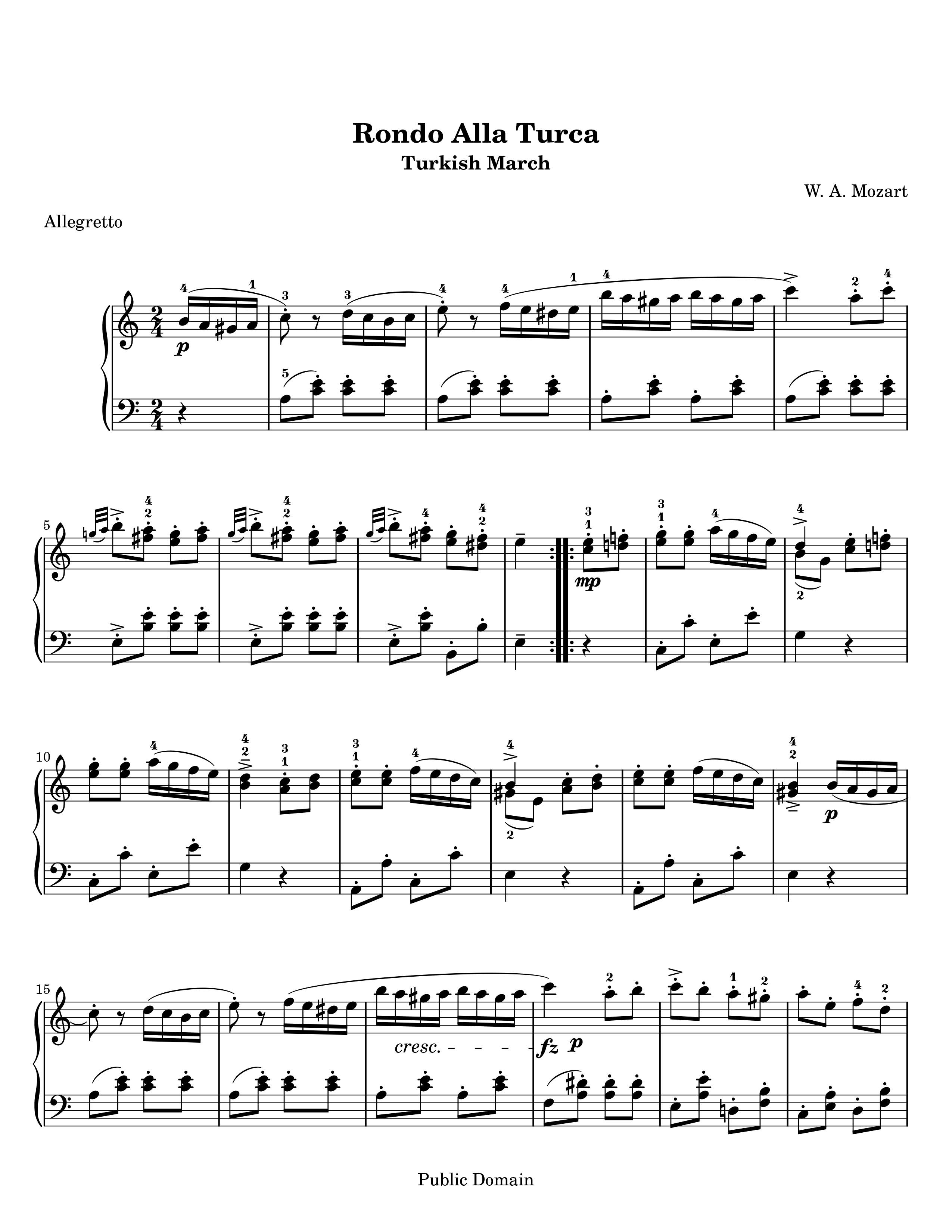
If you were to view this music on a smartphone, you’d either have to zoom all the way out (making it super small), or zoom in on just one section of the page and pan around, which can be a lot of two-dimensional panning — not too great if you’re trying to actually play the music.
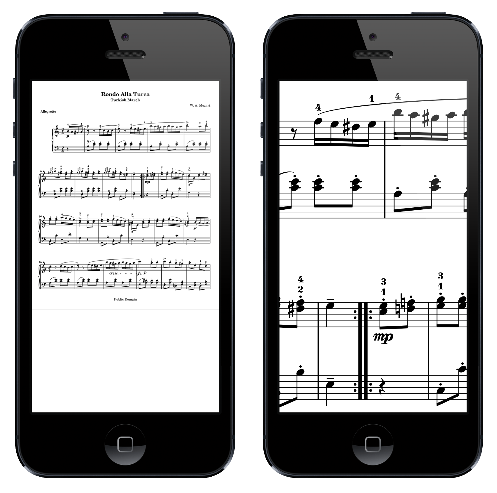
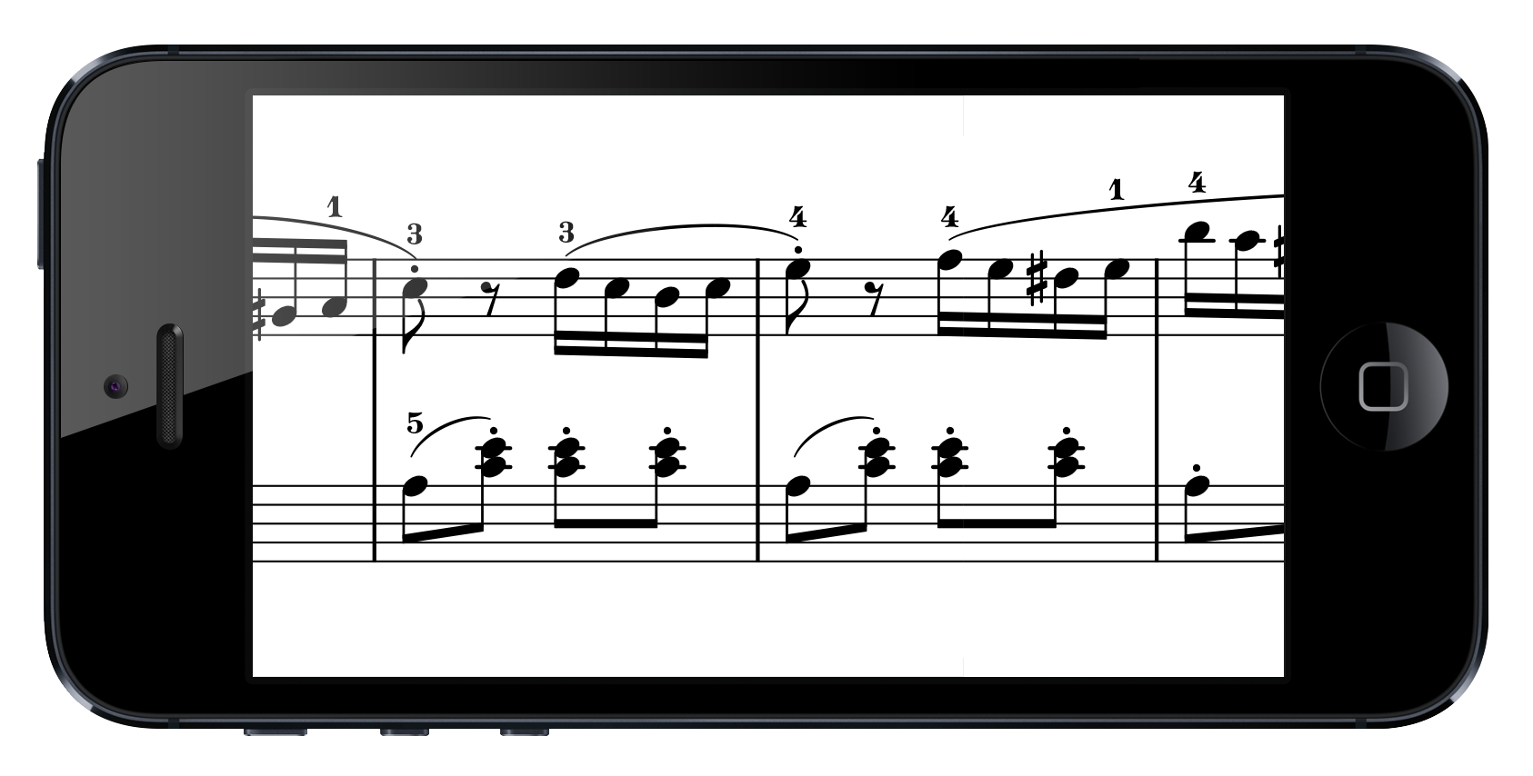
Neither is ideal. So I’m thinking maybe sheet music should automatically reflow to fit your viewport — the way both text and responsive websites do:
(This is just a quick copy-and-paste mockup — in reality you’d keep the clefs on each line and probably make things a little smaller and so on — but you get the idea.)
So as the viewport shrinks, you would drop the space between notes until you hit an unacceptable squishiness, then drop the number of measures per line by one and set the space between notes to be wider to fill the space again. Rinse and repeat. By the time you’re down to smartphone size, you’d probably be at two measures per line as in the above mockup.
Implementation
In a perfect world, there’d be a set of tags in HTML for typesetting music, and the browser would do the rendering, and CSS media queries would take care of the rest. That will almost certainly never happen, though, since it’s too domain-specific. I think the best we can hope for is a JavaScript rendering engine that uses SVG — something like Vexflow.
One other thought: jumps (repeats, codas) should be hyperlinks, so the player doesn’t have to think about where to go. (And when it jumps to the location, it could flash a highlight or marker or something on the measure you should start at.) Or, even better, since we aren’t really worried about taking up space, just flatten repeats and codas altogether — take the repeated section and write it out. Space isn’t as much of an issue on the web. The disadvantage is that it’s not as easy to know that the repeated section is in fact identical.
Disadvantages
If you’re only seeing one or two measures per line on, say, a smartphone, and if you’re playing something with more than one staff (piano music, for example), then you’re going to be doing a lot of scrolling. So you probably wouldn’t want to go down quite this much.
There’s also a slight loss of familiarity. When you play a page of music over and over again, you get familiarity grooves etched into your mind; with responsive sheet music, you wouldn’t really get that as much. (If you used the same device every time in the same orientation, then it’d be a little more stable, but you’d be scrolling instead of flipping pages, which anchors things less.)
Ticker-style sheet music
Another idea that came to mind when I was mulling this over was reducing the music to one line and automatically scrolling it like a ticker. (This probably already exists. Responsive sheet music may exist as well, but I couldn’t find it — if someone has already implemented it, let me know. I want to use it.)
Advantages:
- Focus. Since the music is one-dimensional, the player doesn’t have to think about other dimensions (down and up, where the end of the page is, etc.).
- Linearity. With this style it really would be better to flatten out repeats and codas, so it’s just one long line of sheet music. Then you don’t have to spend any mental cycles thinking about jumping around.
The disadvantages are pretty much the same as with responsive:
- You lose some familiarity — with a full page of music, you get used to its layout and it reminds you of things, whereas a scrolling ticker would always feel somewhat new.
- Flattening repeats makes you lose the knowledge that the repeated section you’re starting to play is the exact same as the previous section.
Slow localhost in Chrome
For a while now I’ve been doing most of my web coding locally on my laptop, creating virtual .local hosts in Apache (like unbindery.local) and aliasing them to localhost in /etc/hosts. That was all well and good, but in Chrome there would always be a two or three second delay when first hitting a page on one of these local vhosts. Subsequent page views would be fast, but if I waited more than a minute or two, it would be slow again.
I finally googled around and just found that the problem is the .local — it’s used by Bonjour on the Mac, causing conflicts that Chrome doesn’t quite know how to resolve quickly. (Safari does, though.)
So, all you have to do is change the name of the vhost to something else — from unbindery.local to unbindery.dev, for example. Works like a charm, and my goodness, I can’t believe I waited this long to fix it.
Update: Turns out this is also the reason my terminal tabs would take two or three seconds to come up. It’s really fast now. Alleluia.
Javascript name box
In genealogy web apps, I kind of like consolidating name fields into a single textbox. Simpler is better. But then you run into the problem of distinguishing the surname from the rest of the name — because of surnames like “Gutierrez Sanchez,” you can’t just assume the surname is the last word in the string.
I’ve been thinking for a while about a clean way to deal with this (as well as giving a nice visual indication of the surname instead of just slashes), and here’s what I’ve got so far, which I’m dubbing (rather unimaginatively) the Javascript name box:
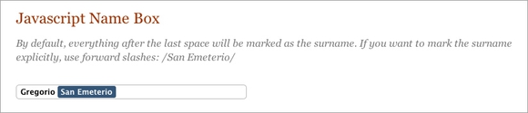
When you click on the name, it becomes editable:

How it works
Basically, you give it an input.namebox element and it creates a corresponding div tag for displaying the highlighted surname. It then flips back and forth between the input and the div, parsing the name field and changing the highlight appropriately.
Live demo
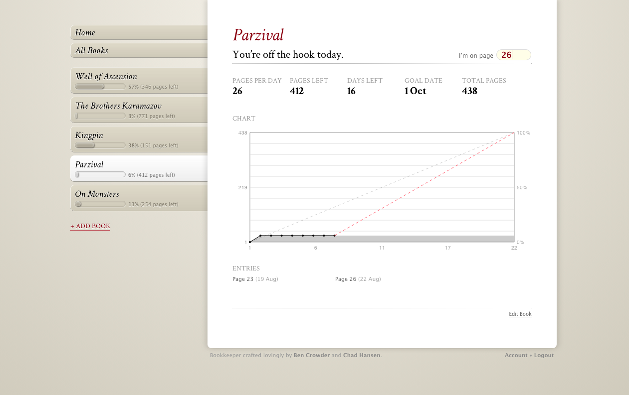
Bookkeeper
About a month ago I was thinking about how I want to read more long, hard books — specifically The Brothers Karamazov. Back in college I plowed through Don Quixote in a week for my Comp Lit class (and I still think that’s slightly insane), and I read lots of other long books as well, all because I had a deadline.
Enter Bookkeeper. My coworker Chad and I have been working on it for the past couple weeks and it’s finally ready for an initial release. And we’re super excited.
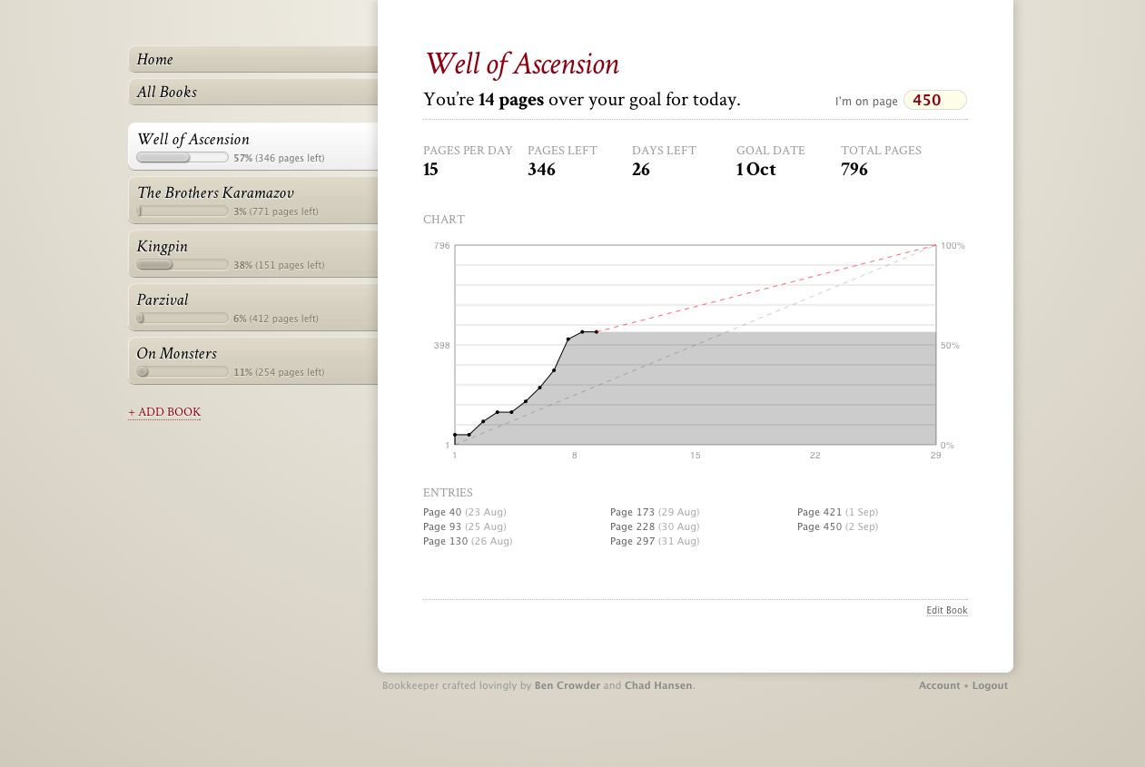
What Bookkeeper is
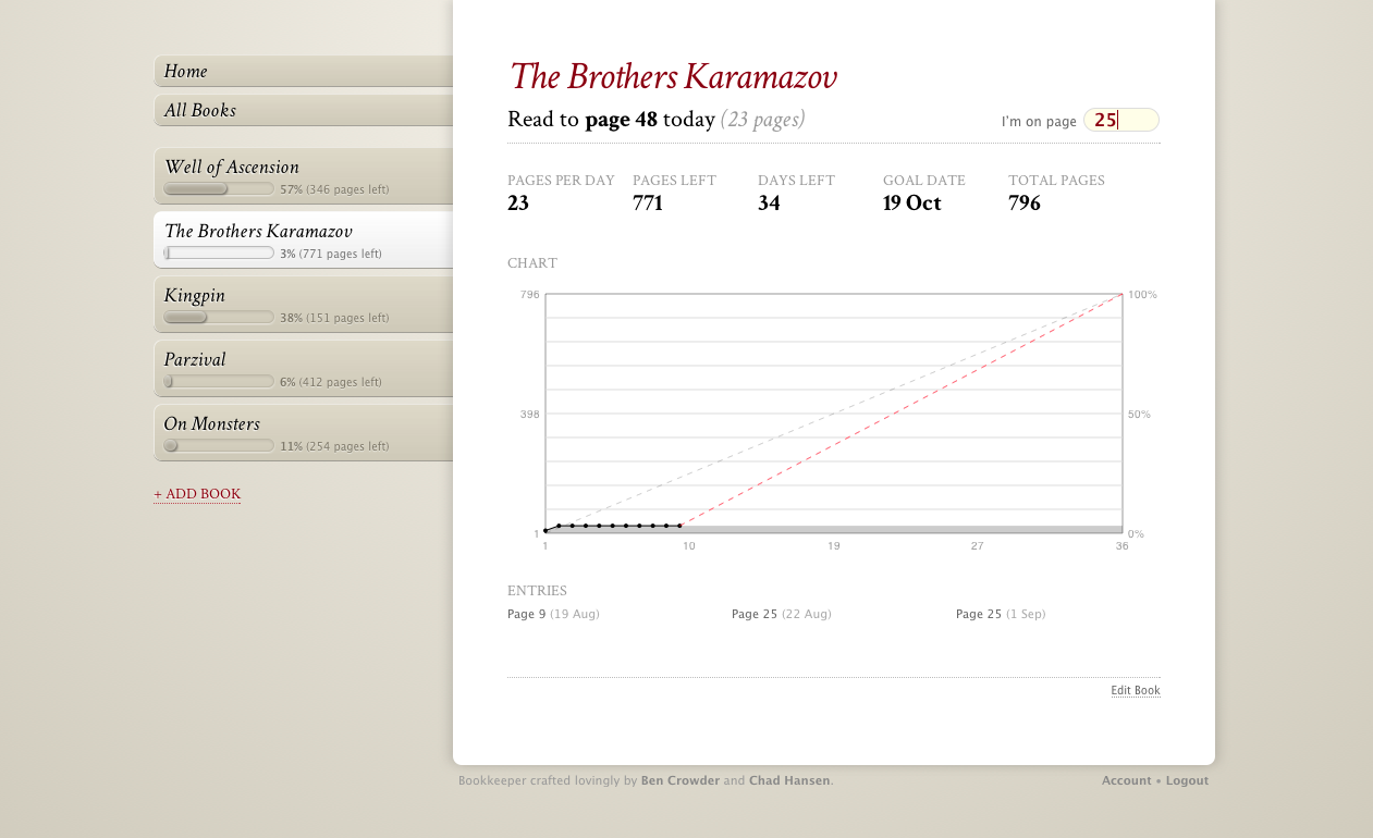
It’s a reading goal tracker. You give it a book, the number of pages in the book, a start date, and a deadline, along with which days you’d like to read (since sometimes you’ll want to take weekends off or what have you), and Bookkeeper will tell you how many pages per day you have to read to hit your goal. If you miss a day, or if you read ahead, it’ll adjust that number (the red line on the chart).
Where to get it
Right now it’s just available on Github (it’s a PHP/MySQL app), and there are installation instructions in the README. It uses Google Accounts for authentication.
I’m not planning to host a public instance of it, at least not right now, but if anyone wants to do that, let me know so I can forward people to it. And of course anyone is welcome to fork the code and do whatever they want with it.
How to use it
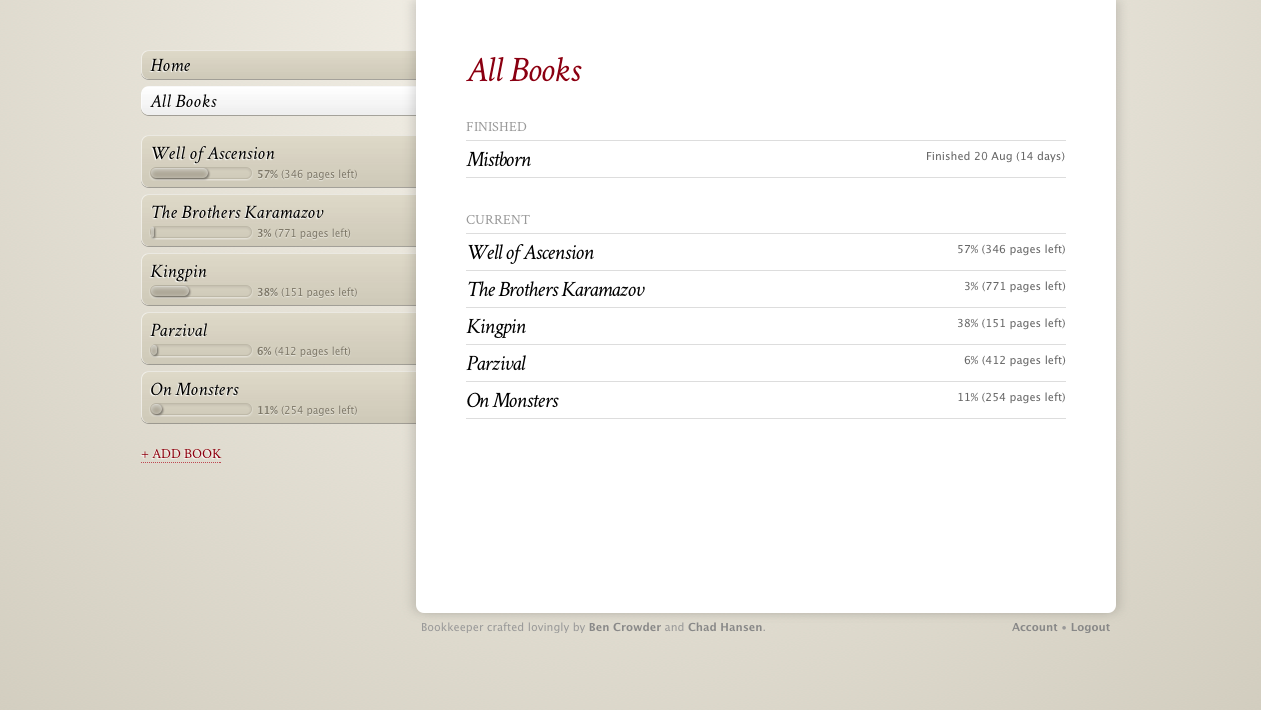
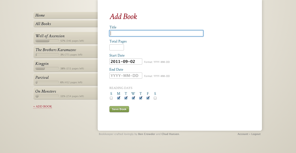
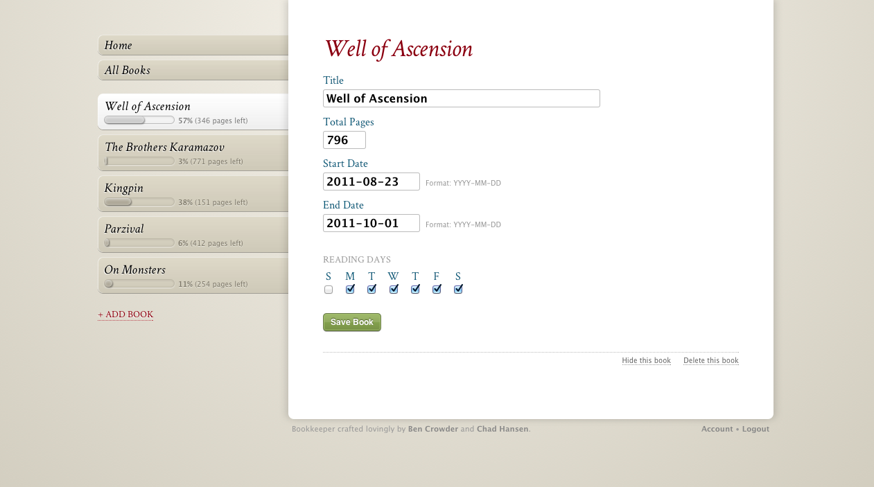
You add books, then whenever you read, you update the page number (in the upper right). And that’s about it. The list of tabs on the left shows you your current books; the All Books tab will let you also see books you’ve finished and books you’ve hidden (for when you temporarily put a book on the back burner).
On the Account page (the link’s at the lower right) you can export your book/entry data as JSON. We figured it’d be nice to have some easy way to get your data out. (And the link doesn’t change, so you could set up a cronjob to curl the JSON weekly or something if you really want regular backups.)
The future
As we make Bookkeeper more social going forward, we’re thinking it’d be cool to build book recommendations based at least partly on reading curves. Looking at my Well of Ascension reading curve up there, you can see that it starts to go up quickly and it’s ahead of the curve, which pretty much means I really got into the book and must have liked it. That’s not a surefire method for determining which books are good and which aren’t, but we’re interested in seeing what kinds of recommendations we can get from reading data like this.
More screenshots