Curves mockup 1
I threw together a (very) rough mockup to explain a few of the ideas I mentioned last week:
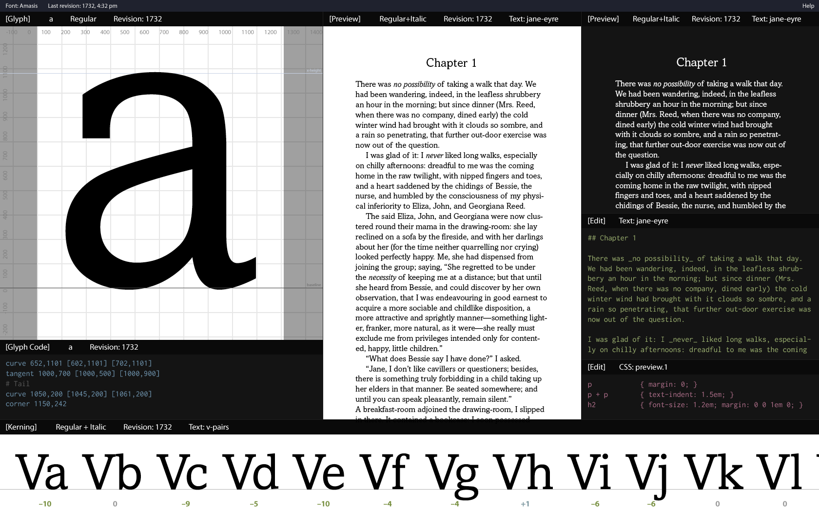
Again, super rough, and lots will change. Salient points:
- Text preview windows. They’re using Markdown converted to HTML and styled with CSS. The idea is to be able to see how your changes affect the typeface when it’s being used on a page (and with the age of ereaders, it’s good to be able to test light on dark as well).
- Revisions. Ideally, it’d be nice to have a preview pane showing a page using an older revision and a preview pane showing your current work, so you can see if your changes are better or worse. And being able to revert to an older revision would reduce the stress of trying things out. (Hmm, I wonder if branching ala Git would be worthwhile…)
- Glyph code. Under the glyph, you can see some rudimentary code describing the glyph. I’m not sure this is the syntax I’d use, but it’d be something fairly similar. (Point type, point coordinates, and then zero to two control points.)
- Regular + italic. As you can see in the preview windows, I want to make it easy to preview italic along with the regular. I don’t know yet what ramifications this has for the font view or glyph editing, but I’ll figure it out.
What I’m not including in this mockup:
- A tool palette. I’m not sure yet if I want to have one at all, actually. With the heavy emphasis on keyboard shortcuts (and with a search that knows about tools), I don’t know if I need one. Or at least not a traditional palette. We’ll see.
- Settings menus for each window. Still not sure how I want this to work, but it would be similar to the side panels in Blender.
And of course there’s a lot more to figure out and work through.