Pigna: fin
I’ve decided that I’m now done with Pigna — partly because I’ve learned the technical things I set out to learn, but mostly because I’m seriously itching to design a real typeface, one I’ll use for actual text work. But first, a review of what’s happened since my last post:
Diacritics
I learned how to add anchors thanks to a tutorial by Peter Baker. It’s quite easy and mmm, diacritics. (The acute, grave, cedilla, and macron are the only marks I drew, though.)

I also played around with the mkmk feature for stacking marks on other marks and got it working (with an acute on top of a macron).
Italics
For the heck of it, I ran Pigna through FontForge’s convert-to-italic feature, and this is what it came up with:
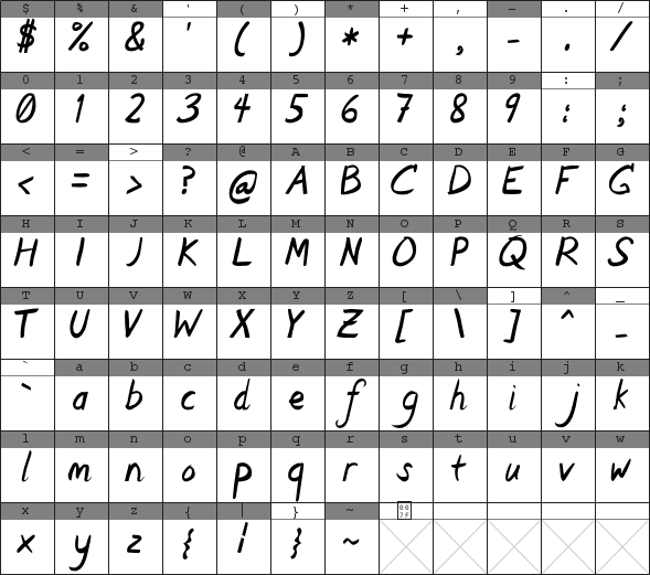
It didn’t have a crossbar on the ‘f’, and the ‘d’ was somewhat mangled, so I fixed both of those. But other than that it’s straight from the conversion. It’s interesting. I’ll still draw italics by hand when I do them for real, though.
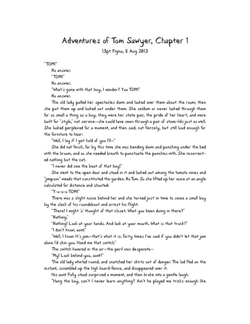
More kerning
I also added the em dash and en dash and curly quotes, but I decided to leave out the oldstyle numerals. (I learned how to do them with a small test font, though.) And I added more kerning, as you can perhaps see in the latest Tom Sawyer test sheet:
Conclusion
That’s all, folks. Pigna has been a good learning exercise, and it’s gotten me to finally make a typeface. Turns out it’s easier than I thought, especially once I got past the initial learning curve. Now on to the real work of making a good typeface.