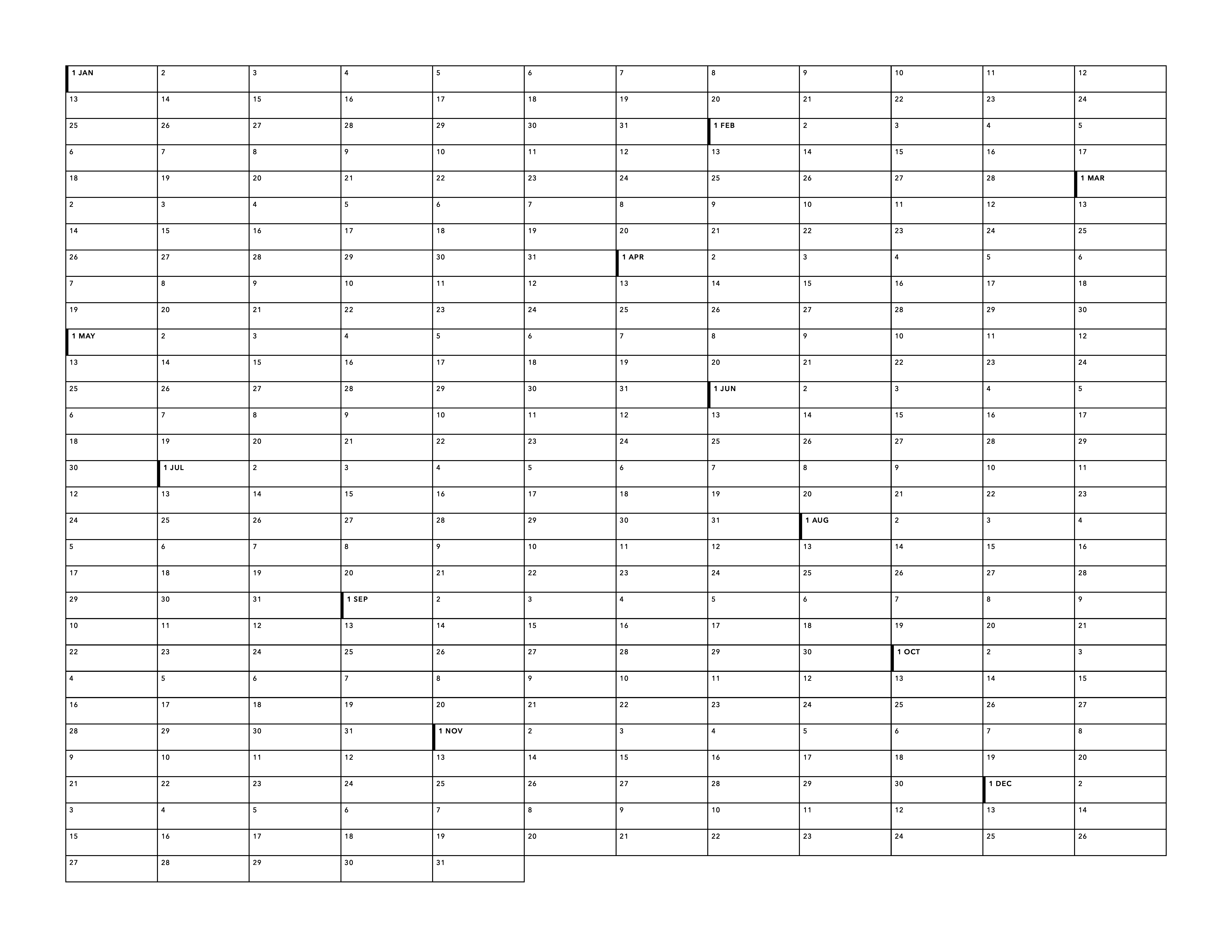
This time the chart doesn’t have a specific year baked in, so it’s reusable. (And there’s a variation for leap years.) It’s freely available as PDFs in both portrait and landscape. Currently just letter size, though maybe someday I’ll start including A4 and other sizes.
Colophon: I made these charts with HTML (it’s just a table), CSS, JavaScript (on page rather than via Node), and Firefox. The font is Avenir Next.
I ported my Latin declensions chart from PlotDevice (which was Mac-only and thus not accessible to people without Macs) to HTML/CSS.
Some notes:
My goal with this was to make a chart that’s modifiable as easily as possible without building a full chart-generation app.
Because this HTML and CSS is intended for print and not at all for the responsive web, there are a few ways I did things that I probably wouldn’t have used on a web project.
I considered using on-page JavaScript to generate the table HTML, since right now there’s a lot of duplication, but I opted to stick with straight HTML to make it easier for non-technical people to modify.
The column widths are manually set so that things line up across tables. I could have done one big table instead, but the editing ergonomics would have been substantially worse.
Chrome still can’t print lines less than 1pt in width, so I used Firefox to export the PDF.
I wish custom properties worked in @page. I also plan to eventually refactor this so that more of the CSS is configurable via custom properties. (At this point it’s just column widths/gaps and colors.)
This 3.0 version of the chart changes the font from Museo Sans / Minion Pro to EB Garamond, so that the font is freely available. (EB Garamond also feels more appropriate to Latin than Museo Sans.)
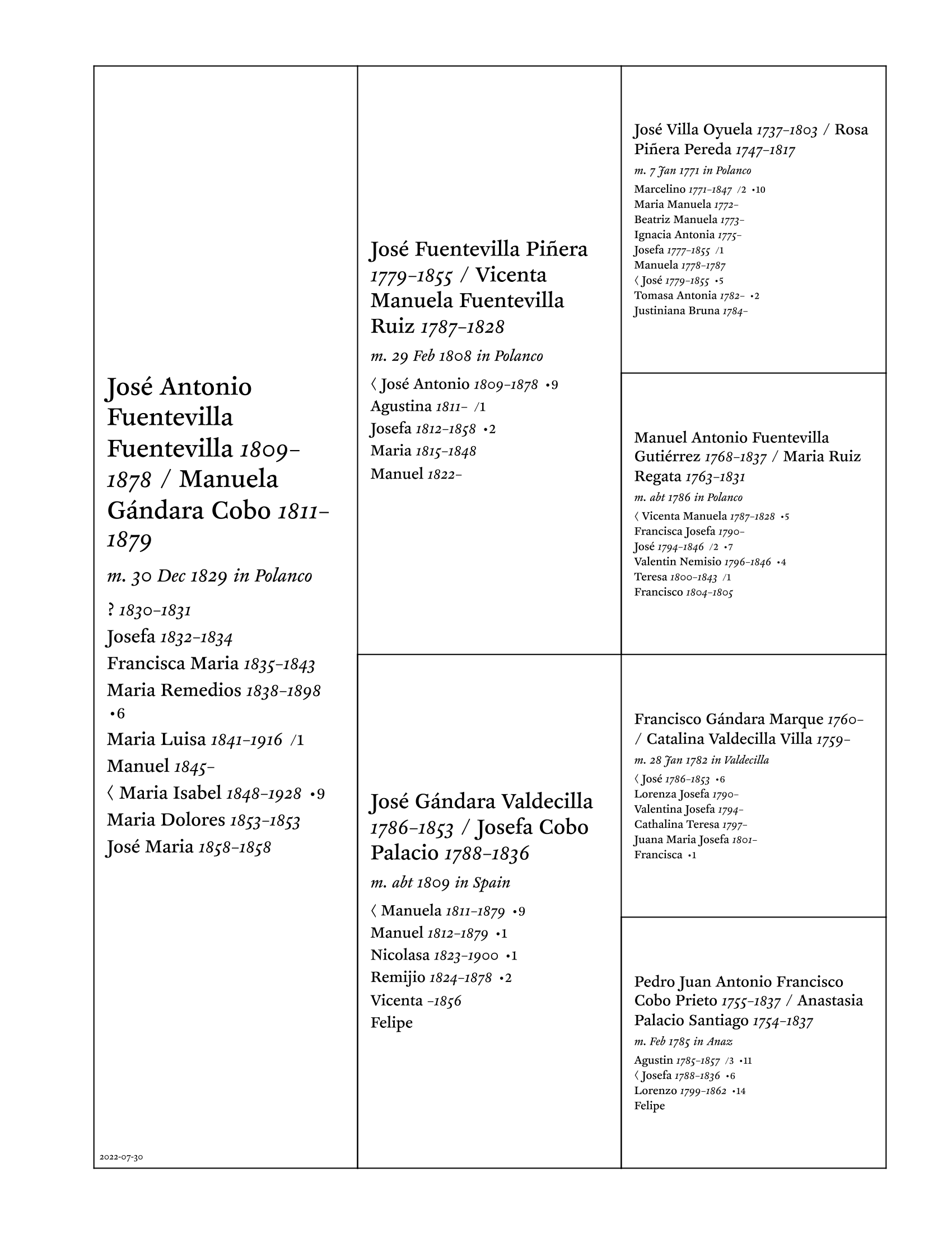
As you can see, it’s a little different from the initial design. This modern incarnation admittedly isn’t as pretty in some ways, but it’s a heck of a lot easier to lay out programmatically.
New things: It shows which child the line comes through, I added the lifespan right after each parent’s name, and I added indicators for the children showing how many kids they had (the dot) and how many marriages (the slash, though if they were married only once and had children, I left the marriage indicator off).
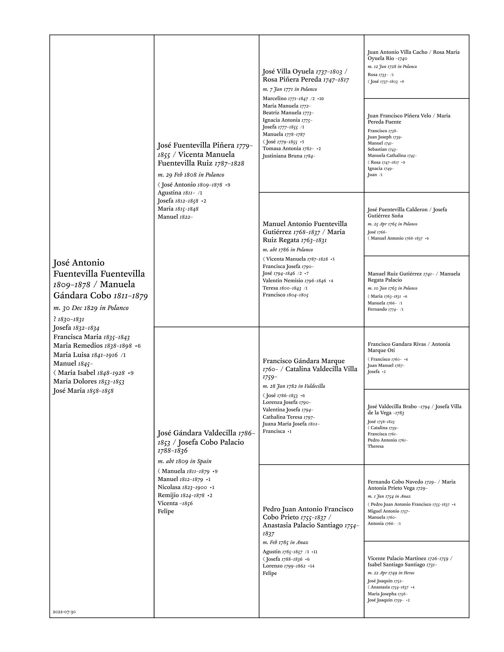
It also supports four generations, admittedly with less space and smaller type:
I tried it without the table borders, by the way. While it was more readable than I expected, it felt a little too loose and unmoored.
The input uses ArchieML and currently looks like this:
[families]

family: 1.1
marriage: 30 Dec 1829 in Polanco
father: José Antonio Fuentevilla Fuentevilla // 1809-1878
mother: Manuela Gándara Cobo // 1811-1879
[.children]
  name: ? // 1830-1831

  name: Josefa // 1832-1834

  name: Francisca Maria // 1835-1843

  name: Maria Remedios // 1838-1898
  children: 6

  name: Maria Luisa // 1841-1916
  marriages: 1

  name: Manuel // 1845-

  name: < Maria Isabel // 1848-1928
  children: 9

  name: Maria Dolores // 1853-1853

  name: José Maria // 1858-1858
[]

# --------------------------------------

family: 2.1
marriage: 29 Feb 1808 in Polanco
father: José Fuentevilla Piñera // 1779-1855
mother: Vicenta Manuela Fuentevilla Ruiz // 1787-1828
[.children]
  name: < José Antonio // 1809-1878
  children: 9

  ...etc.
[]

...etc.
Right now the family numbering is table-based (column, row), but eventually I think I probably want to make it hierarchical (somehow) so it’s easier to know which cell to put things in.
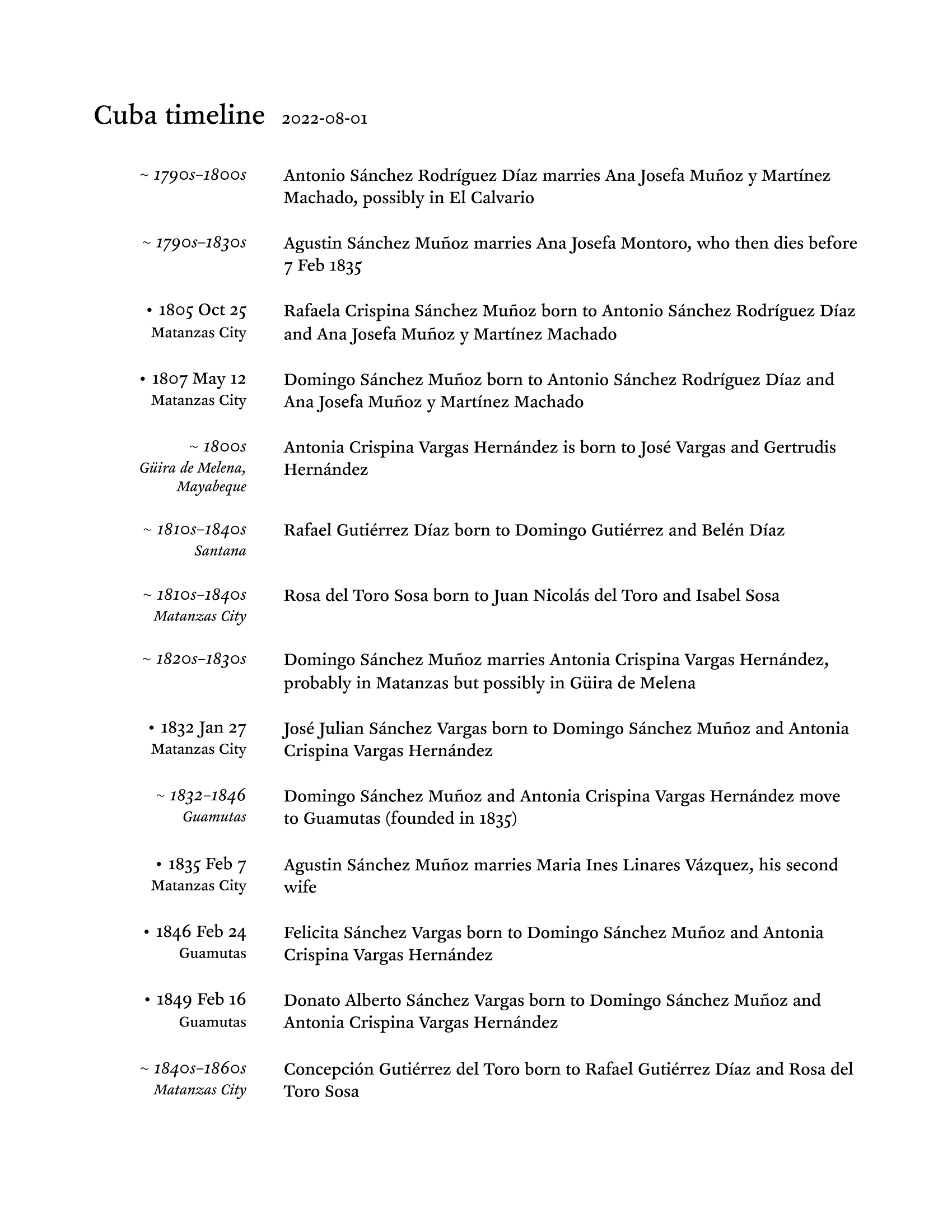
Timeline charts
Another new chart of sorts: timelines. I’ve been sorting through my Cuban lines and realized I needed some way to map out everybody so I could see the bigger picture.
The input is an ArchieML file that just lists events with dates and optional places:
title: Cuba timeline

[timeline]

event: Antonio Sánchez Rodríguez Díaz marries Ana Josefa Muñoz y Martínez Machado, possibly in El Calvario
daterange: 1790s-1800s

event: Agustin Sánchez Muñoz marries Ana Josefa Montoro, who then dies before 7 Feb 1835
daterange: 1790s-1830s

event: Rafaela Crispina Sánchez Muñoz born to Antonio Sánchez Rodríguez Díaz and Ana Josefa Muñoz y Martínez Machado
date: 1805 Oct 25
place: Matanzas City

event: Domingo Sánchez Muñoz born to Antonio Sánchez Rodríguez Díaz and Ana Josefa Muñoz y Martínez Machado
date: 1807 May 12
place: Matanzas City

event: Antonia Crispina Vargas Hernández is born to José Vargas and Gertrudis Hernández
daterange: 1800s
place: Güira de Melena, Mayabeque

...etc.
If the date is a range, it’s italicized to show that it’s broader than a specific date.
(I originally was just going to use Google Docs for this, by the way, and made an initial prototype there. Having to do all the formatting manually got old, though, so I scripted it. Now I can just focus on the content.)
Family sheets update
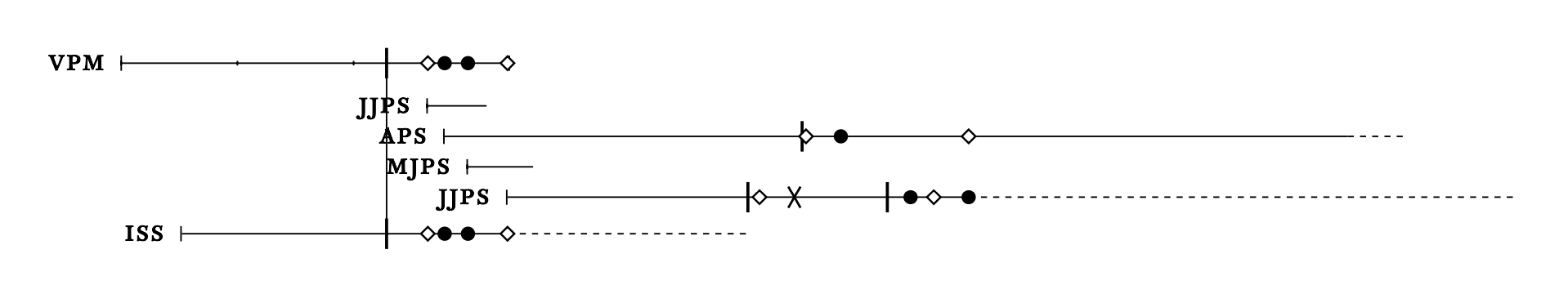
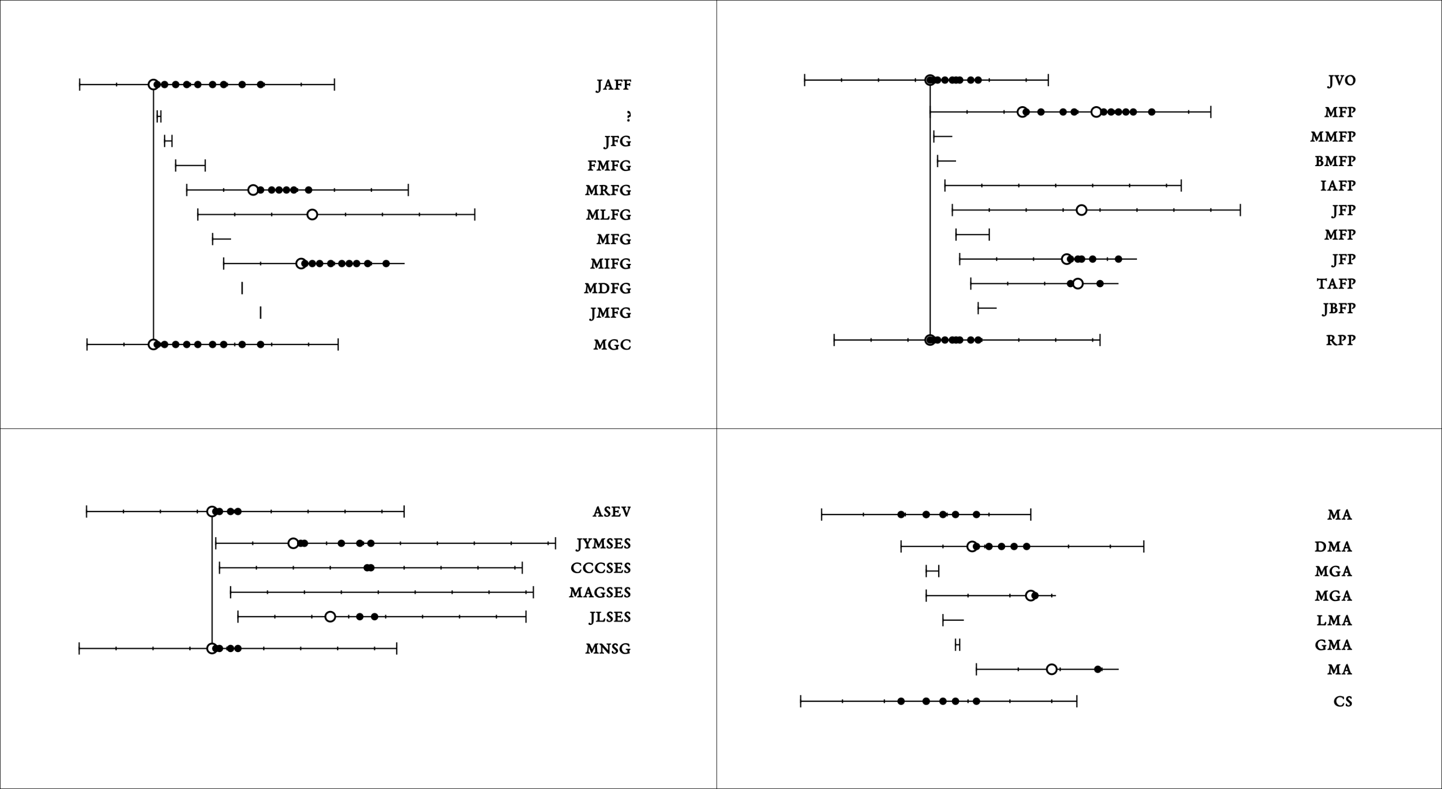
I’ve got almost all the family sheet functionality ported to Node/JavaScript and cleaned up. (The sparklines code now uses tracks and markers in a way that is much more extensible and easier to work with.) In the process, I also revised the resolution (before, it just keyed off the year, but now it uses the month and day if present as well, so spacing is more accurate), added dotted-line support for date ranges (for birth and death), and added a marker for divorce (a skinny X):
Still have a number of bugs to fix, but it’s getting close.
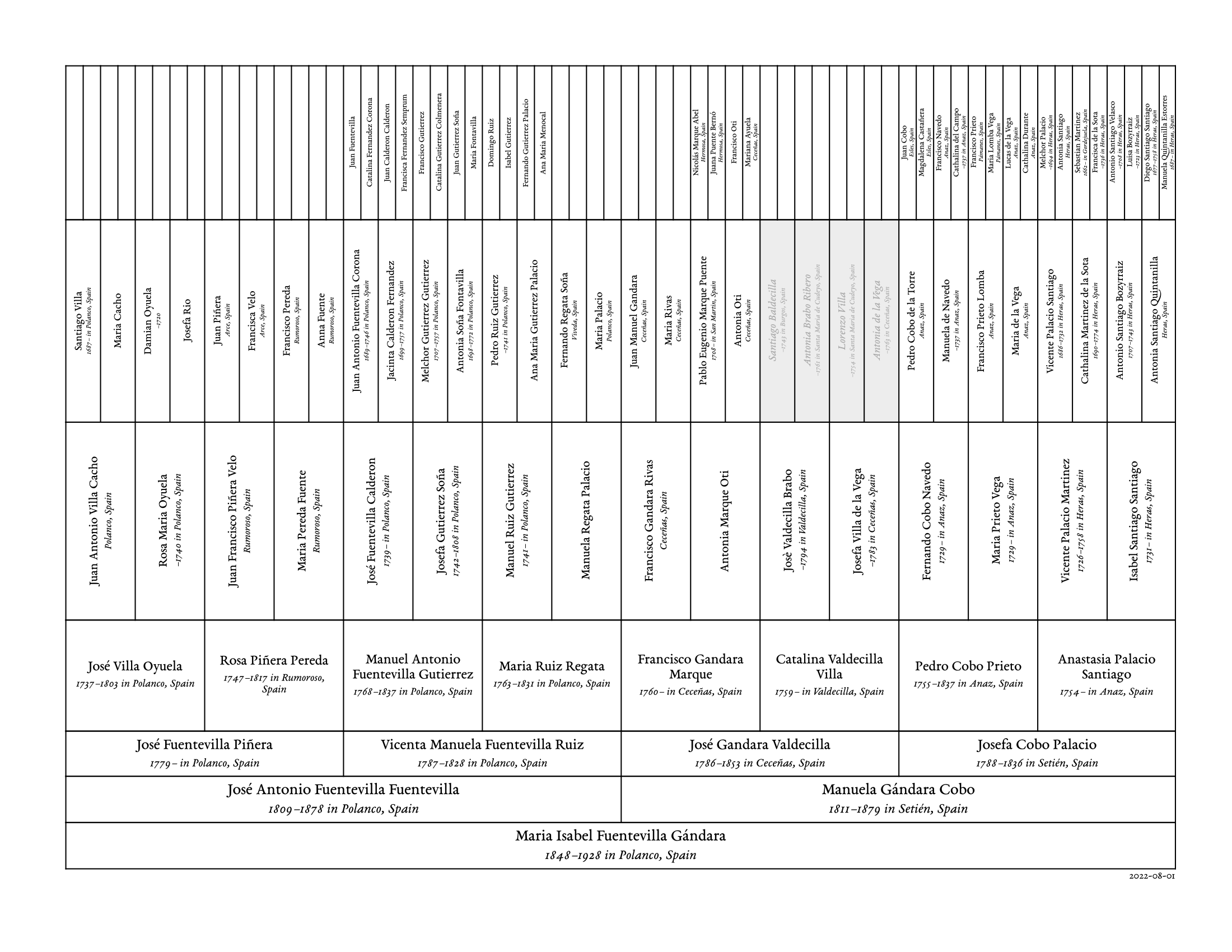
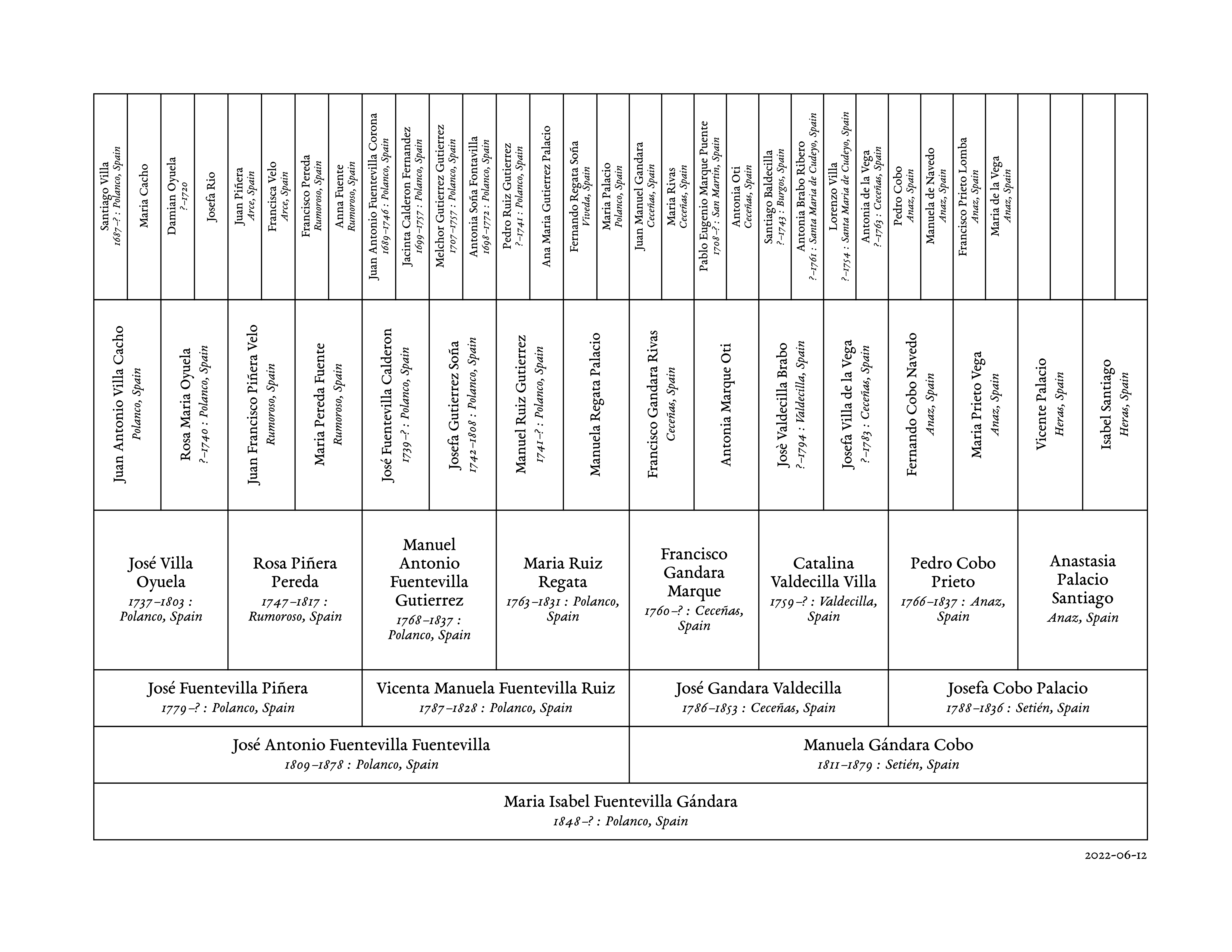
Tabular pedigrees update
I ported the tabular pedigrees to Node/JavaScript and added support for seven-generation charts:
Comparison to the six-generation chart:
The shaded cells, by the way, indicate that I haven’t yet verified those people. Basically a TODO comment for myself.
Can’t wait till Chrome supports border stroke widths smaller than 1pt.
Quick links
Last and sort of least, I’m slowly putting together a page with quick links to the various Torre de’ Passeri civil registration scans on FamilySearch, to save myself some time. Planning to do this for the other localities I do research in as well.
(At this point are they really still sparklines, you ask? Good question.)
These families are from my Spanish line, by the way, which is why there is an abundance of initials.
Basic idea: larger hollow circles are marriages, smaller filled circles are children. Vertical marks at beginning or end for birth and death. (If the vertical tick isn’t present, the birth or death date isn’t known.) Father at the top of the chart, mother at the bottom, children in the middle. Vertical line from father to mother for the parents’ marriage. In cases where the marriage isn’t known (like in the bottom right MA/CS family), the vertical line and circles are left out. People’s initials are at the right to help know who is who. The smaller vertical tick marks on each line mark ten years of age. If there isn’t a death date, it goes five years past the last known date.
It’s still a work in progress, but I like how it provides an at-a-glance overview of a family. With the JAFF/MGC family in the upper left, for example, I can easily see that:
The parents were alive for all three marriages of their children and most of the grandkids’ births
They had five children die young
I don’t have a marriage or death for MFG
I haven’t found any children for MLFG
You can also see a child born before the wedding, how old people were when they married, gaps where there might have been children, etc.
I’m sure I’ll refine it further in the future, but I wanted to post where it’s at right now.
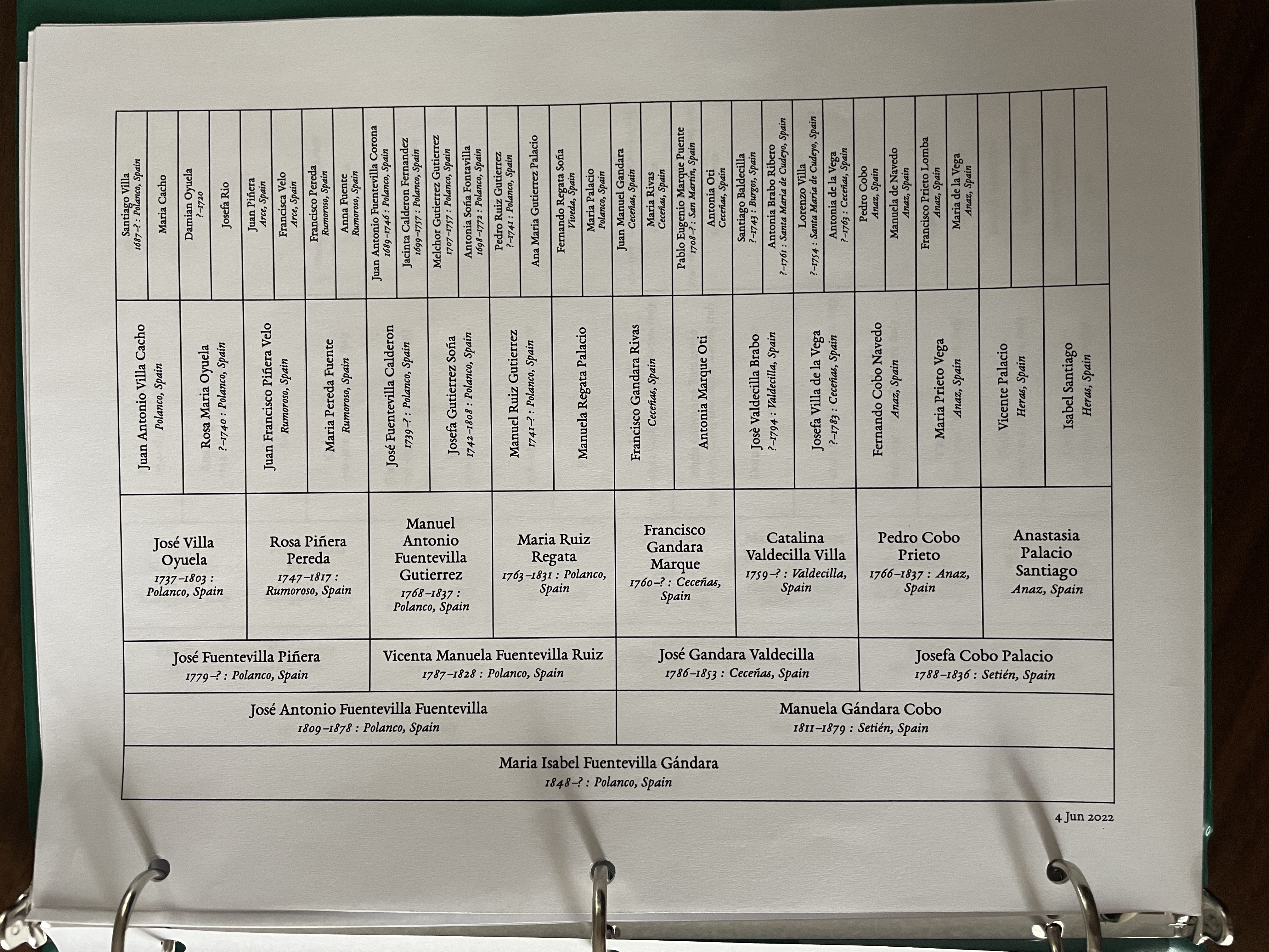
Lately I’ve found myself wanting to have local, paper copies of my genealogical research. As part of that, I wrote a script that takes input like this:
- Maria Isabel Fuentevilla Gándara | 1848 | ? | Polanco, Spain
-- José Antonio Fuentevilla Fuentevilla | 1809 | 1878 | Polanco, Spain
--- José Fuentevilla Piñera | 1779 | ? | Polanco, Spain
---- José Villa Oyuela | 1737 | 1803 | Polanco, Spain
----- Juan Antonio Villa Cacho | ? | ? | Polanco, Spain
------ Santiago Villa | 1687 | ? | Polanco, Spain
------ Maria Cacho
----- Rosa Maria Oyuela | ? | 1740 | Polanco, Spain
------ Damian Oyuela | ? | 1720 |
------ Josefa Rio
---- Rosa Piñera Pereda | 1747 | 1817 | Rumoroso, Spain
----- Juan Francisco Piñera Velo | ? | ? | Rumoroso, Spain
------ Juan Piñera | ? | ? | Arce, Spain
------ Francisca Velo | ? | ? | Arce, Spain
----- Maria Pereda Fuente | ? | ? | Rumoroso, Spain
------ Francisco Pereda | ? | ? | Rumoroso, Spain
------ Anna Fuente | ? | ? | Rumoroso, Spain
And turns it into what I’m calling a tabular pedigree chart:
It’s not glamorous by any means, and it’s still a work in progress, but it was super simple to implement with HTML tables and a bit of CSS. I print it to PDF from the browser. Overall, I’m fairly happy with it.
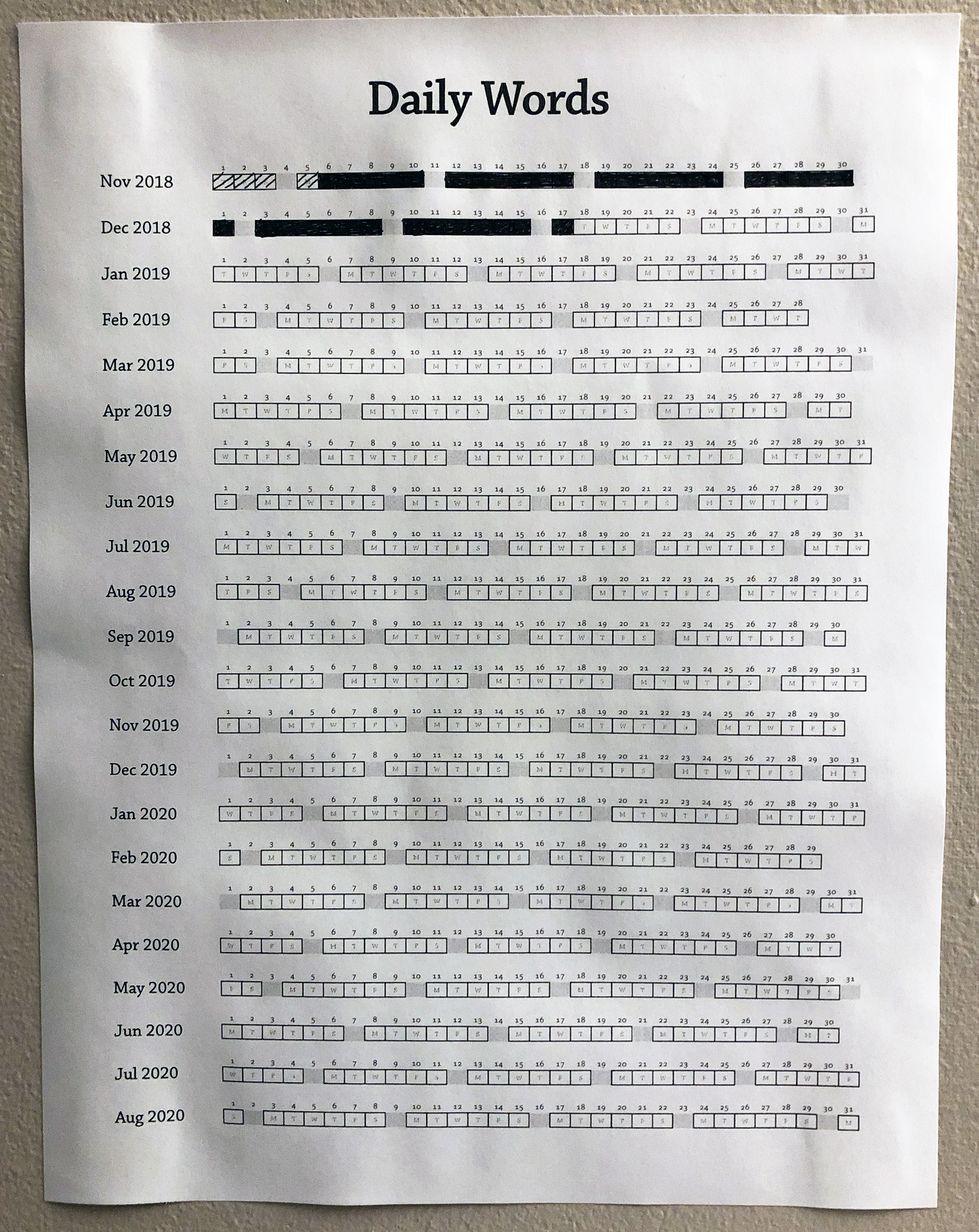
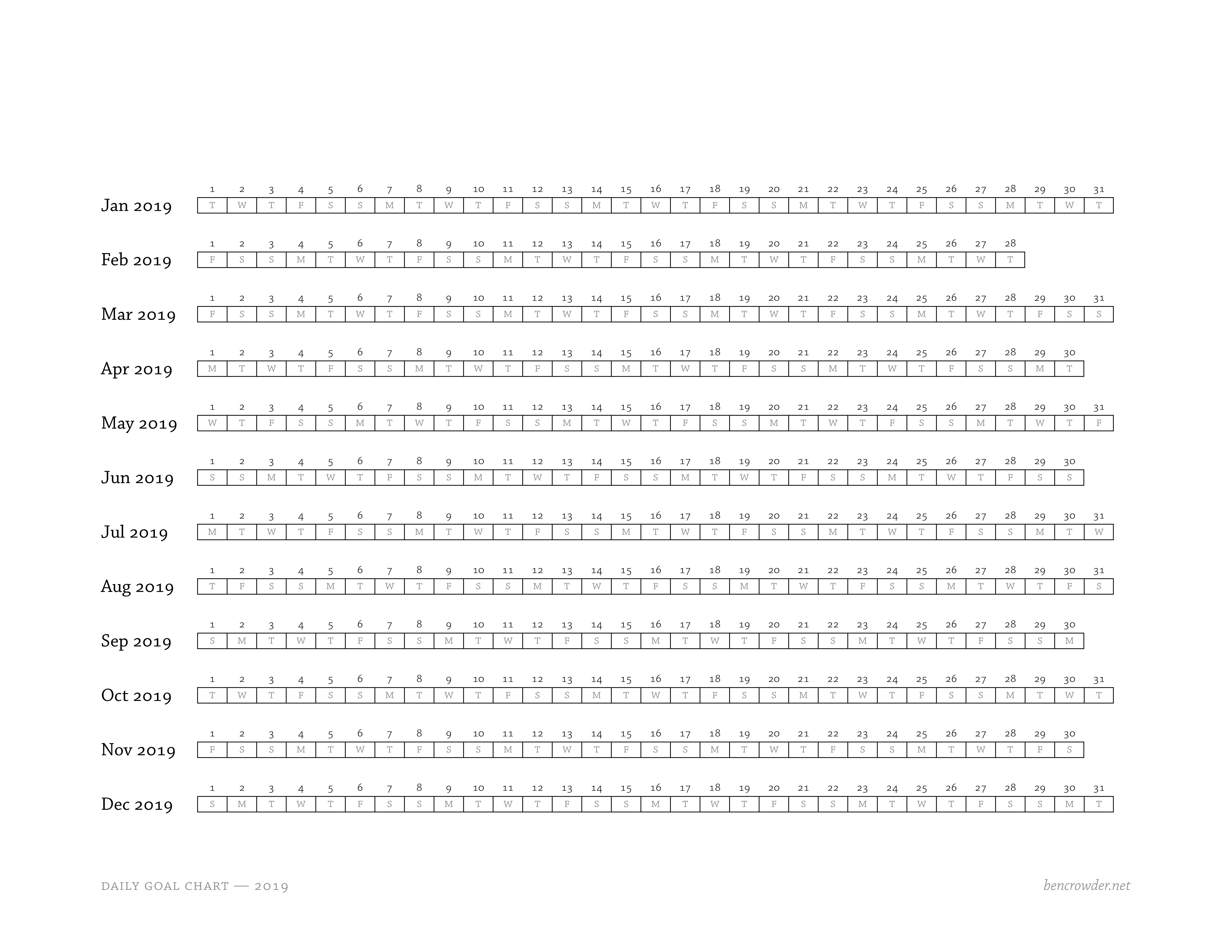
The only time I’ve had success writing each day has been when I’ve made a physical chart, taped it up on my wall, and then filled in a box each day I hit my goal. It’s Jerry Seinfeld’s don’t break the chain idea, and it works remarkably well for me. My current streak (I don’t write on Sundays):
Since this seemed like it might be useful for others, I’ve made daily goal charts, available for free PDF download:
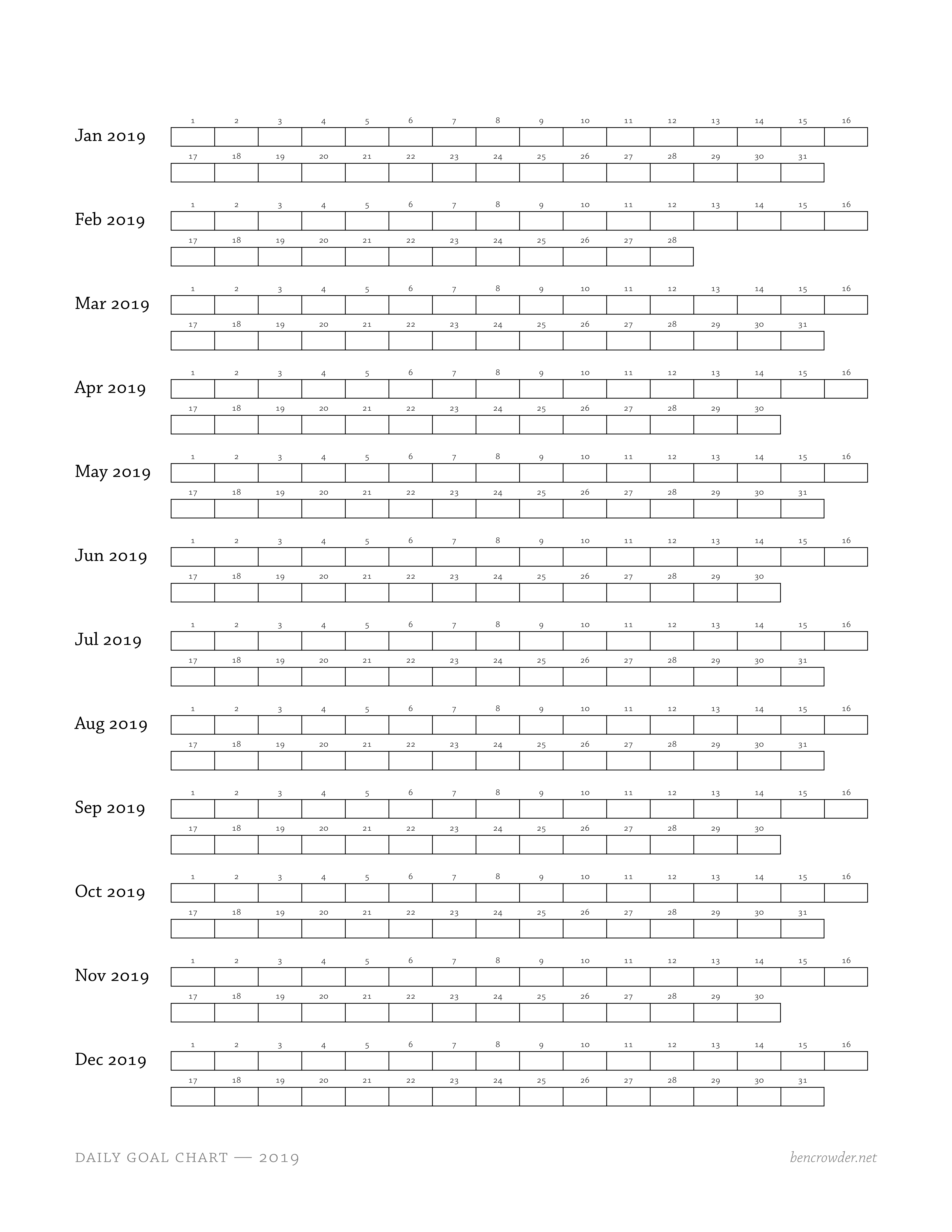
There’s also what I’m calling a “blank” chart, where you can write in the number of words you wrote (or anything else like that):
Charts for 2018 through 2023 are up. (I figure five years is enough for now.)
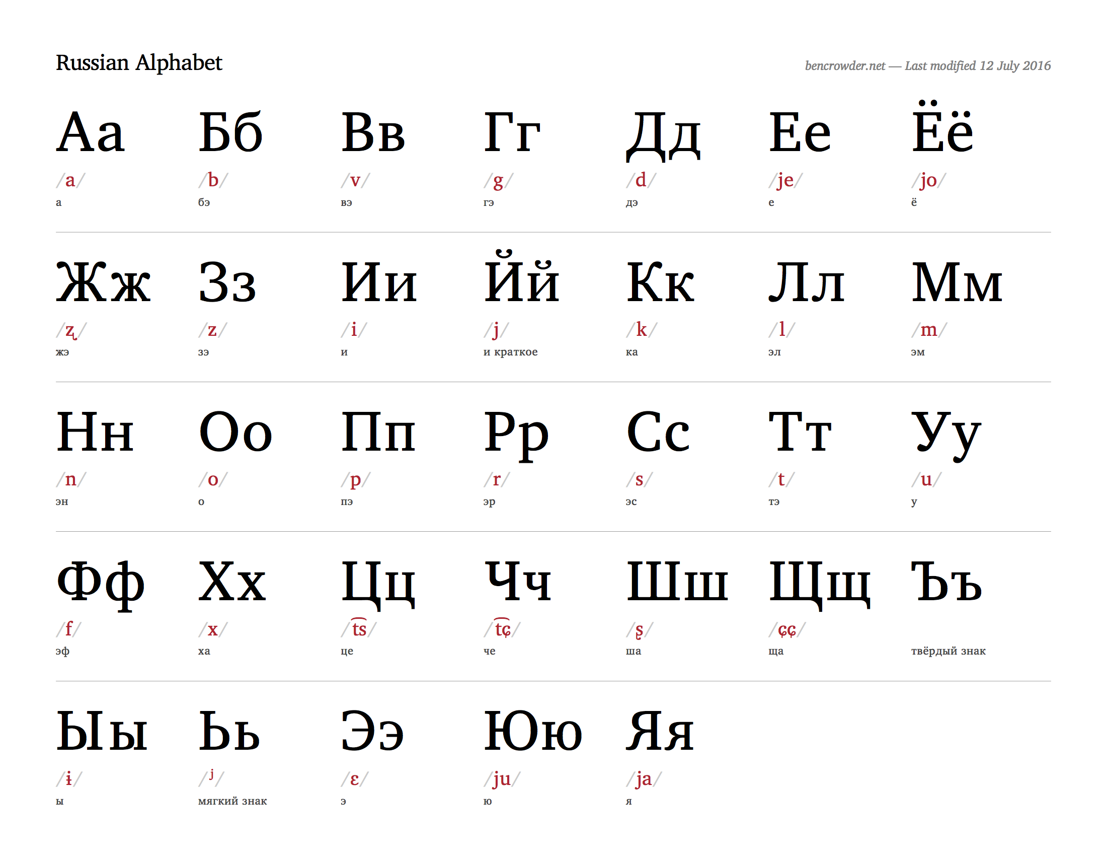
I’m working on a Russian alphabet chart at the moment. Things are mostly in place, with some spacing to do on some of the IPA bits, possibly adding cursive, and then sending the chart to some Russian speakers for proofing. It’s close.
Updated the Latin 1st conjugation chart — the passive subjunctive pluperfect plural was incorrectly using the singular forms. Thanks to John Batali for the heads up!