Over the weekend I read Ben Kuhn’s post on syntax highlighting and thought the idea sounded intriguing, so I tried it out.
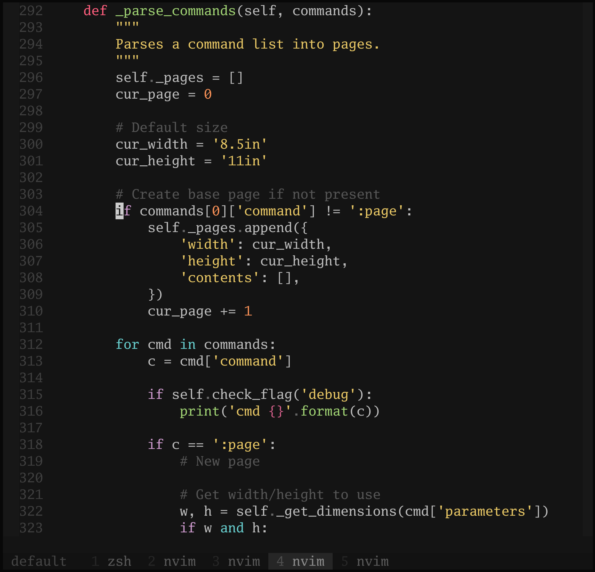
Here’s what I had before (and let me add that I was tweaking my Vim colors a few days before this, so this wasn’t technically my normal setup) (and let me further add that this is fairly old code and not anything particular exciting):

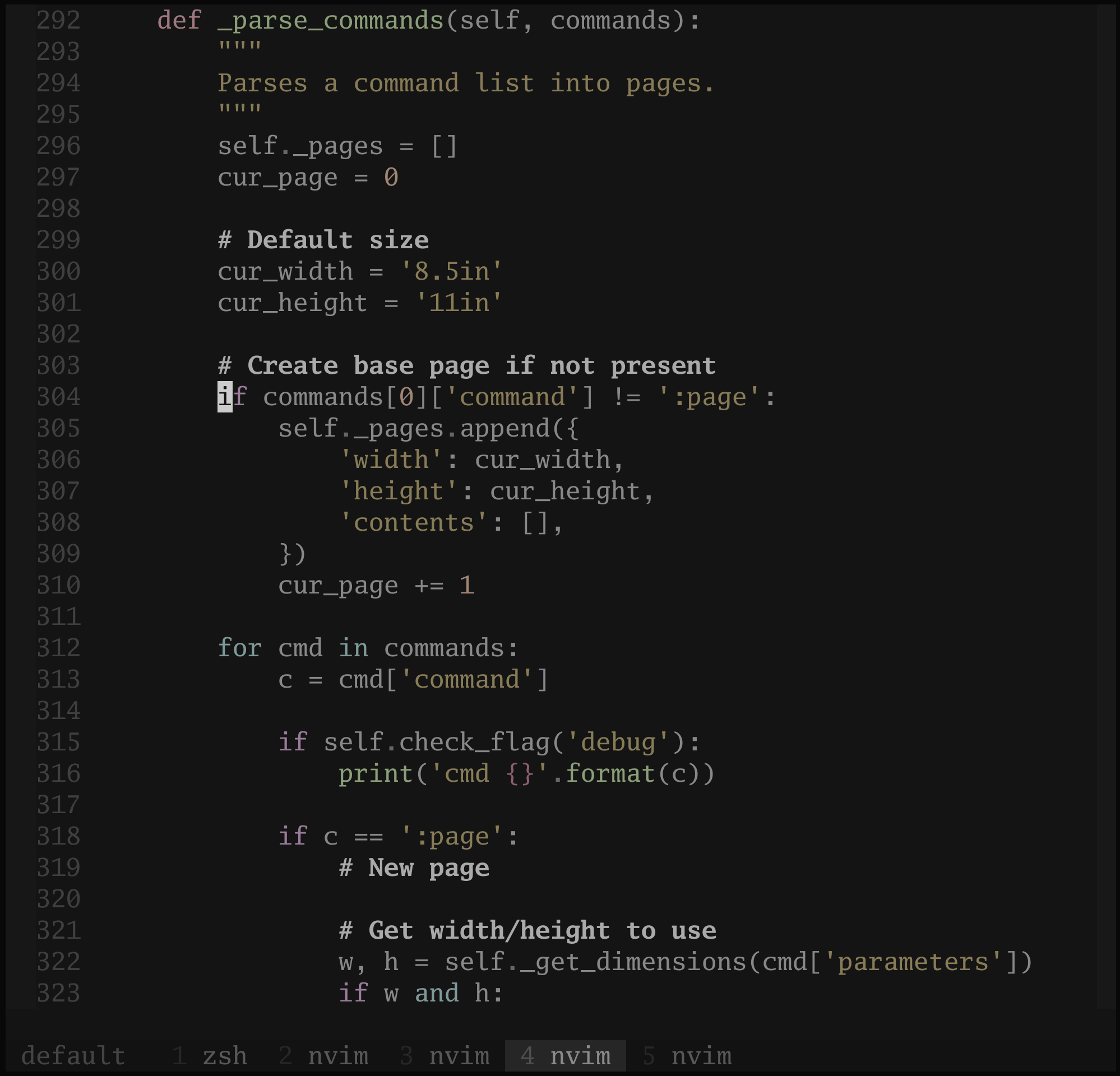
And after, where comments are bold and brighter than the rest of the dim code:

Hmm. This isn’t a perfect implementation of the idea in the least, but even so, I don’t know that I like having comments so predominant.
This does, however, give me several ideas for modifying my existing color scheme (or starting from scratch, which is feeling a bit more likely right now). Something more soothing, less garish. And still some way to make comments stand out more — italics or a somewhat brighter color, probably. (Sidenote: nvim-treesitter has caught my interest.)