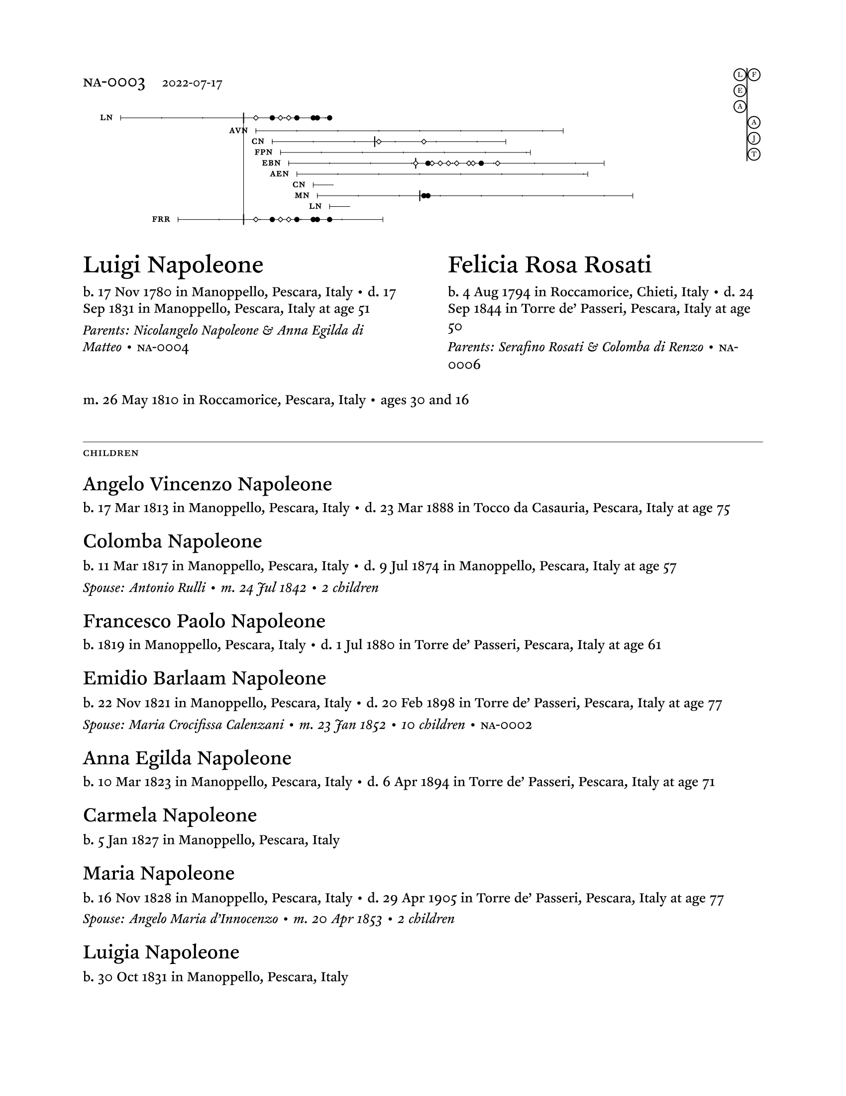
I’ve been doing a lot of genealogy lately, and as part of that I’ve been refining the family sheets I mentioned last time:
Ancestor line chart
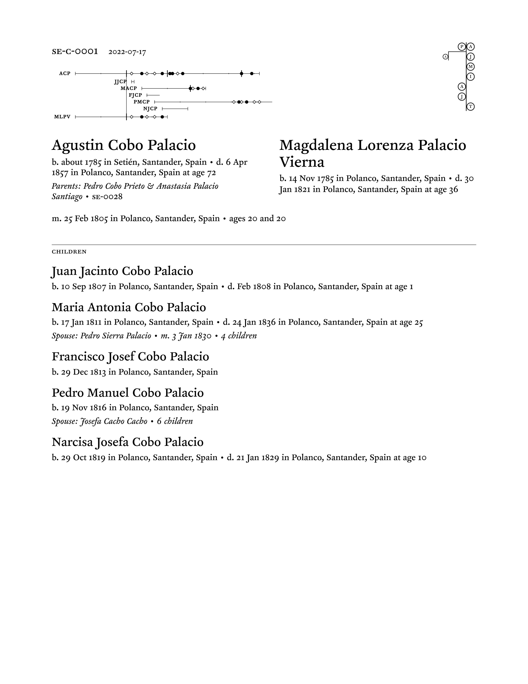
The main new thing is the ancestor line chart in the upper right, showing where the family is on my line in relation to me, with fathers on the left and mothers on the right. (So this family is my mother’s mother’s mother’s father’s father’s parents.) Each person’s initial is in the circle.
For collateral lines, it looks like this:
If the family sheet were for Agustin’s grandchildren or great-grandchildren, the collateral line would extend further downward (with each collateral line generation lining up with its parallel main line generation).
The syntax for both ancestor line charts:
line: -T -J -A A- E- LF

line: -T J- A- -I -M -J PA > A-
I went through a whole bunch of iterations on the syntax before landing on this, which I really like. It’s concise and reads easily to me, and it also happens to be very, very easy to parse.
Family sparklines
I’ve changed the family sparklines to show whether children are sons (hollow diamonds) or daughters (filled circles), and the marriages are now slightly thicker and longer vertical lines. (So in the second screenshot, you can see that Agustin married three times. And yes, he had a couple children when he was in his sixties!)
Though these don’t show it, I’ve also added support for twins and other multiple births.
Next up, I’m planning to add dotted lines for date ranges (“died between X and Y”) and markers for divorce and for the death of a spouse. Also working toward making this month-level granular instead of just year-level. (Right now, if someone is born in January of one year and their next sibling is born December of the next year, the sparklines make it look like they’re only one year apart even though in reality they’re almost two apart.)
Other changes
The layout has changed a bit, mostly to give more horizontal room for the sparklines, and to set the husband and wife side by side (which saves vertical space and also creates a spatial analogue to the ancestor line chart).
I’m no longer manually (and laboriously) loading these in the browser to export the PDFs. Instead, I call Chrome in headless mode as part of my script:
/Applications/Google Chrome.app/Contents/MacOS/Google Chrome \
  --headless \
  --disable-gpu \
  --print-to-pdf \
  --print-to-pdf-no-header \
  http://local.test/family-sheets/html/FILENAME.html
Last (and also least), I’ve switched the font from EB Garamond to Clifford Pro. Mmm.
The code
Right now the code is a bit of a mess. Now that the prototype has served its purpose, I’m about to rearchitect it all and port it to Node, possibly Bun, possibly with ArchieML. (It’s currently Python with Jinja2 and YAML. For years I’ve used Python for writing almost all my command-line tools, but lately I find that I’d rather write JavaScript. Time for an ecosystem shift.)

