Another in-progress bit of design, this time from a writing app I’m working on. (Which I’m thinking of as a potential replacement for Storybook.)
Panes
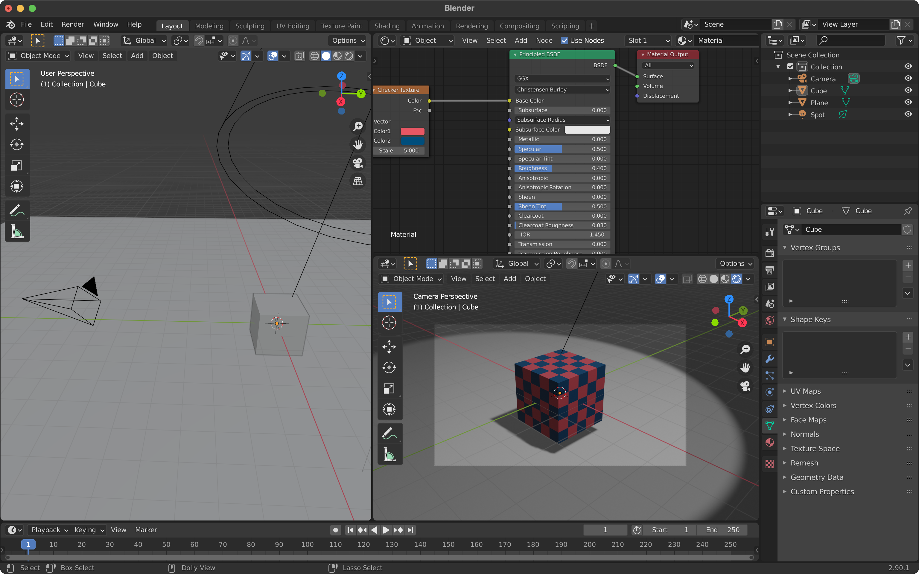
One of the core ideas I want to explore with this app is a pane-based layout system, similar to what you get in Blender and After Effects, and in tiling window managers. Here’s what Blender looks like:

There’s a lot going on there, but fundamentally it’s just panes. You can split a pane, merge it with another, resize panes, and change the type and/or contents of a pane.
There is also usually the idea of a workspace, where you can switch between different pane layouts for different types of work. (In Blender, for example, there are workspaces for modeling, shading, animating, compositing, and more.) Photoshop has echoes of this as well, though it’s not fully pane-based.
A brief analysis
Some of the advantages of panes (at least in my mind):
- Flexibility. You can create the workspace you need, with things arranged the way you want.
- Simplicity. You can see everything in a workspace, with nothing hidden under another window. (This isn’t completely true, though.)
- Responsive. Because the layout needs to adapt to a variety of configurations, each pane needs to work at pretty much any size.
- I’m not sure yet what to call this, but you can easily switch between tasks, whether that’s changing a pane briefly or switching workspaces.
And some of the disadvantages of panes:
- Fiddly. Because it’s malleable, you end up spending more time tweaking the layout.
- Connected. Resizing a pane resizes the adjacent panes on the other side of the divider.
- Complexity. There can be (and usually are) panes that you don’t have visible in your workspace, with state about your project. Some things are hidden after all.
Because I’m interested in interface design, and because I’ve long wanted to explore this particular space, I’m going to try applying the pane idea to writing. I’m not sure it’s a good fit, but if it’s not, I want to find out which factors determine that, and which types of activities would be better candidates for a layout system like this.
Panes on mobile
Designing for mobile first, I immediately ran into the hard, cold fact that a phone screen is too small to split into panes.
This got me thinking about what panes do, at a more abstract level. My conclusion: panes let you have multiple things open at a time, in a way that preserves state (where you are in each pane, to use a spatial metaphor).
With that in mind, it seems to me that the closest analogue would be a screen for each pane, with a way to switch between them — similar to the way Safari handles the open tabs in iOS in portrait mode on a phone. This model allows for switching between tasks in a reliable, persistent way on a device with a small screen.
Pane types
I first brainstormed some possible pane types and came up with this tentative list:
- Draft. Where you do the writing.
- Outline. A foldable outline or note cards or something in that vein.
- Feedback. Comments from beta readers and editors.
- Notes. Your notes on characters, locations, etc.
- Labels. Working off the idea that you can label a chapter/scene/paragraph, this would be a pane for working with labels (navigating and managing the list of labels, seeing what has been tagged with a given label, etc.).
- History. A way to see previous drafts. My plan involves a branching model ala Git, though, which would include experimental drafts, so this probably needs to be renamed.
Mobile pane design
I made some quick sketches and considered turning them into a prototype, but going to wireframes instead seemed a better use of my time (it’s much easier to iterate on wireframes).
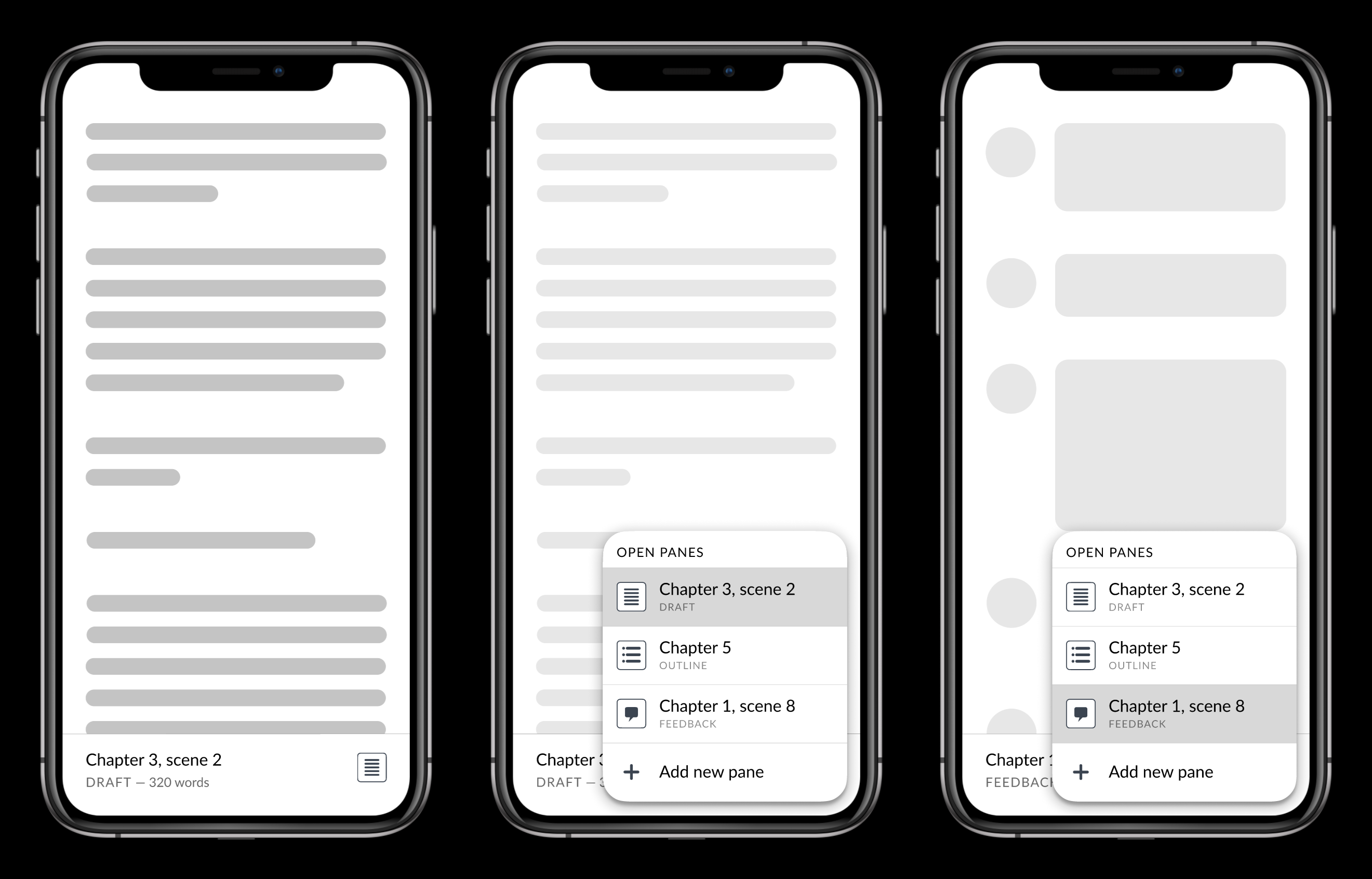
Here’s the current state of the prototype (made in Figma with variants and auto layout and Smart Animate). It’s not finished, and it’s still a bit rough, but you can at least start to get the idea:
And some of the screens:
Further work
Some of the things I’m thinking about at this point, that I plan to validate and iterate on through testing:
- Whether the switcher makes sense as an overlay (what we’ve got here) or its own screen. Leaning towards an overlay so that the other panes are near the bottom of the screen, closer to the user’s hand.
- Whether a right-handed overlay is problematic for left-handed users. (Keeping in mind that the button for the switcher is already on the right side of the screen, and so the user’s finger will already be in the vicinity. But that may not make a difference.)
- Whether a list like this is the right way to display panes, or if a visual of the actual panes (like the app switcher in iOS) would be better. For visual-based work this makes sense, but for work like writing that’s largely text-based, I’m not sure. This will affect the type of transition used when switching between panes, too.
- When you add a new pane, what the pane type should be and where it should be navigated to. The same type/contents as the active pane? The same type but reset to the beginning of the project? Some default pane type?
- Whether switching a pane’s type (by tapping on the pane type icon in the switcher list) makes sense in this context. I believe it does when you’re working with actual panes on a larger screen, but it may not fit.
Once I’ve got this sorted out (by testing and iterating), I’ll follow the same process to design the UI for working with panes at larger screen sizes.
