As I’ve been toiling away on my design portfolio, I realized that a) I haven’t been working in public on this project and b) that ought to change. Which it will. Starting now.
My plan at this point (subject to change) is to design the portfolio site itself first, then post each case study project as I finish it.
The portfolio site
Note: the following is effectively an initial draft of a case study documenting the design of the portfolio itself. It’s a little meta, sure, and I expect to replace it in the portfolio as soon as I have enough other projects, but it’ll do for now. And if reading case studies isn’t your thing, stop here!
Problem definition
The goal: to design a site showing what I do as a designer, both in the case studies showcased as well as the design of the portfolio itself.
The main users of the portfolio will be hiring managers and recruiters, who will be evaluating my work to determine whether they should interview me. From what I’ve read, they’re primarily interested in seeing my design process—how I tackle a project, how I solve problems—and secondarily interested in the quality of the final designs. (There’s more to it than that, but you get the idea.)
Research
I began by doing some lightweight competitor analysis, looking at thirty or so portfolios for UX/product designers, and watching a handful of critique videos. By that point I had a good idea of what ought to be involved—initial text describing what I do and what my experience is, case studies documenting my process, a link to my resume, my contact info—and I felt that the site was small enough that I didn’t need to do more formal research at this point. (On other projects, though, this is where I’d do surveys, interviews, card sorting, tree tests, empathy maps, personas, usability tests, etc., depending on what makes the most sense for the project.)
Sketches
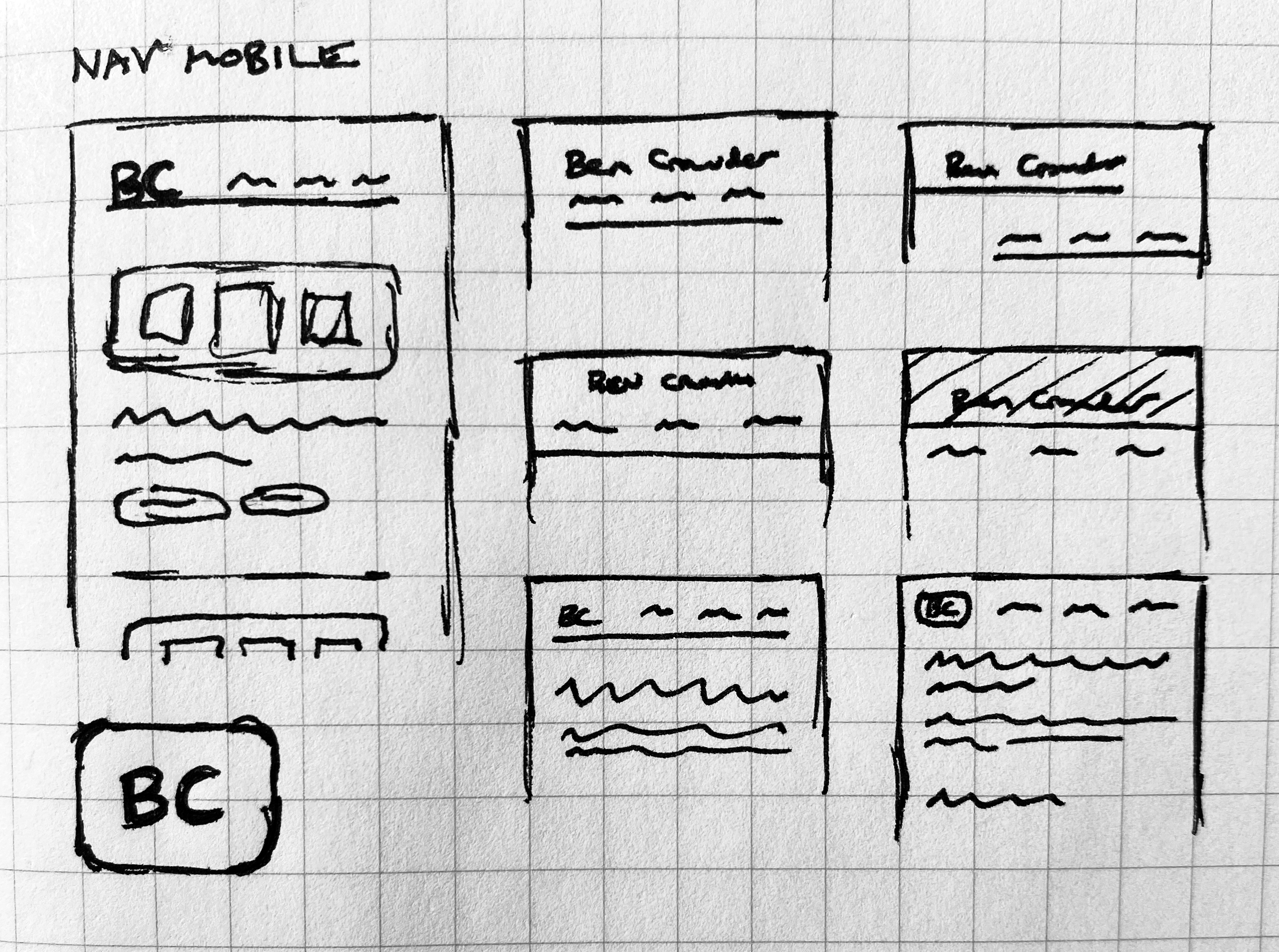
I sketched out some ideas for the nav, starting with mobile first since it’s easier to begin there and scale up to desktop:
I also sketched out some rough layout ideas, with the main focus on the list of case studies on the home page and the case study detail pages.
Blockframes
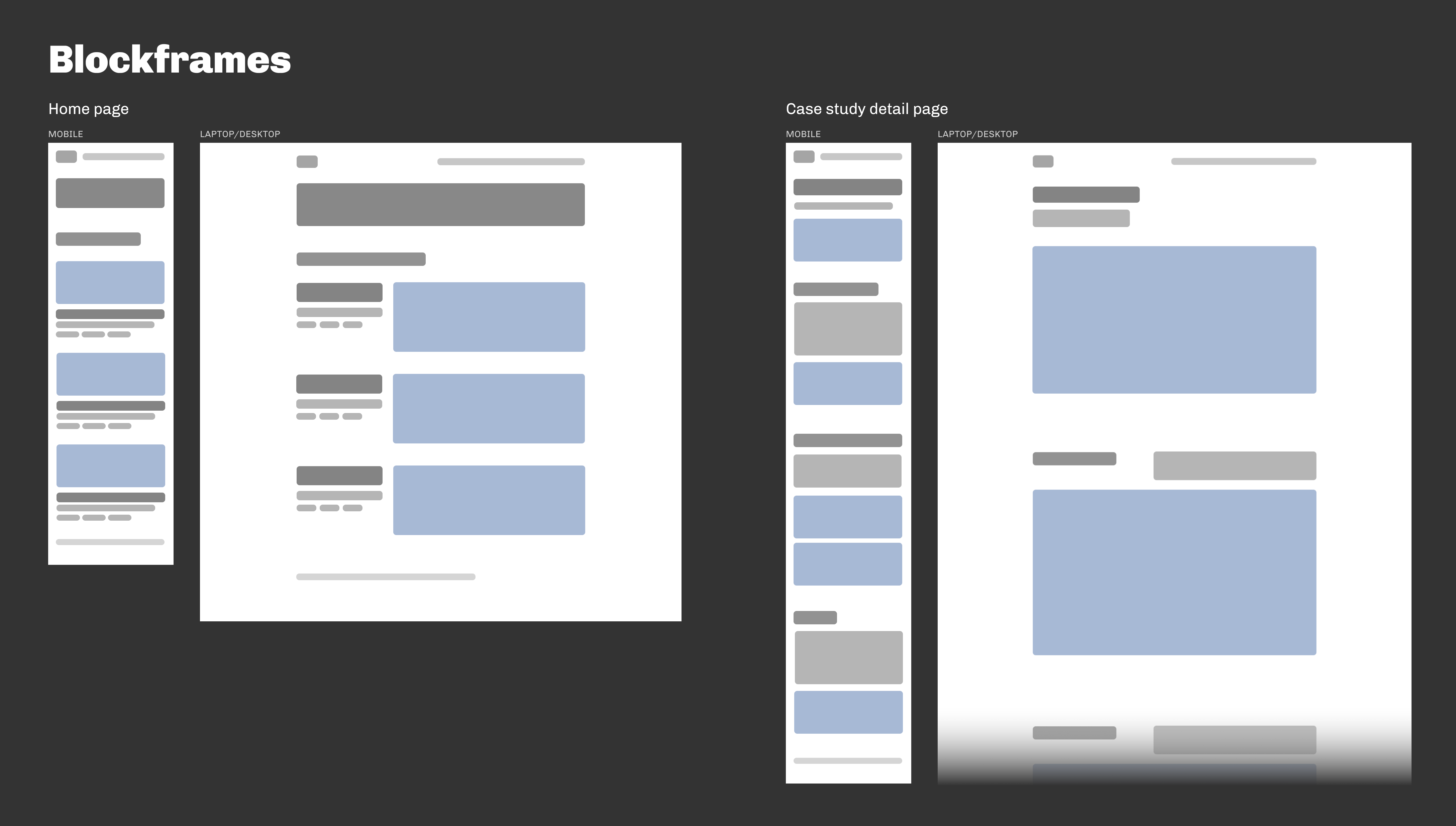
Last week I was reading about blockframing and have been itching to try it out, so I did:
It’s great. Easier to work with than wireframes, which helps in the earlier stages. Definitely planning to continue using it. (I should also mention here—for curiosity’s sake if nothing else—that I used Figma for everything past the point of sketching.)
Wireframes
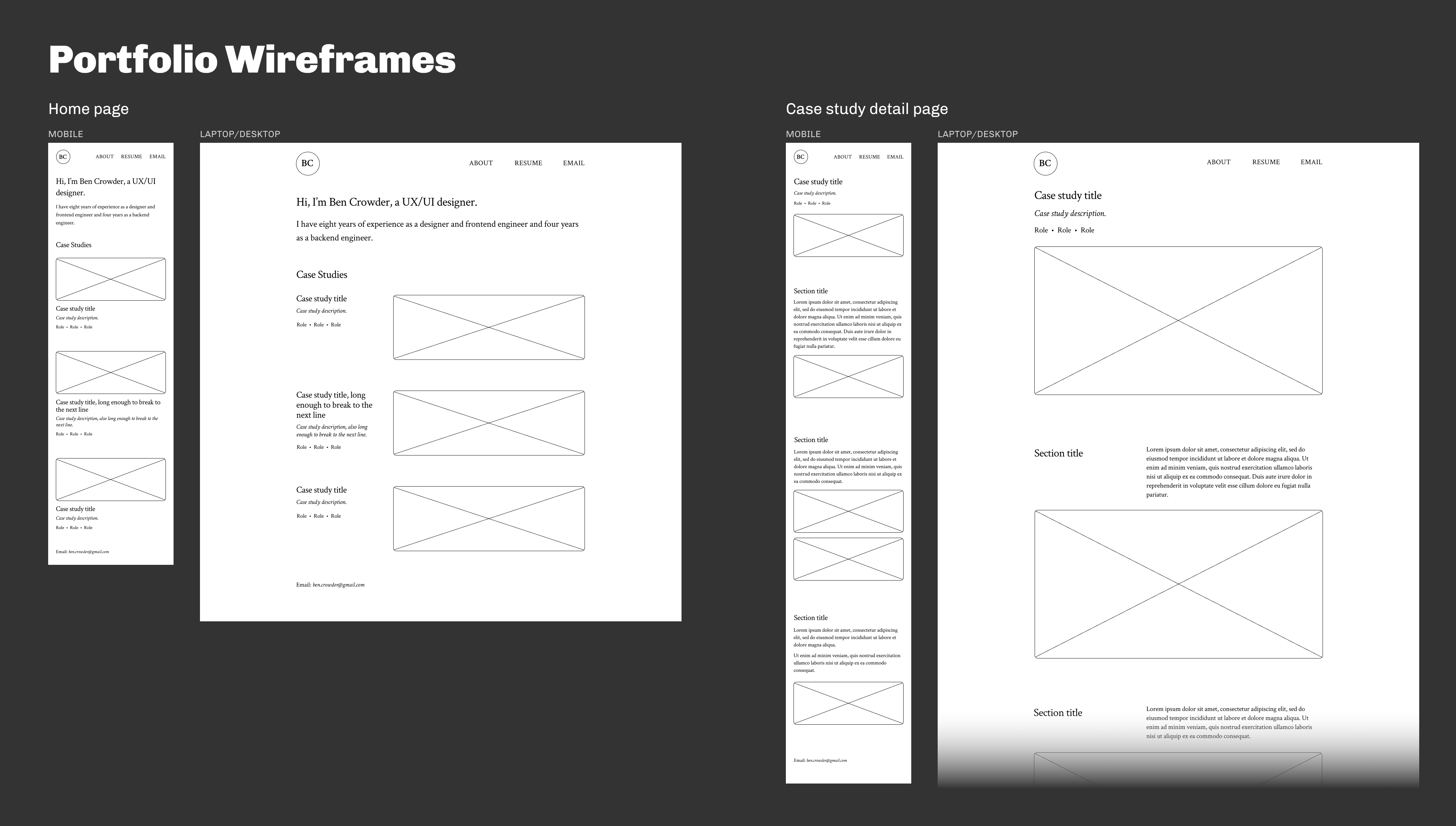
I continued with wireframes, to flesh out the ideas with actual text (placeholder text, anyway):
Crimson Text is the primary font (indeed the only font), which I chose because a humanist (old style) serif seemed like the best fit for my personality and the type of design I do.
Color palette
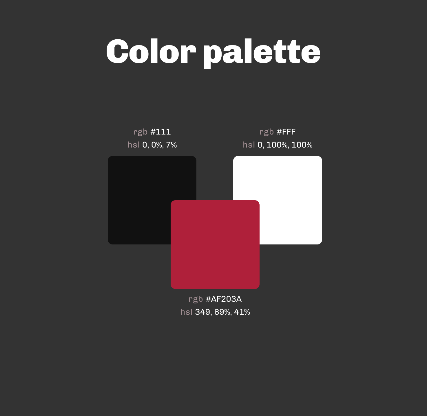
Next I chose a (very) simple palette:
Ordinarily, though, I’d need a more complex, organized color scheme.
High-fidelity mockups
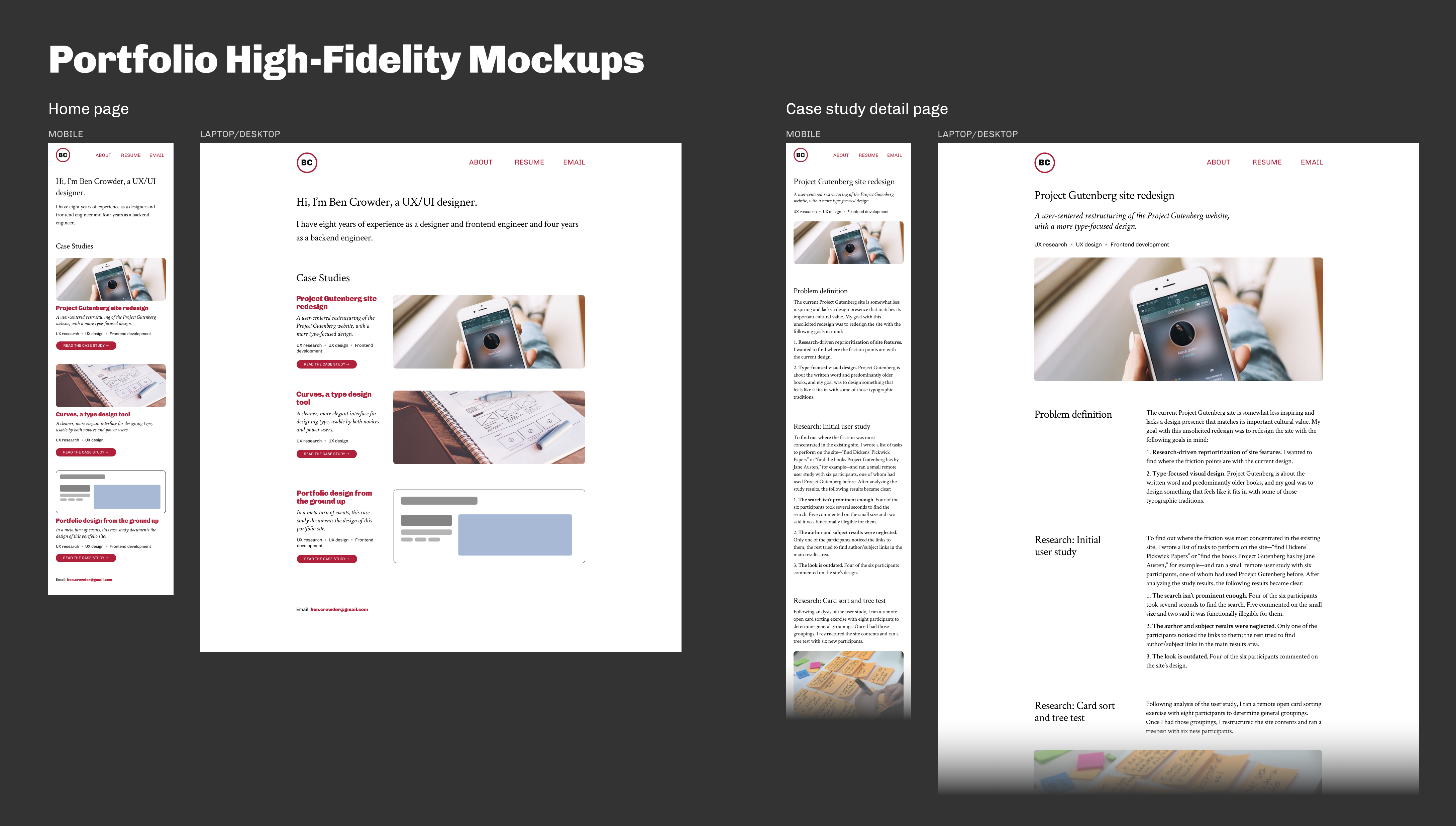
And then we come to the high-fidelity mockups (in which the photos are all from Unsplash or Pexels, and the case study text is made up):
As I applied color, it became clear that the design would benefit from a secondary font, so I added Chivo as a compatible sans-serif. I also added clearer call-to-action links to the individual case study sections on the home page.
What’s next
Doing some small usability tests to make sure the design works, then straight to implementation. I’m planning to skip prototyping for this project because a) it’s so, so small and there’s not much to prototype beyond dead simple link behavior, and b) with this being a personal project, I’ll be doing the frontend development, and the initial implementation there will be a fairly effective prototype.
