A slightly different kind of ebook
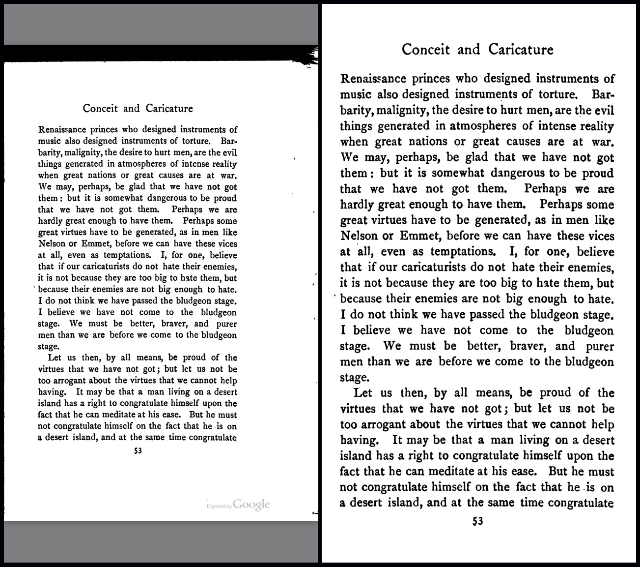
Turns out reading PDFs of old books (from Google Books, Internet Archive, etc.) on my iPhone works out reasonably well. For example:

On the left is the fully zoomed out page. Indoors, I’m able to read it without too much difficulty, though my eyes do thank me when I zoom in (as on the right). The problem with zooming, however, is that navigating to the next page then requires more swiping, and, at least in iBooks, you have to zoom in again every time you turn the page.
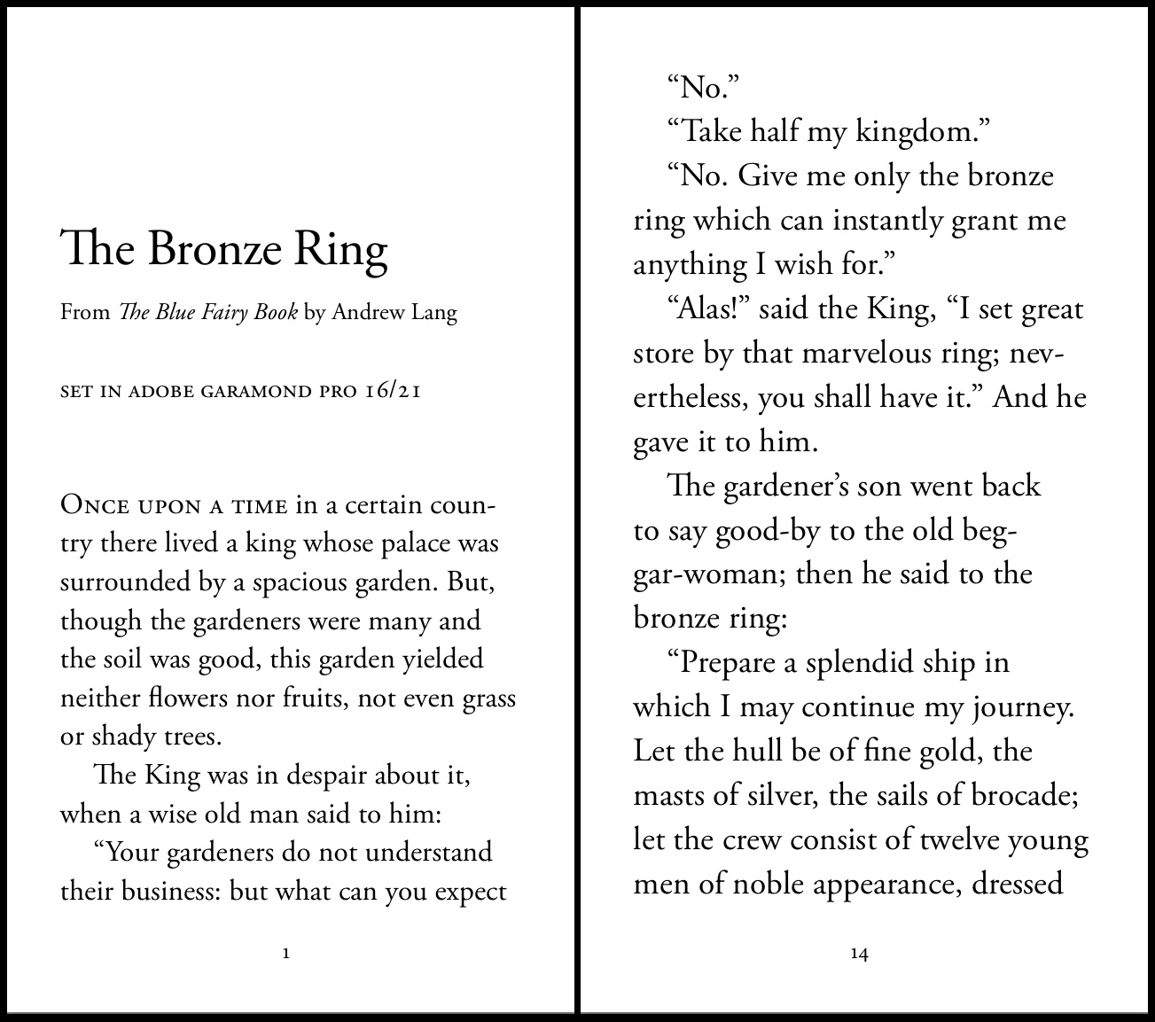
After a bit of this, I got to wondering what it would be like to typeset an iPhone-sized PDF, designed specifically to be read on a phone. Here’s how it turned out (and this is a proof of concept, nothing too polished):

The pages are set at 7.573×4.267″, which I arrived at by taking 1136×640 (iPhone screen dimensions in pixels) and dividing by 150. Arbitrary, but it worked out well enough. And the text is at 16 points on the left and 18 on the right. (Also arbitrary, but dependent on the page size, of course.)
The PDFs:
The main advantage to a foolhardy scheme like this is full typographic control — margins, fonts, layout (important for poetry), tracking, etc., all without worrying about limitations of ebook readers. I could try to do something about widows and orphans, for instance, though I didn’t do that with this proof of concept.
The downside is that it’s custom-tailored to the dimensions of the iPhone 5S, and on other devices it wouldn’t fit as perfectly. Not necessarily a dealbreaker, though.
Is it worth pursuing? No idea. One of these days I’ll set a full book this way and try reading it on my phone to see how it compares.