Pigna: font in a month
I’ve been trying for a while to get myself to start doing type design, but I rarely get past the sketching stage. Since these “do x in a month” goals seem to work for me, here’s the plan:
By August 31, I will design a typeface using FontForge, and I’ll blog about the process as I go. (I’m starting today, which technically makes it a little more than a month, but I don’t want to have to remember which day of the month I started this.)
With this font, my aim is to learn the production aspects of type design (by which I mean everything but the outlines). I’m not going to make the outlines look good or harmonize with each other. That pains me a little, but I don’t want to get distracted. This is a throwaway font for learning purposes only. Beautiful fonts will come later (hopefully).
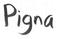
The font will be called Pigna — after the Fontana della Pigna in Rome — and will have these characters in it:
ABCDEFGHIJKLMNOPQRSTUVWXYZ
abcdefghijklmnopqrstuvwxyz
0123456789
`~!@#$%^&*()-=_+[]{}|;:'",./<>?
I started today by sketching out the characters on graph paper and scanning them:
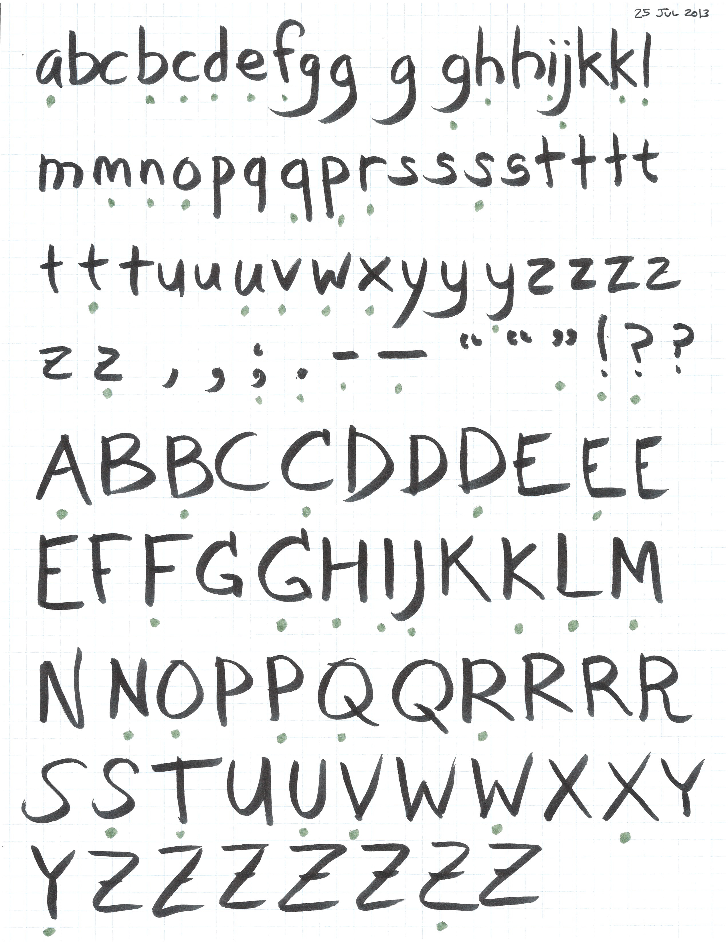
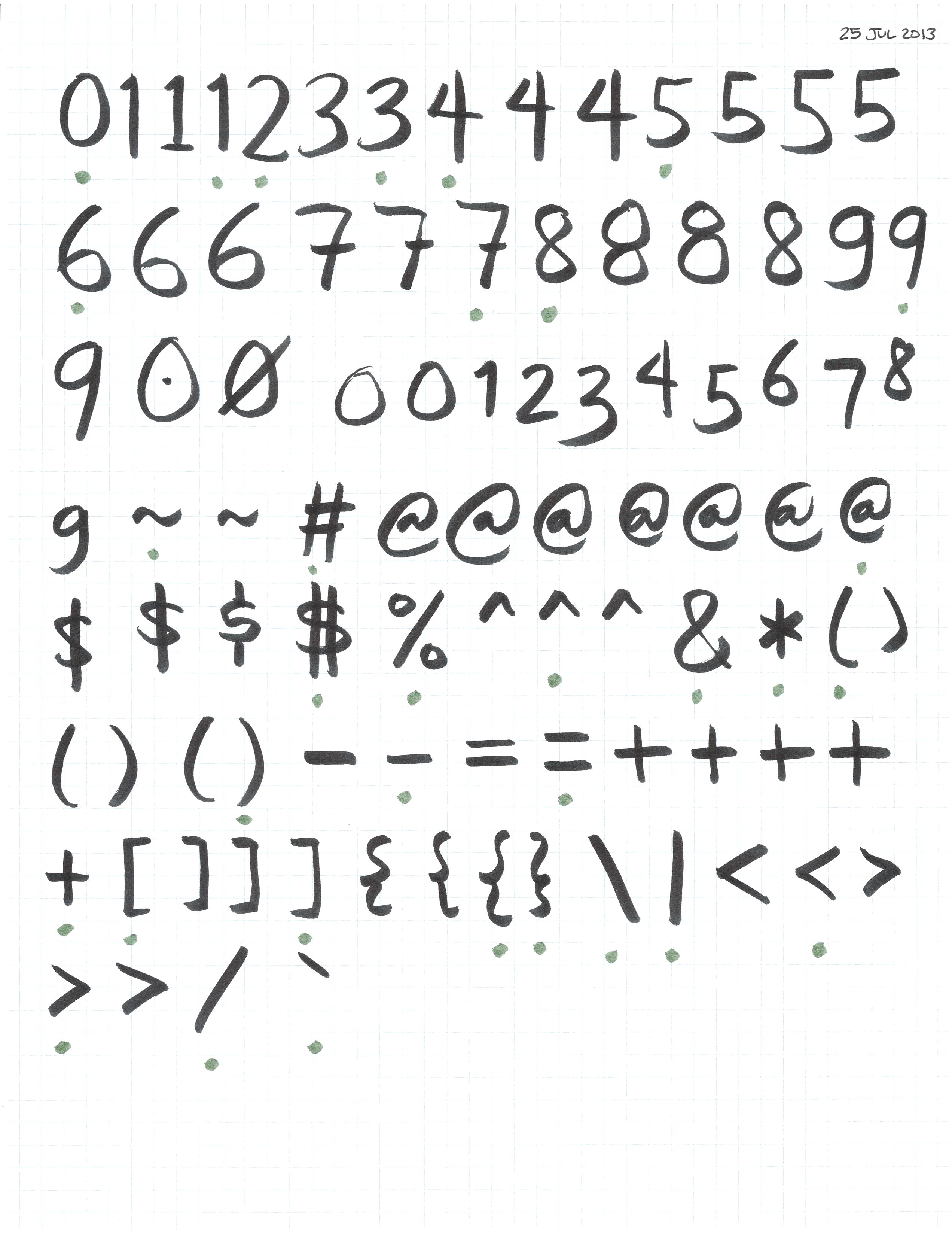
I marked the individual sketches I want to use with green dots underneath the character. (I ended up deciding to use the first 1 instead of the one I marked, though. And I’m planning to use the semicolon components to make the colon and the comma, so I didn’t mark those separately.)
After that, I split each character out into its own file (a.jpg, b.jpg, 5.jpg, hyphen.jpg, octothorpe.jpg, etc.) by copying and pasting in Photoshop.
Next up I’ll import them into FontForge as background layers and trace the outlines on top of them. When I start doing real font production later on, I think I’ll make sure to set up baselines and grids and things so that the images are all the right size and position. (With these, they’re all different sizes, so I’ll have to move them around by hand once they’re in FontForge.) I’m also thinking that Typlate would be more useful to me if it could do several smaller rows, like in the sketches above — at least at this point, I don’t see myself using a whole piece of paper for a single character or two.