Cantilever update 16 Sep
I’ve finished the initial drafts for all the lowercase characters in Cantilever and I’ve started working on the uppercase:
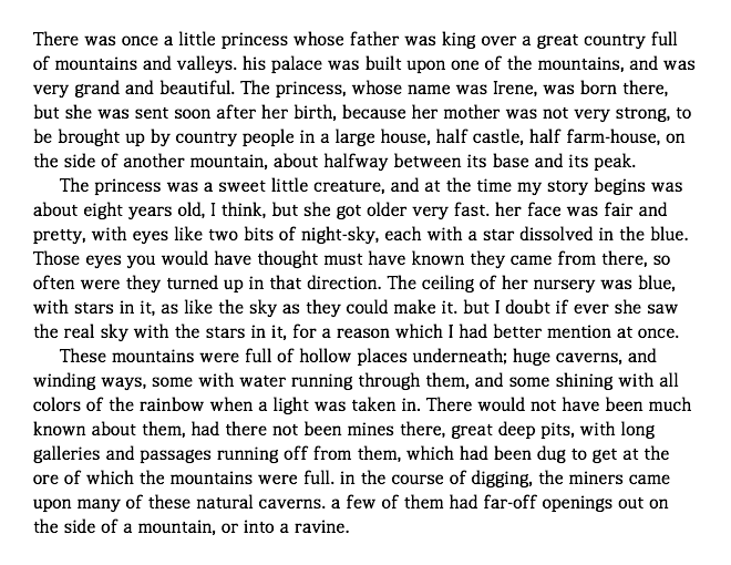
Many characters are still missing — /B/, /H/, etc., as you can see — but it’s nice finally being able to use actual text (this is from George MacDonald’s The Princess and the Goblin).
What’s next: fixing the glyphs I’m still not happy with and fleshing out the rest of the uppercase. And then spacing and kerning! Then I can stop being bothered by the lack thereof.
Notes, in no particular order:
- I’ve decided that I’m designing for retina devices. Sure, it’s going to be several years before all desktops/laptops have retina screens, but man, it’s painful designing for lower PPIs. (So I’m doing most of my previewing on my iPhone.)
- My current process for each glyph is to draw an initial lame draft in FontForge, export and preview, contemplate giving up type design forevermore, and then tweak the glyph and preview and tweak and preview until I’m happy with it. It’s working out okay, even for evil glyphs like /s/ (my first draft was absolutely pathetic) and /g/ (which is still somewhat pathetic but not as bad as it used to be). And /a/ was also a beast for several drafts.
- I’m struggling with the uppercase. I’m going to look at some other fonts to see where I’m going wrong.
- I finally got FontForge to compile on OS X with Python, so I’m writing some scripts to automate things (such as an export script that removes overlap and copies output files where I want them).
- FontForge isn’t quite as bad as I originally thought it was. And the recent versions have user-customizable hotkeys.