Saturn intro
Another entry in the frankly too long series talking about my personal productivity tools.
Saturn is my launcher app for my phone. It’s a small Go web app. The name comes from the Saturn V rocket launcher, and I wrote it as a replacement for Launch Center Pro (when it switched to a subscription model, because apparently I am allergic to those).
Overview
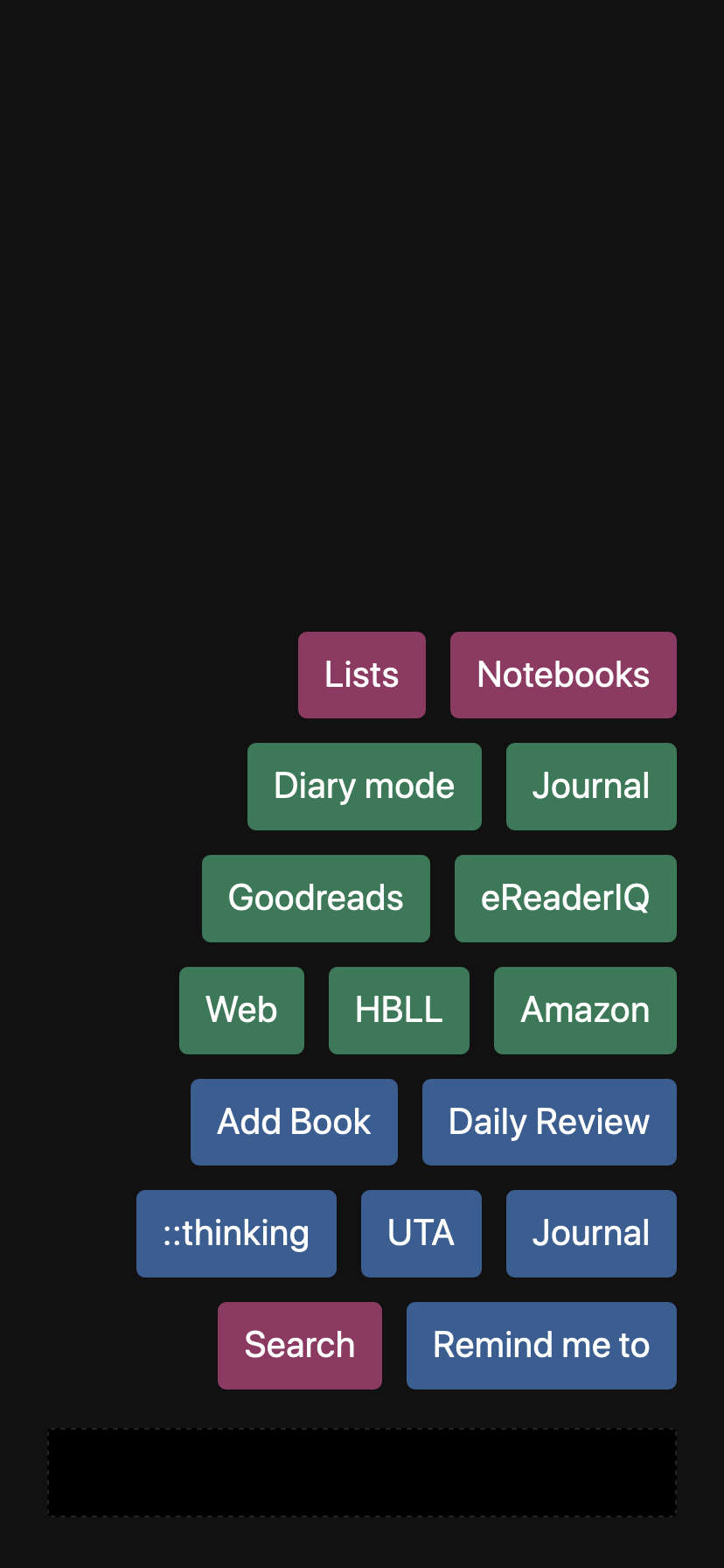
This is what it looks like:

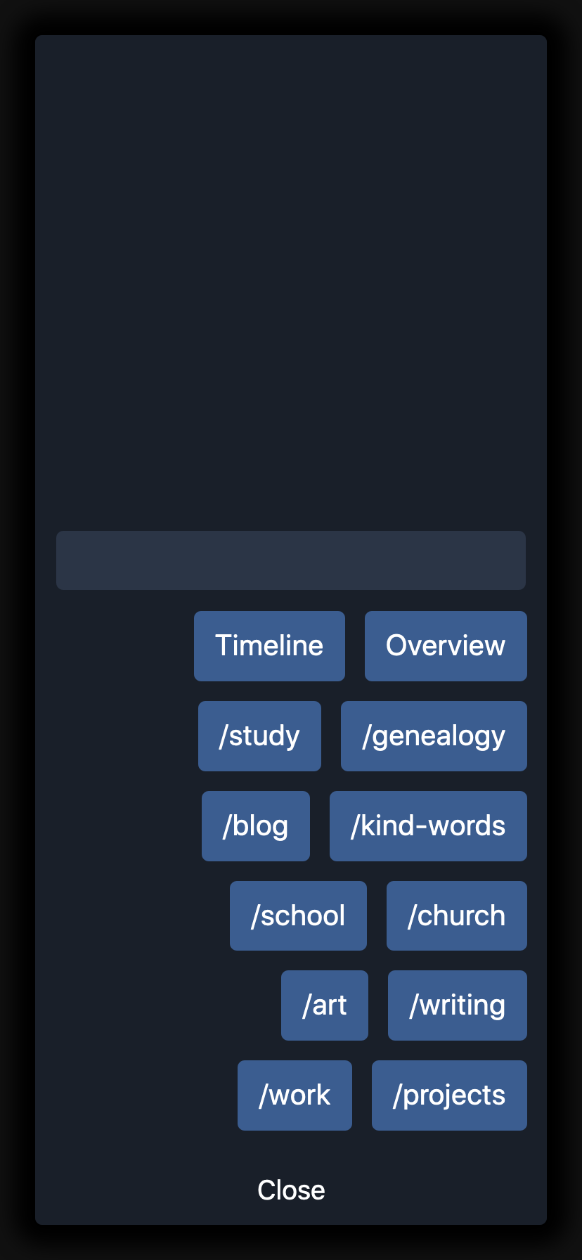
The blue buttons are direct links to pages. There’s a very hard to see dark textbox at the bottom, and if I type something in there, the green buttons take that and execute a search somewhere else. Finally, the pink buttons open secondary panels, like this Notebooks panel:

On this panel, the lighter rectangle above the buttons is a search box that allows filtering through Vinci notebooks.
How I use Saturn
On my phone, I have it saved to my dock. It’s not set to be a PWA, because then the links would open in the in-app Safari; I prefer having them open in normal Safari.
I use Saturn pretty much every day. I mainly use it to set reminders, search Amazon, Goodreads, and eReaderIQ, and get to my journal and my daily review list.
The future
I’m largely happy with it as-is. Maybe some more refactoring of the buttons (the Search button is largely obsolete now that I’ve moved all those buttons to the main screen, for example), and it could use a little design love to make things more consistent (search boxes, for example), but that’s it.