Circle series process
As requested, here’s my process when creating the circle series paintings.
Conception
My ideas for these pieces usually come while I’m in the shower or reading the scriptures. Sometimes, as with Sweet Hour of Prayer, I’ll be consciously trying to come up with an idea for a new piece. Other times the idea just comes to me in a flash, as happened with Sacrament — in the middle of an unrelated verse in Mosiah during family scripture study, it popped into my head fully formed.
Once I’ve got the idea, I sketch it out, run it by my wife to make sure it makes sense, and revise as necessary. With Sacrament, I painted a mockup in Brushes Redux on my phone (ArtStudio is also good for painting):

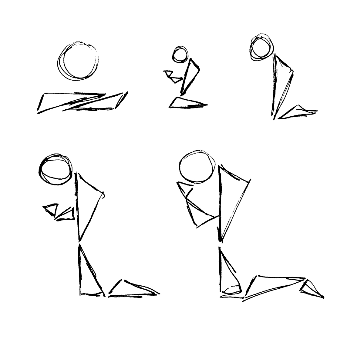
With Sweet Hour of Prayer, I drew some thumbnail sketches, trying to figure out the best configuration of circles and triangles to convey the idea of prayer:
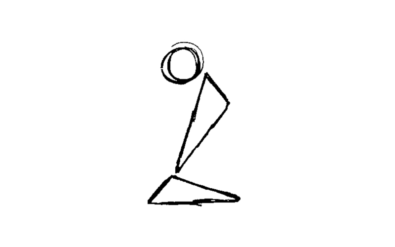
I then settled on this layout:
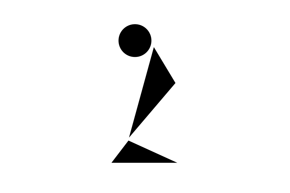
I also made a version in Illustrator so I could further refine the idea (it’s easier to manipulate the shapes there):
Execution: Shapes
I’ll then open Photoshop and create a new file, usually around 4500px wide so the resolution is high enough for printing at larger sizes. This is also where I’ll decide on the orientation of the painting — square, horizontal, vertical, etc.
I fill the background layer with a color to get started. The color usually ends up changing by the end.
I then paste in my mockup and set the opacity to something like 10% so I can trace over it.
On a new layer, I take my Ninety-One brush (part of my Eclectica brush set) and, using a light color set to Color Dodge at 20% opacity, I paint in each shape in successive passes, usually doing seven or eight passes. This gives the edge look I like.
At this point it looks something like this:

Execution: Texture
Once I have the shapes in place, I texture the painting, generally trying to make it look like it wasn’t made on a computer (with varying levels of success).
I then add five to fifteen texture layers. For each, I usually choose one or more colors, paint all over with a noisyish brush (dots, lines, etc.), and then erase lots of it with another noisyish brush. I optionally set the layer blend mode to Soft Light or Overlay and/or turn the layer opacity down to 10–20% (this combination of steps I’m going to dub “SLO” since I’ll be using it again in later steps). The layers for Sacrament:
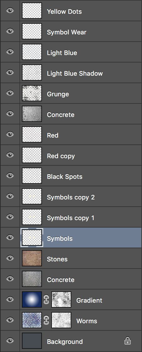
I’ll also usually drop in a photo texture (usually pictures of concrete sidewalks I’ve taken) on a new layer and set it to SLO. I’ll also often desaturate the image and play with the curves to get a more contrast.
Sometimes I throw in a radial gradient (usually white to a color) on another new layer and set it to SLO (sensing a trend here?). I also often add a layer mask and paint/erase some noise in black on it to get rid of gradient banding.
I sometimes paint/erase noise, then duplicate the layer, make it darker, turn the layer opacity down, place it under the original layer, and move it down and to the right to simulate shadows.
I usually tweak the colors of the piece at this point, using the hue slider to play around with the background color layer and the radial gradient layer.
Completion
The execution phase usually takes an hour or two. After I’m done, I send it to my wife for feedback.
Once I’m satisfied with the painting, I flatten the layers. I optionally run the Unsharp Mask filter on it to make it look a little more like a photo/scan. And then I save it to a full-res PNG and upload it.
Entitlement
After it’s done, I’ll come up with a list of possible titles and send it to my wife. I almost always use whichever title she chooses from the list.
Conclusion
Any more questions? Let me know.