Family group record redesigns
Traditional family group records (at least the ones I’m used to) are usually a little ugly, but man, they don’t have to be. Here are a couple of redesigns I’ve been playing around with (and you can click on the screenshots to get a full PDF of each).
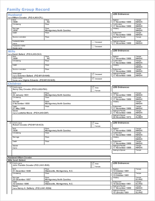
Original
I should add that they normally don’t look quite this bad — this happens to be printed from the new FamilySearch website, and the print stylesheets need a bit of work. But this is the general layout of traditional family group records.

Too many lines. And lots of wasted space on information that isn’t present. (If you intend to fill it out as a form later, however, then it’s a good thing. For the purposes of this redesign, I’m assuming you’re doing your data entry on the computer.)
Also, the visual hierarchy is essentially flat, making it hard to see the names of the people involved.
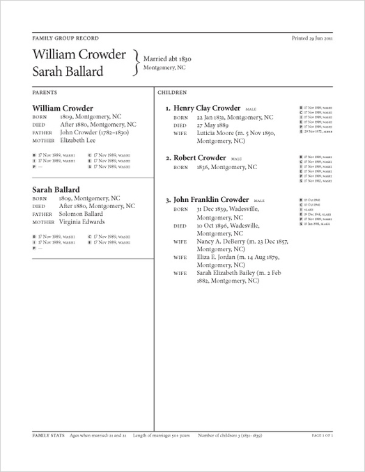
Version A

- At a glance, you can tell which family the record is for. This is handy when you’ve got a lot of family group records.
- The layout’s a little more compact. (If a family has lots of kids, I’m thinking the second page would drop the parent sidebar and go full-width, kind of like in Version B.)
- For the parents’ parents, I’m including a lifespan to help place things in context (see John Crowder).
- I’m using “born” and “died” instead of “birth” and “death” since they’re shorter.
- The LDS ordinances are a lot more compact. (And for people who aren’t LDS, it’d be really easy to remove them from the layout.)
- I’m still not very happy with the placement of the gender designation on the children.
- The footer is home to some “family stats,” interesting tidbits on the family that aren’t immediately visible from the absolute dates.
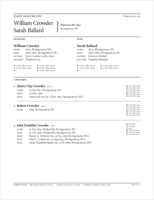
Version B

- The parents are now side-by-side on the top. This layout emphasizes the vertical hierarchy of the family, for what that’s worth.
- There’s more space for each child’s information. I’m not sure that space is necessary, though. Hard to say.
Conclusion
I see these as initial explorations into the area of family group record design — there’s still a lot of work to be done, and I’ve got lots of other ideas for ways to visualize family history data.
Anyway, feedback is welcome as usual.