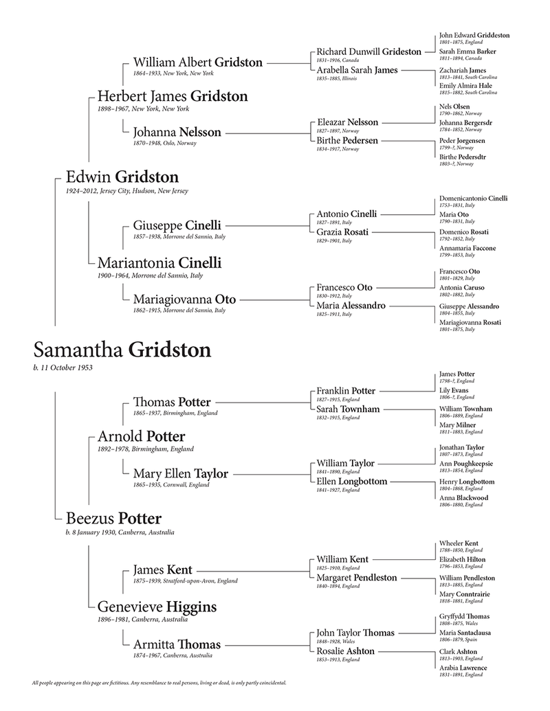
Experimental pedigree chart
Because I apparently can’t stop making genealogy charts: here’s a pedigree chart I put together as an experiment to see what things would look like if the more recent names were larger. The result:

I do like the larger names, but it seems that on the left side of the chart the hierarchy is harder to read. This kind of chart might work better with just four generations instead of six.