BC

Minimalist portfolio design from the ground up

Admittedly a bit on the meta side of things, this case study documents the design of this very portfolio site.

Blockframes, wireframes, and high-fidelity mockups of this portfolio

Problem definition

The goal: to craft a site documenting my skills and experience as a designer, through the case studies and through the design of the portfolio itself.

The primary users of the portfolio will (hopefully) be potential employers—managers, designers, recruiters—and they’ll be evaluating my work to determine whether I’m a good fit for their company.

From my experience hiring designers, and from what I’ve read, the users of the portfolio will be primarily interested in seeing my design process—how I tackle a project, how I solve problems—and secondarily interested in the quality of the final designs.

Research

I began by doing some lightweight competitor analysis, looking at thirty or so portfolios for UX/product designers, and watching a handful of critique videos. By that point I had a good idea of what ought to be involved:

  • Description of what I do and how much experience I have
  • Case studies documenting my process and work history
  • My contact info
  • Link to my resume

It quickly became clear to me that the site would be so small that more formal research wouldn’t be particularly productive. (In general, though, this is where I would do surveys, interviews, card sorts, tree tests, empathy maps, personas, usability tests, etc., depending on what makes the most sense for the project.)

User flow

I drew out a user flow, but it was so simple—utterly straightforward—that it’s not worth including here, trust me. On a larger project, though, I’d spend more time here.

Sketches

I prepared for sketching by listing what needed to be on each type of page and what the priority of each element was, from the perspective of a user trying to achieve their goal.

With that in place, I sketched out some ideas for the navigation, starting with mobile first since I’ve found that it’s easier to scale a design up than it is to scale it down from a larger version. I also sketched out some rough layout ideas, focusing especially on the marginally more complicated elements like the case study links on the home page.

Hand-drawn sketches of the mobile navigation

Blockframes

This was the first time I’d used blockframes, actually, having heard about them for the first time only a week or two before this. I look forward to trying the technique on more complex projects, to get a better feel for its usefulness. (In my very limited experience so far, blockframing was helpful to rough things out, but I also found that I tended to misjudge the necessary size of text blocks. This may just be my inexperience with the technique, though.)

Shaded blocks showing rough layout

Wireframes

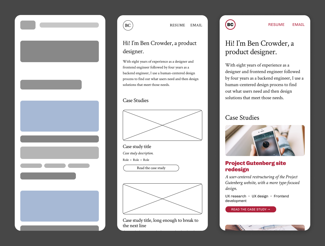
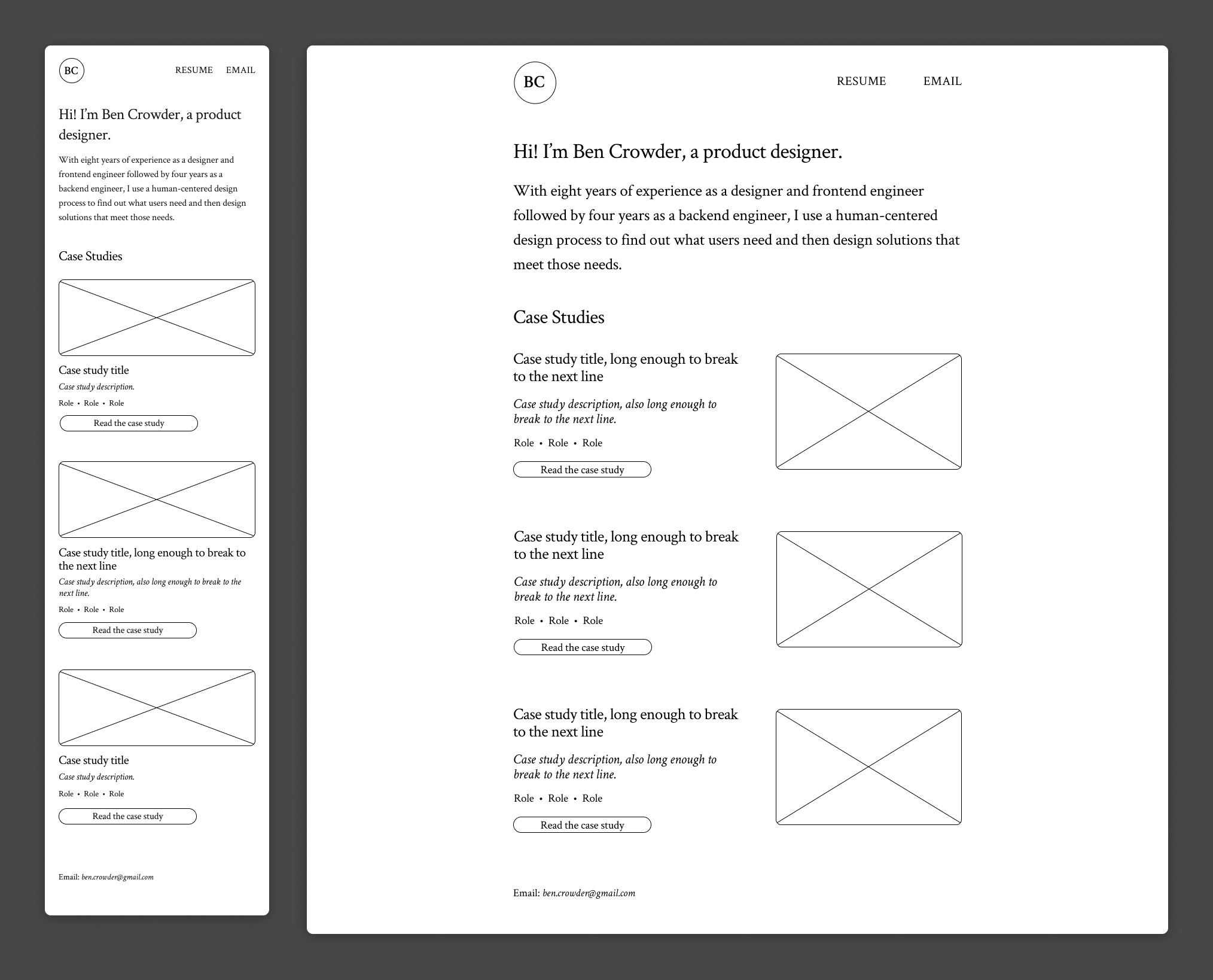
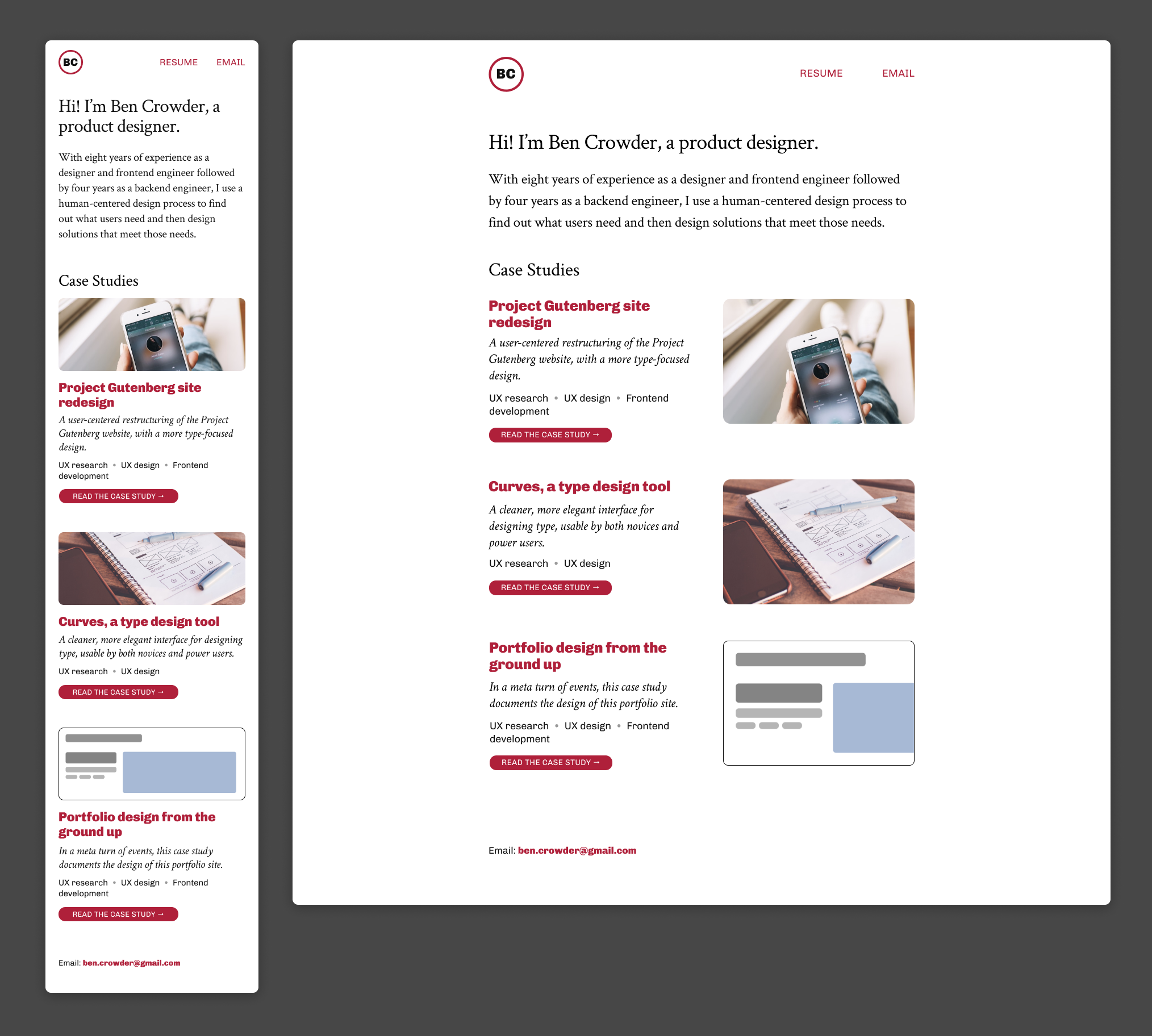
With these wireframes, my intent was to get an initial type treatment in place. For new work without pre-existing constraints, I tend to start with just one typeface and only expand if needed. In this case, I chose Crimson Text as my base typeface because I really, really love humanist (old style) serifs, and a portfolio is a place where that kind of personal preference can and should shine through. The other guiding factor in my choice was that the text is an important part of a portfolio, and serifs are usually somewhat easier to read.

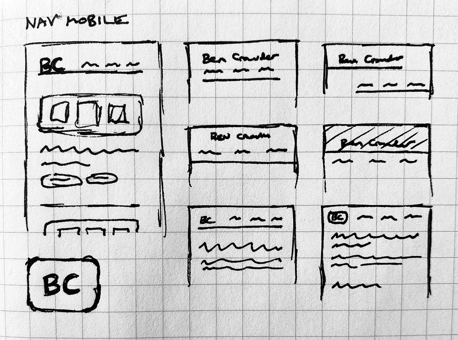
I ran a small sanity-check user test with four people using the wireframes to verify that the site navigation was usable. (More specifically, I created a prototype in Figma and linked to it from a Google Forms survey that asked the user to perform tasks like “Find the list of case studies” and “Find a way to email Ben” and write a short qualitative answer for each describing the difficulty of the task and any other observations.)

All participants were able to successfully complete all the tasks and said it was easy. One participant noted, however, that the text was too small, and they were right. I fixed this when developing the high-fidelity mockups.

Wireframes with placeholder text

Color palette

On a larger project I would ordinarily use a larger, more organized color scheme, but this portfolio site was so small that there wasn’t a pressing need for anything more. I’m also a bit of a minimalist, and a more minimal color scheme seems a better representation of my personality.

Three swatches of color: black, white, and a slightly purplish red

High-fidelity mockups

We come at last to the high-fidelity mockups. As I applied the color scheme (using color styles in Figma), it became clear that the design would benefit from a secondary font, so I added Chivo as a compatible sans-serif.

I built a new prototype and ran another small user test with four new participants. This test was very similar to the wireframes test, but with an added question about legibility of the text. No major issues were found.

In case it isn’t clear: the photos are stock from Unsplash and Pexels, and the case study text is made up.

The website in color, with placeholder images

Evaluation

Beyond the two small user tests mentioned above in the wireframing and high-fidelity mockup sections, when I finished implementing the site, I ran a user test with six participants. The test was structured identically to the previous two, and the results were all positive.

Handoff

Since I was the frontend engineer on this project, the handoff didn’t involve much formality.