BC

Library site responsive redesign

A reconstructed short case study showing work redesigning the BYU Library site.

The BYU Library home page

Note

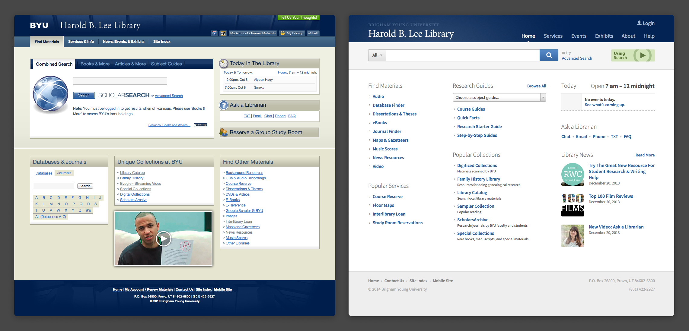
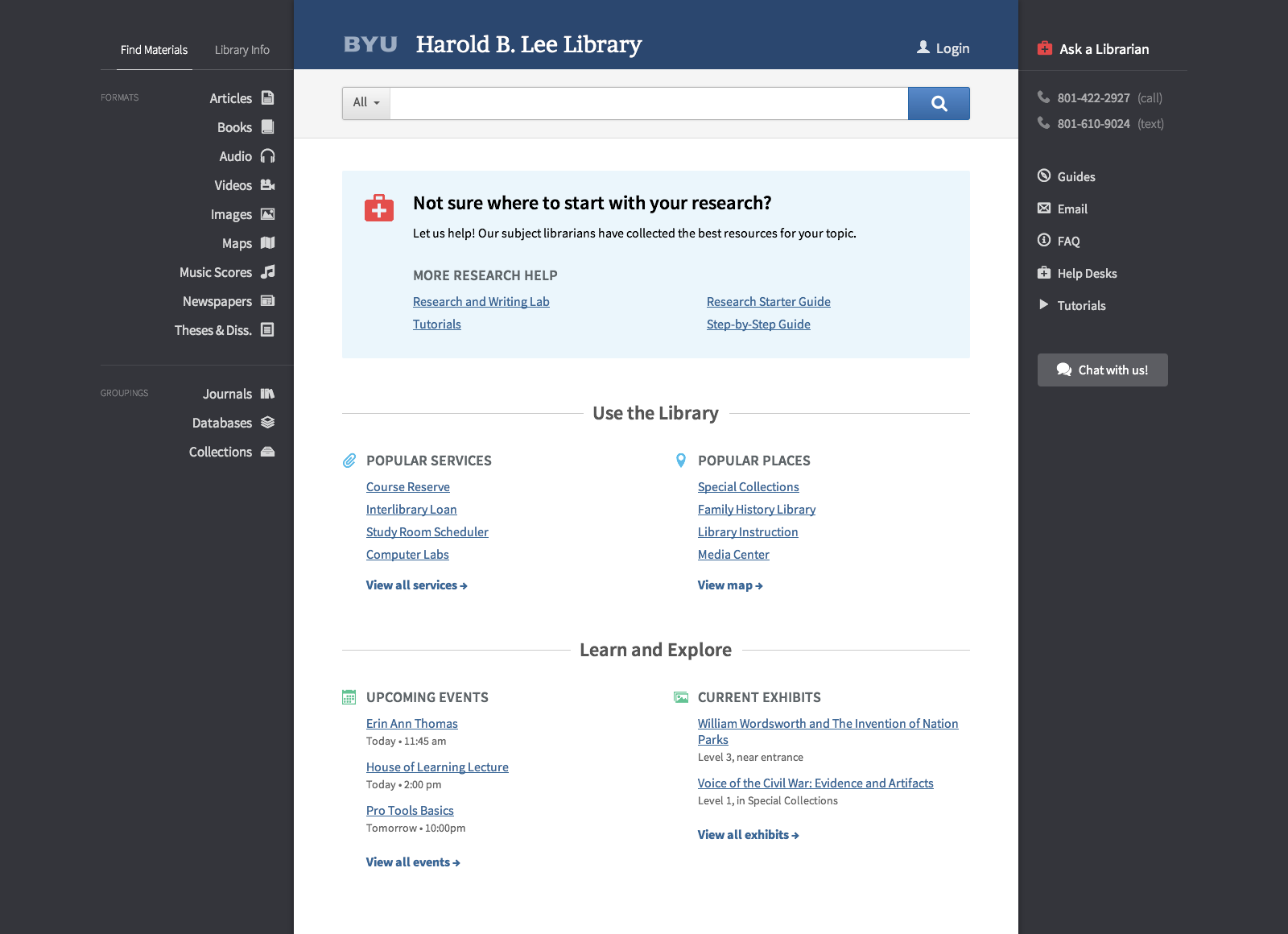
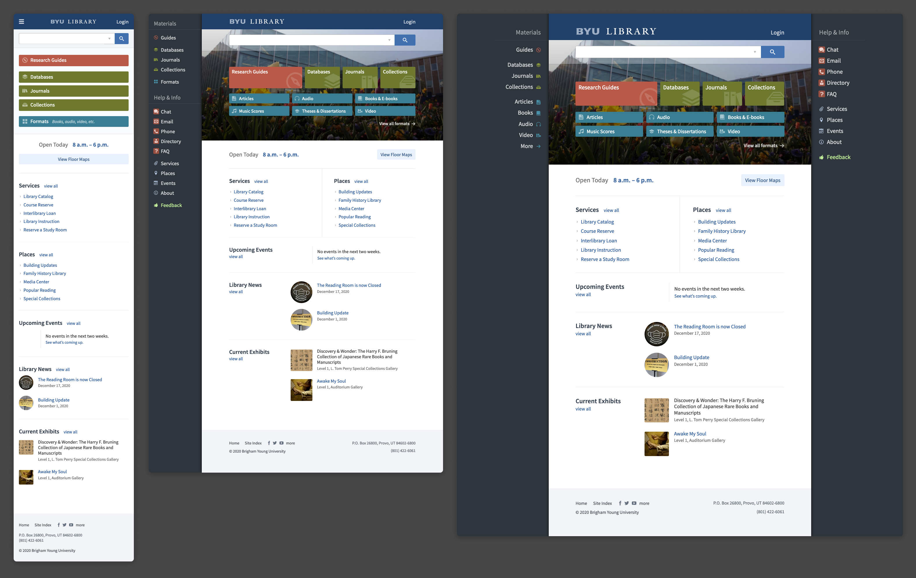
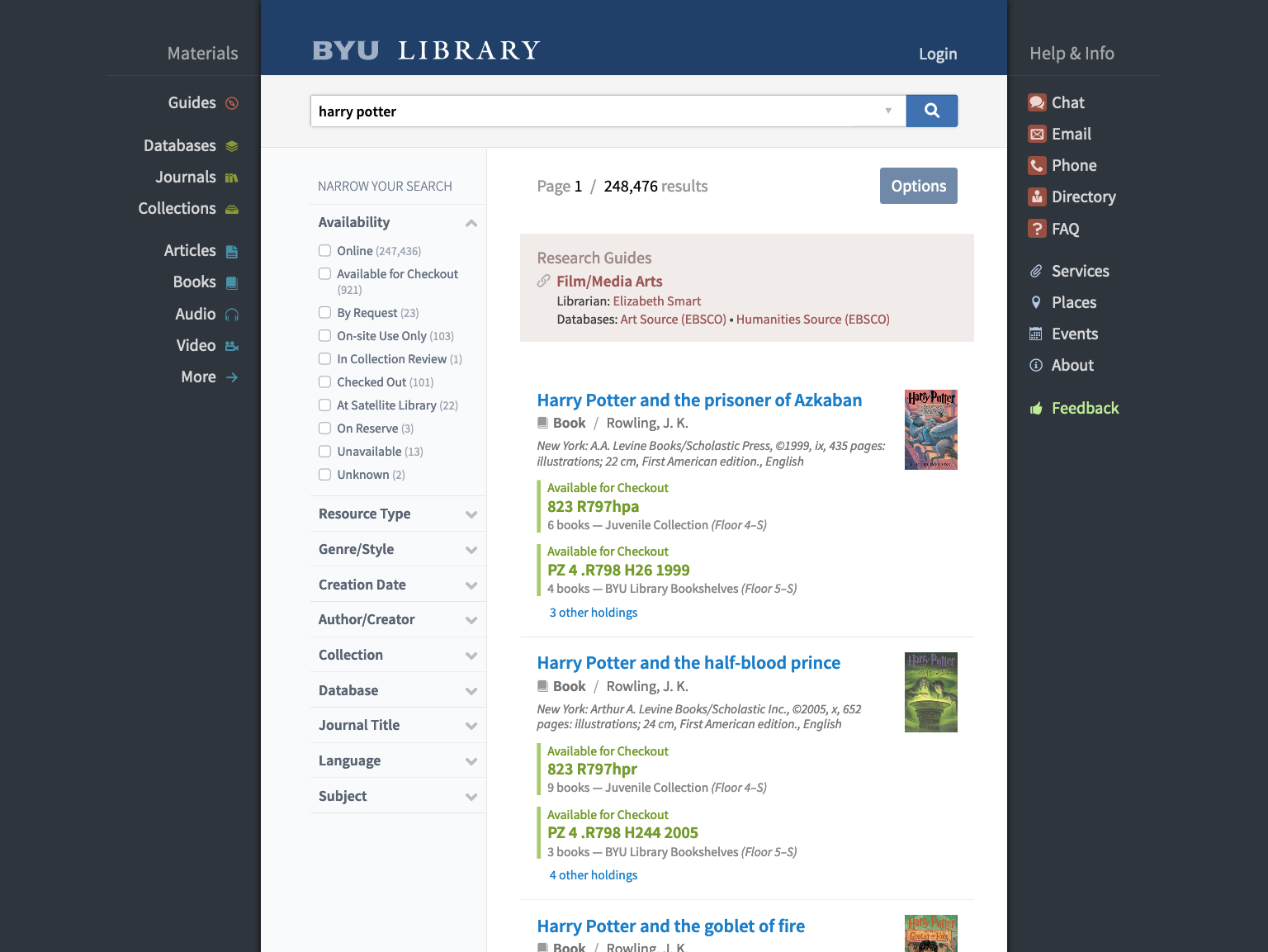
This is not a full case study, because I unfortunately did not document most of the process beyond a few saved screenshots.

Also note that I primarily acted in a supervisorial capacity on this project, other than a few parts which I’ll specifically mention. I supervised a junior designer, who I’ll call G.

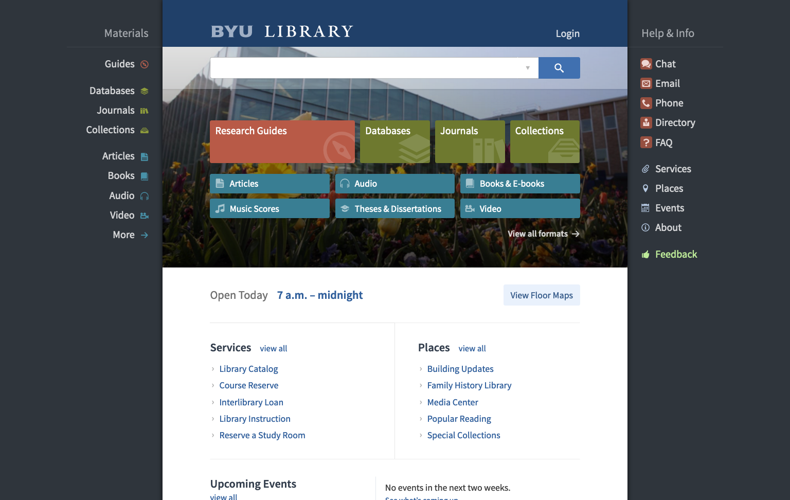
The stewardship of the website belonged to a committee of librarians, the Web Working Group. I updated them on progress throughout the process, and they gave feedback which G and I then incorporated into the designs and evaluated with a small user test.

Problem definition

Our goals with this redesign of the BYU Library site were:

  • Make it responsive. At the time we had a separate site for mobile devices. We had watched our mobile traffic rise significantly year over year, and with the availability of media queries and the growth of responsive design, we wanted a better offering for our users.
  • Unify more subsystems. There were dozens of library subsystems—databases, journals, subject guides, library directory, etc.—all of which had different interfaces. We wanted to pull as many of those as we could under the same interface, to make the experience more seamless for users.
  • Make it more colorful. We also had received repeated feedback in the library’s LibQUAL+ survey that the site’s existing design was too bland and not colorful enough. While this wasn’t the dominant reason for the redesign by any means, we did want to take it into account, especially considering our target audience (primarily undergraduate students).

For context, please see the following image. The screenshot at left shows the site as it was in late 2010, a few months before I became the lead UX designer at the library. The screenshot at right shows the site in early 2014 after several smaller redesigns I’d made over the years. This was the starting point when we began our responsive redesign.

Two screenshots of early library website designs

Research

Our initial research consisted primarily of two parts:

  • Analysing the LibQUAL+ survey results, which included questions with linear-scale answers as well as short-form comments.
  • Interviewing librarians, trying to understand how they used the library site to support students and faculty. G conducted these interviews and we reviewed the results together.

Design

G and I examined the information architecture of the existing site, mapping out the sections of the site. Using the survey results to guide us, we identified which parts of the site needed to be more easily accessible and formed a new IA.

From that point on, our usual process had G drawing wireframes on a whiteboard. After several iterations of review with me, G would then mock the designs up in Photoshop for my review, again with several iterations usually following. We sometimes ran small user tests with these mockups; other times, we prototyped the ideas in HTML and CSS and JavaScript and tested the prototypes instead.

The first image here is the earliest screenshot I have from the process. While I only have a screenshot of the desktop view, the design was mobile-first throughout the process.

The next image is the current design at mobile, tablet, and desktop sizes. It’s largely unmodified from what we ended up with in 2014.

An early mockup of the website The current design of the website, showing mobile, tablet, and desktop sizes

Catalog redesign

For historical reasons that aren’t particularly relevant here, the library’s catalog is a separate system from the main site. Similar to what we did for the other subsystems, we wanted to take the new design to the catalog for a more seamless user experience.

Scheduling constraints pushed that work to a second phase, and I ended up doing most of the design instead of G. We followed largely the same process, with G reviewing my designs.

The catalog search design

Evaluation

Over the course of the design we ran dozens of small user tests, usually with six or seven participants each. After G and I drafted the list of tasks for a test, G would conduct it by going to the library atrium and finding volunteers (candy may have been used as a bribe), asking them to perform the tasks using the mockup or prototype. G would observe what they did and take notes. Afterwards, we would analyze the results and decide how to proceed.

We succeeded in making the site responsive, unifying more subsystems, and making the design more colorful. The largest metric of success for us, however, was the next LibQUAL+ survey, where the number of negative comments about the website dropped to almost nothing (and there were many more positive comments).