This is not a full case study, because my only role here was supervisorial. I supervised a junior designer, who I’ll call B.
Library instruction class scheduler design
A reconstructed short case study showing supervisorial work on a redesign of the library instruction scheduler.
- Management
Problem definition
Subject librarians teach hour-long library instruction sessions every semester to over a thousand BYU students, as part of the students’ class requirements, primarily for first-year writing and advanced writing courses.
Our goal with this project was to redesign the existing library instruction class scheduler, which had several issues that were causing unnecessary friction for librarians, students, and administrators. We measured success by the following metrics:
- More user-friendliness for librarians, students, and administrators.
- Reduce the number of one-on-one sessions taught by librarians. (This was one of the goals the librarians had, to try to consolidate teaching into group sessions for greater efficiency.)
Research
B interviewed several users in each role (librarians, students, and library instruction administrators), observing them while using the system and also asking them how they used the existing system, what frustrated them about it, what they liked about it, and what they felt was missing.
User flows and wireframing
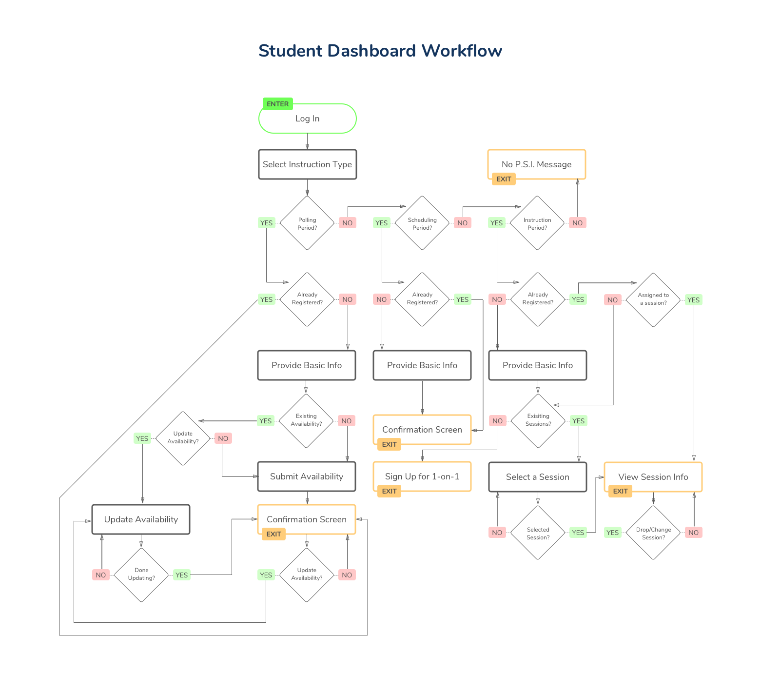
Once we had a good idea what each type of user needed, B diagrammed the user flows (as seen in the first image below) and reviewed them with me.
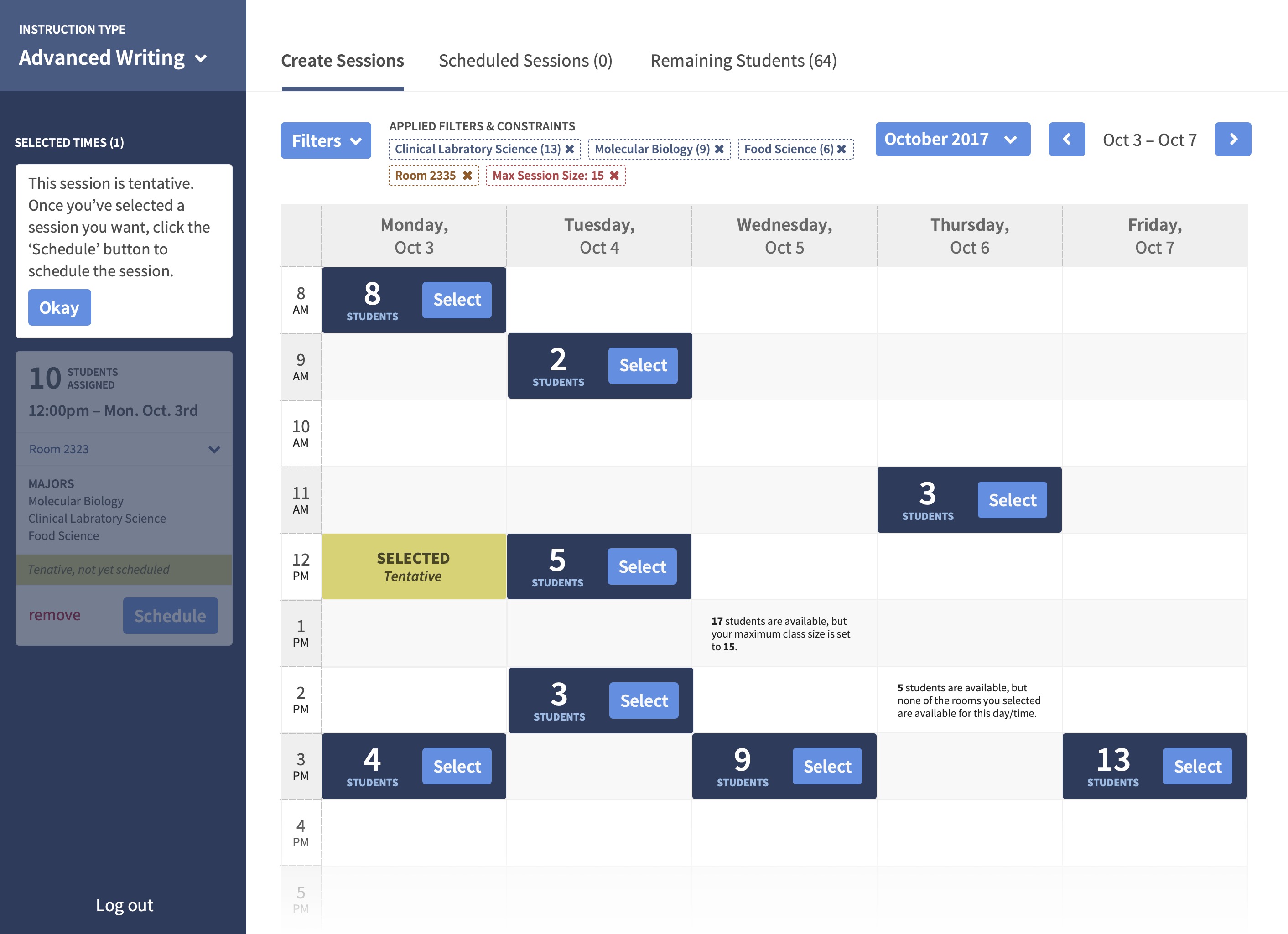
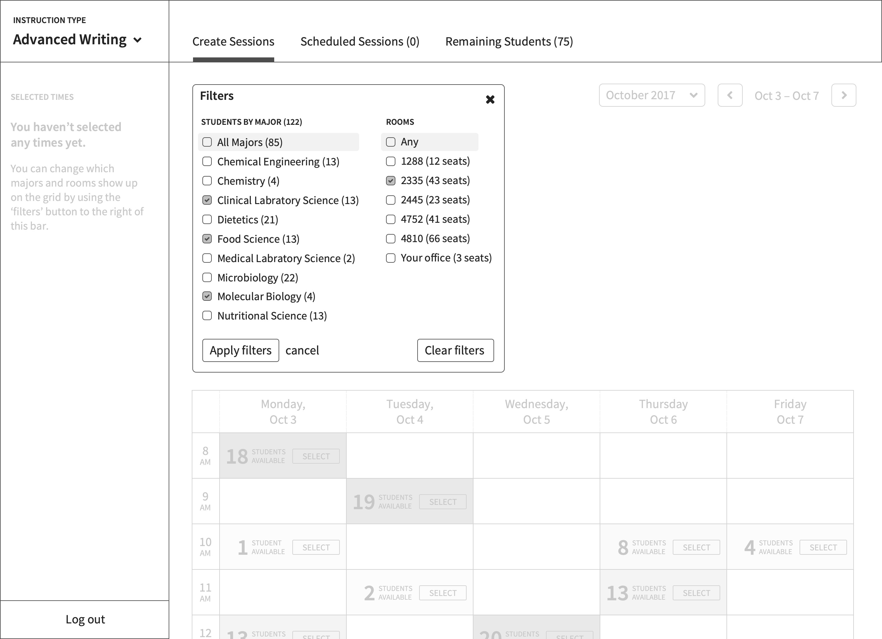
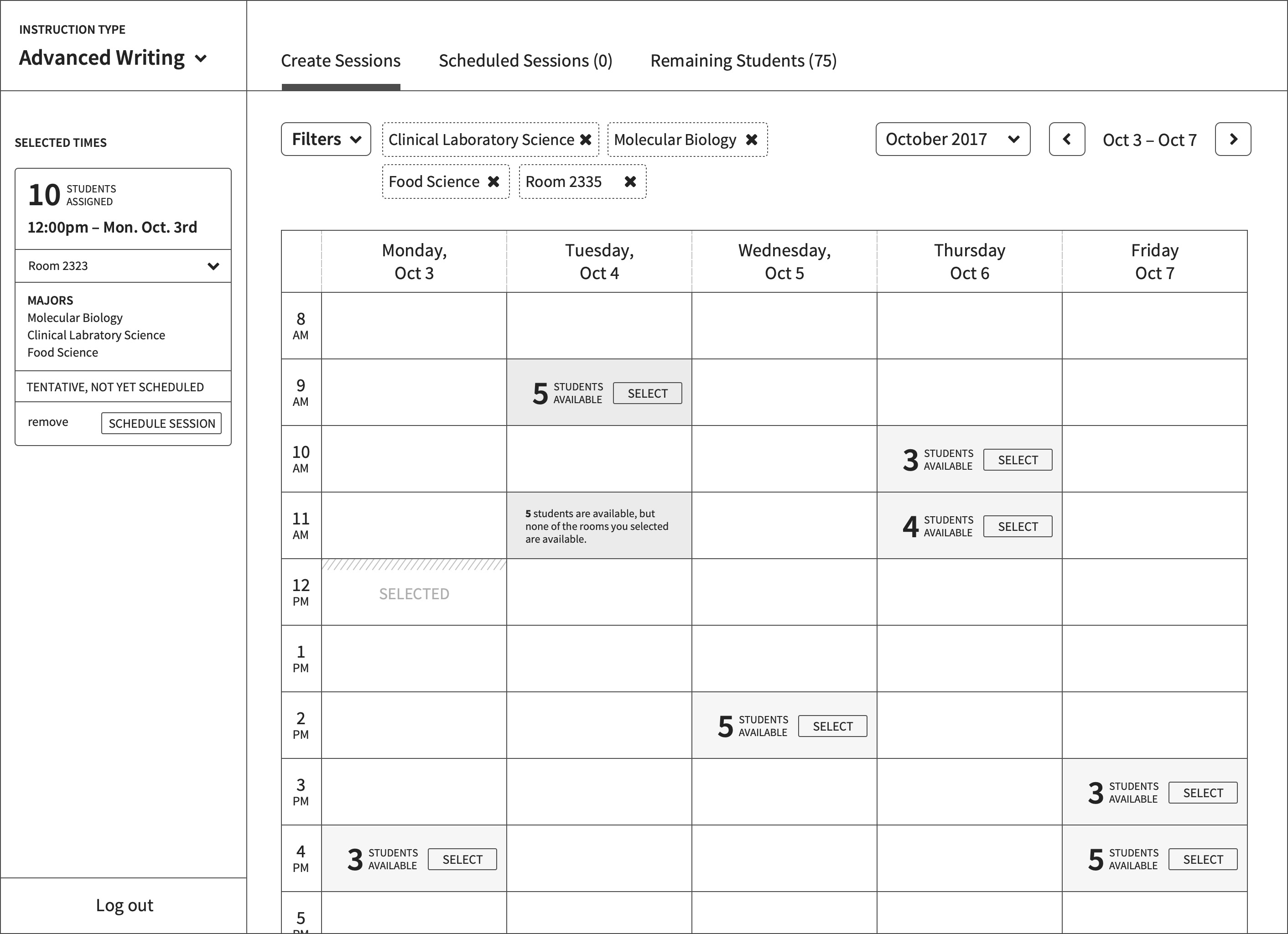
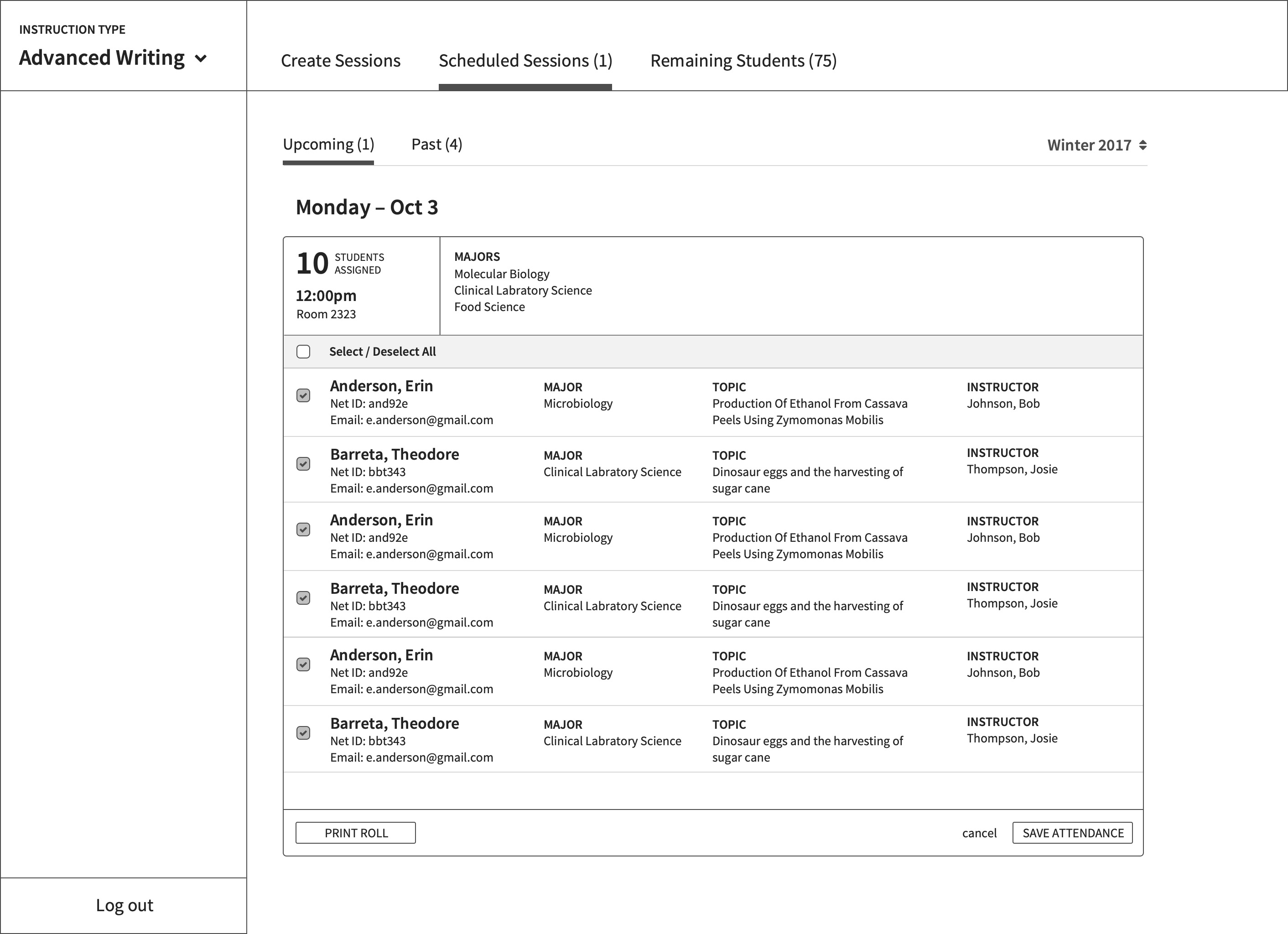
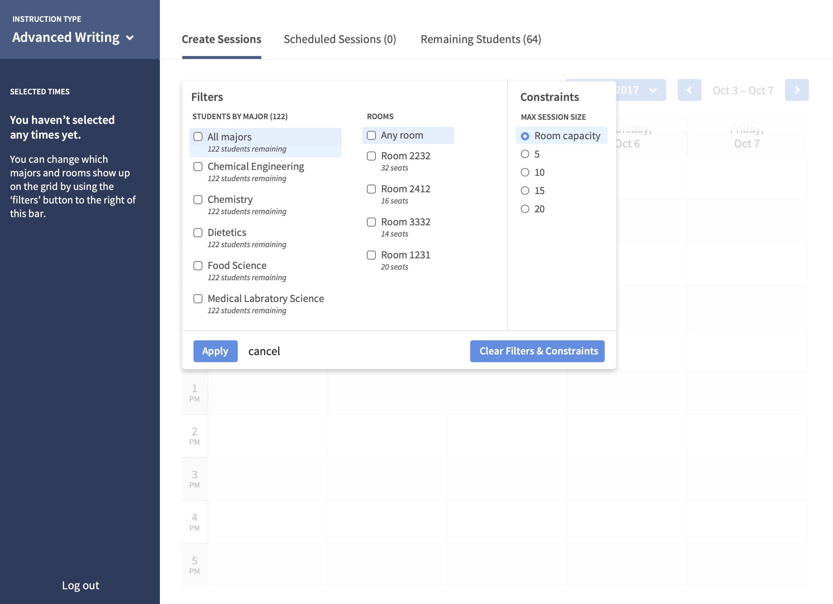
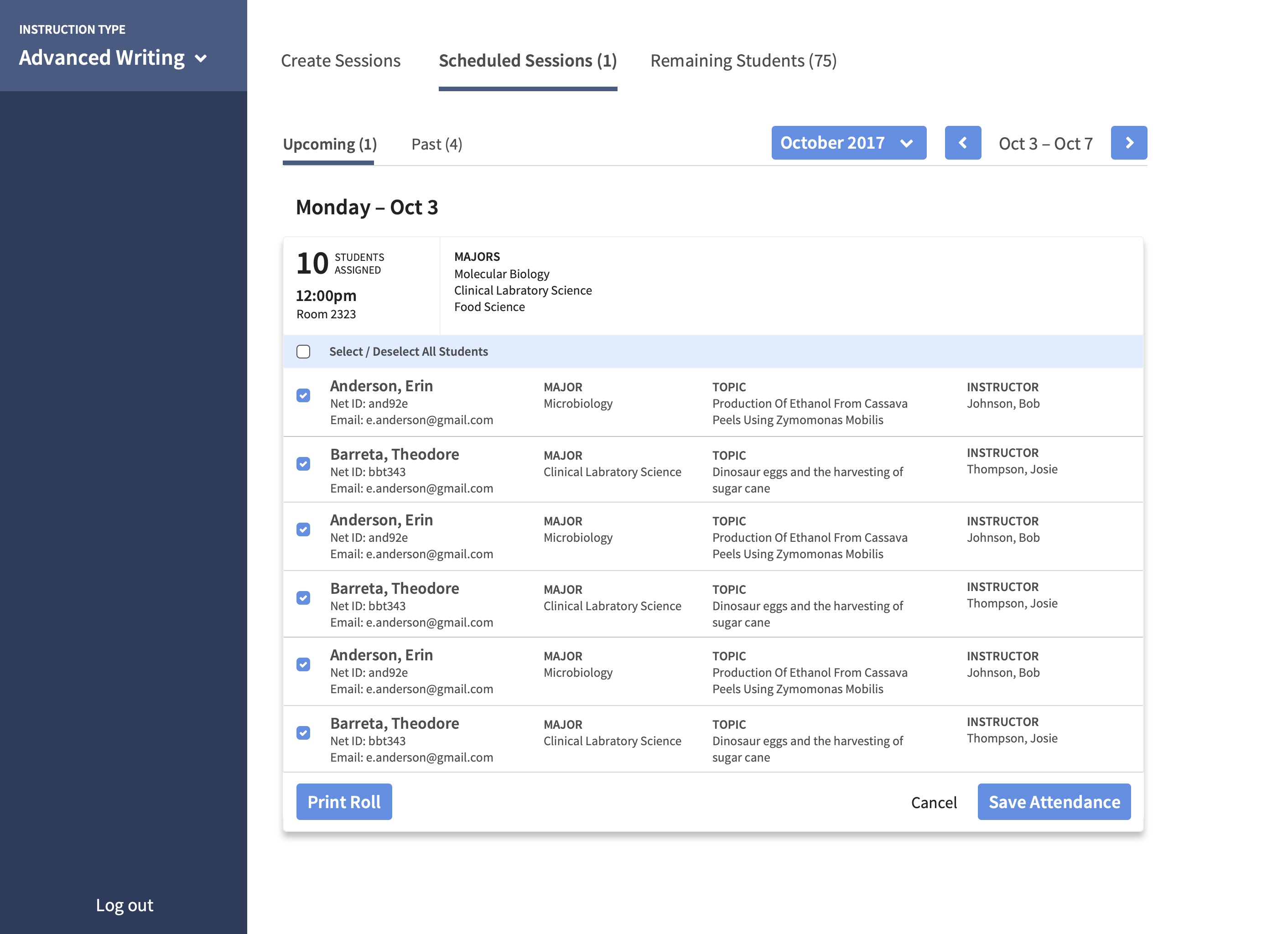
Past that point, our usual process had B drawing wireframes on a whiteboard, though unfortunately neither of us took photos of these. After several iterations of discussion and review, B would then put together low-fidelity wireframes in Sketch, as you can see in the subsequent images below. Once those were ready, we would plan usability tests which B conducted in the library atrium, recruiting patrons as participants. B and I would then review the test results together before deciding what changes we needed to make.
High-fidelity mockups
Once the wireframes were testing well enough, we moved to the high-fidelity mockup stage, again using Sketch. We followed largely the same iterative procedure as before: B would turn the wireframes into high-fidelity designs, we would review and discuss them, and B would then run usability tests and we would review the results together.
Evaluation
After launch, the number of one-on-one sessions increased by 1.6%. This was a failure per our original metric, of course, but the qualitative feedback we gathered from librarians, students, and library instruction administrators was overwhelmingly positive about the new system. I suspect the increase in one-on-one sessions may also have to do with inherent tensions between students’ needs and librarians’ needs, which would be a worthy candidate for followup research.