This is a very abbreviated case study, because I don’t have any process artifacts and because it was a print design project.
Library floor maps design
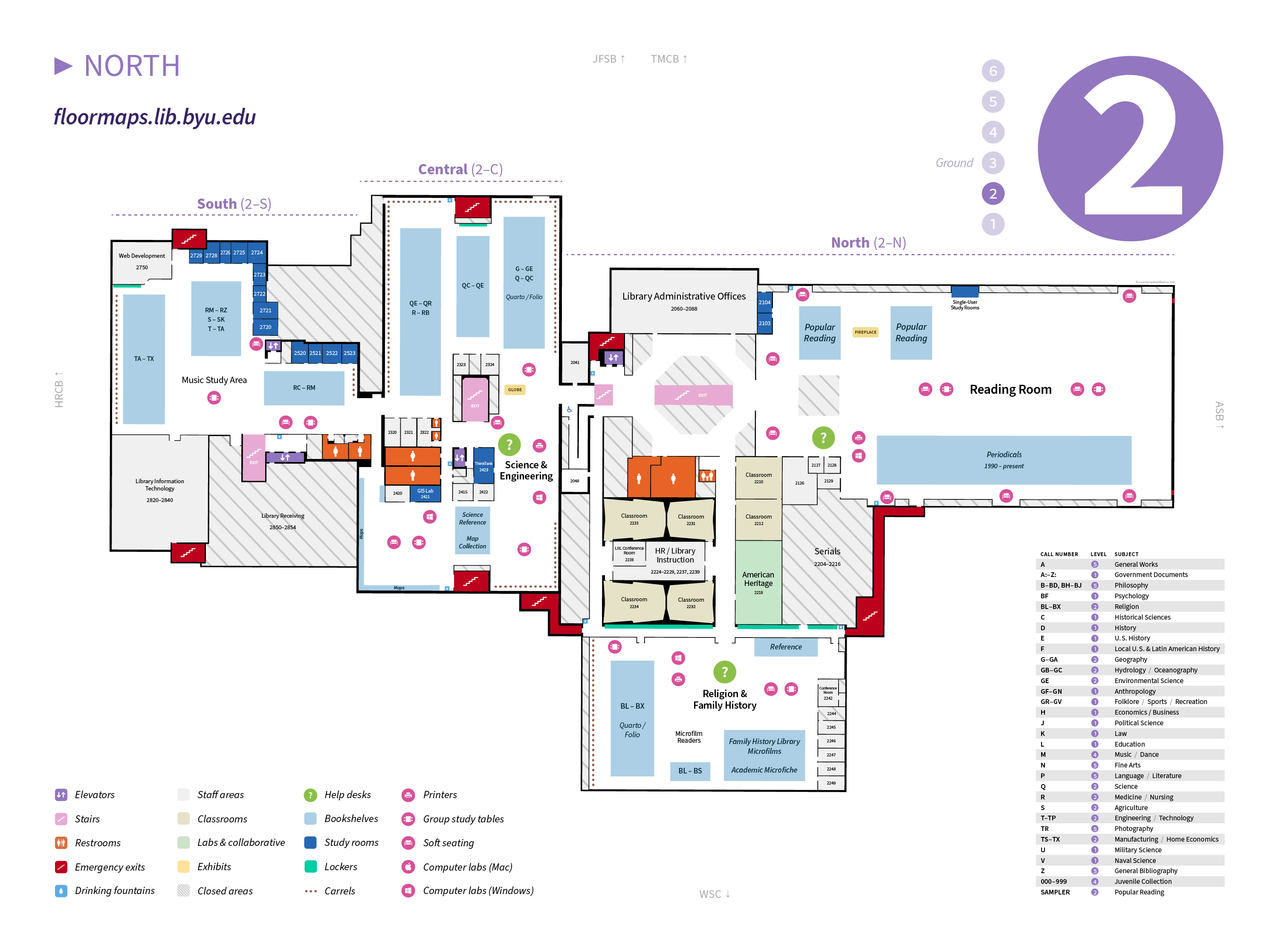
A reconstructed short case study showing visual design work on a redesign of the BYU Library's floor maps.
- Visual design
- Usability testing
- Management
Problem definition
Before this project began, we had several completely separate floor maps for the library: print maps, the floor maps app (with one set custom-tailored for mobile and one for desktop), mini maps included in our catalog item detail pages, and a directory kiosk located near the entrance to the building. Keeping all of these updated in coordination was burdensome and things were slipping through the cracks.
Task force
I set up a series of meetings with the building manager, the stacks manager, the communications person responsible for the print maps, the junior designer, the two GIS librarians, and a software engineer with GIS experience.
In the early meetings we agreed that our primary goal was to unify all the maps into one canonical set. We also wanted to make the maps more user-friendly, including features that hadn’t ever been shown on the maps (locations of study tables, soft seating, etc.).
Design
We initially wanted to use ArcGIS as the underlying base technology for the maps, so that we could use the campus Revit files for easier updates. We hired students in the geography department on campus to do this initial work.
After we finished going through revisions, however, we found the ArcGIS map frontend unsuitable for our needs. (I don’t remember all the details, but what I do remember is that the text treatment had fairly severe kerning issues.)
I led the decision to use only the base layers from the ArcGIS files and instead craft the rest of each floor’s map in Illustrator. It was less automatic than what we had initially hoped for, but the end result was much higher quality.
I then designed the rest of the maps: the text, the icons, the legend, and other peripheral material. I also fixed issues with the underlying maps—points that were slightly off, color changes, etc. During this process I ran small internal usability tests with fellow employees on my team, particularly with the pink feature icons.
Evaluation
I don’t remember if we ran any usability tests after the maps went live. I believe we did, but I haven’t been able to confirm this. In retrospect, I believe this project would have benefited from more extensive research beforehand and more testing throughout and after the process. I don’t remember why we didn’t do that, but I do regret it.