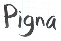
Pigna: tracing
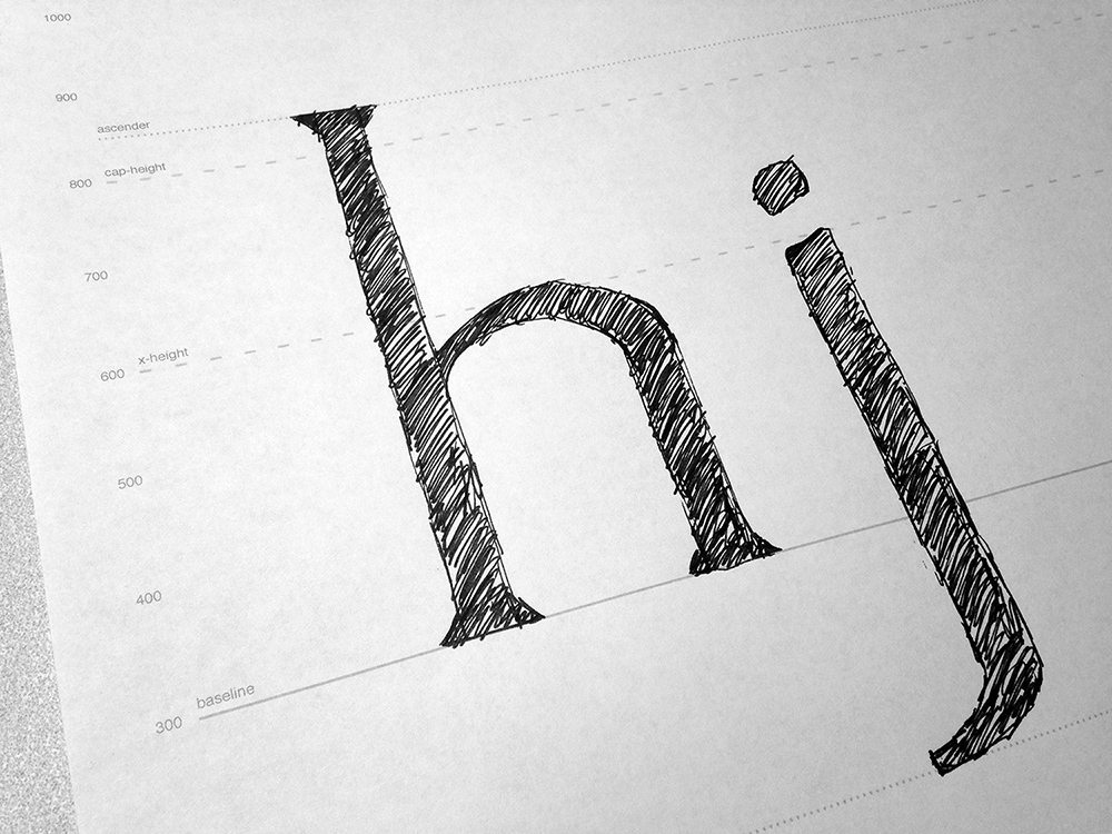
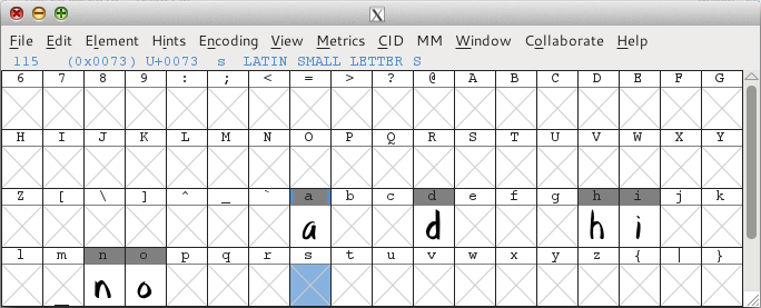
I’ve traced ‘a’, ‘d’, ‘i’, ‘o’, ‘n’, and ‘h’ so far, in that order. (The two common starter strings I’ve seen are “adhesion”, which I’m doing, and “hamburgesfontiv”.) It’s already addicting and I don’t want to stop.
My process on these:
- Double-click on the glyph in FontForge (in the main font window).
- In the glyph window, click
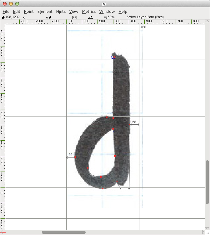
File->Importand choose the sketch for the background layer. - Select the background layer and resize the background image so that it rests on the baseline and matches the x-height. (Before I started, I made a guide for the x-height.)
- Select the foreground layer.
- Make sure
View->Show->Fillis not selected. (If it is, the glyph covers up the background image, making tracing impossible.) - Switch to the pen tool (‘p’).
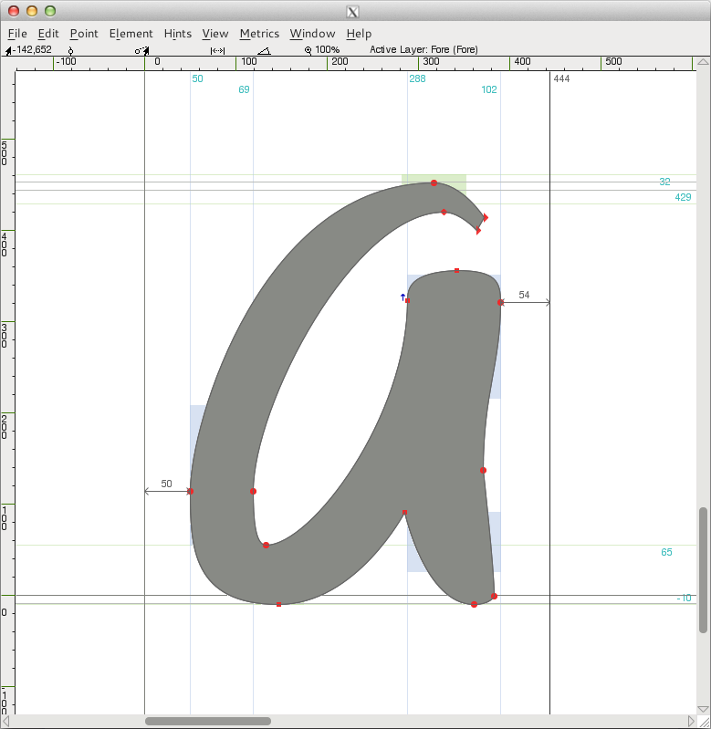
- At a zoomed-out level where I can see the whole glyph, place initial points. I place them at the extrema, since that’s apparently what’s best for fonts. (One thing that helps a lot with this is selecting
View->Show->Extrema, so I can see if I’ve gotten it wrong.) - Then I zoom in close, switch to the pointer tool (‘v’), and finesse the points and control points till the curve matches the background image.
- Zoom out, hide the background layer, turn on
View->Show->Fill, and see how the glyph looks. Adjust as necessary.
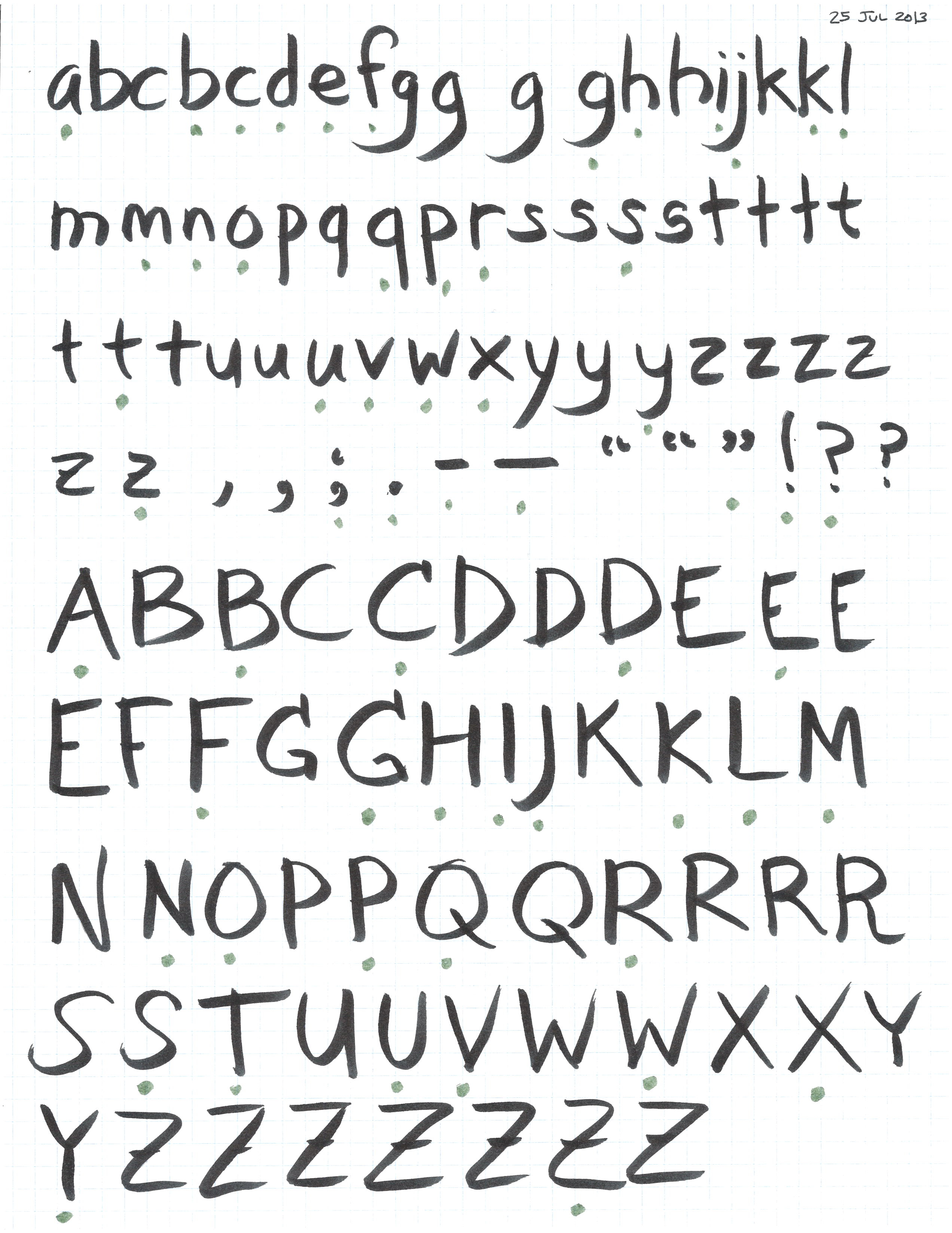
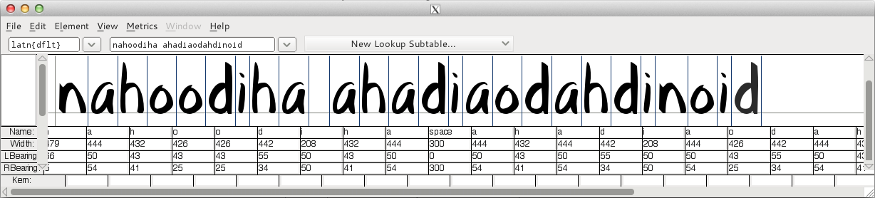
After I did a few, I opened the metrics window (Window->New Metrics Window) and typed the characters in (I got them from adhesiontext, though LibreText is also good), then tweaked the bearings (dragging the lines, but editing the LBearing and RBearing boxes also works) until it looked a little better.
The hardest thing so far? Resisting the urge to try to make these font outlines look good. It’s. So. Hard.
General notes
- I should mention that a few months ago I read Design with FontForge. It’s a good starting point.
- Somewhere I read that you only want to use horizontal/vertical control points. For the most part I’ve been able to do that, and it feels cleaner, but some curves just don’t seem to be possible that way. Maybe you’re supposed to use more points in those cases? Not sure. I’ve opted to allow some exceptions where necessary.
- I initially wasn’t sure how wide the left and right bearings should be, but as I’ve started spacing things, I’m getting a better feel for it. The metrics window alone isn’t enough, though, since the lines get in the way — pretty soon I’ll do a pageful of dummy text in different point sizes and see where the spacing is off.
- For curved parts (like the top of the ‘n’ and the top and bottom of the ‘o’), you want to optically adjust by making them extend past the x-height/baseline, so I’ve added guides for that. I’m not entirely sure how much bigger the adjustments ought to be, but I trust that’ll come with iteration down the line. (Though for this font, I’m not doing that.)
FontForge notes
- Yes, FontForge is an ugly app. I’m still not sure where it sits on the spectrum between the UI being horrible and the learning curve being really high (like with Vim).
- I originally had labels showing on the guides, but they disappeared and I haven’t yet figured out how to get them back.
- It’d be nice to make the glyph semi-transparent so I can see the glyph shape (not just the outline) and the background image at the same time. So far I haven’t figured out if this is possible.
- I wasn’t sure how to take a point with only one control point and get a second control point out of it. This may not be the best way, but I control-clicked on the point, went to
Get Info, and then edited the second control point’s coordinates directly so it wasn’t 0,0. And then I could drag it in the glyph window. - A keyboard shortcut to toggle the fill (and just the fill) would be nice. In fact, customizable keyboard shortcuts that don’t involve editing a gettext .pot file would be nice. Someday, hopefully…
- I haven’t yet found a way to scale the background image proportionally (you’d think
Shiftwould work, but it doesn’t, at least not consistently). - When I double-click on a glyph to open it, I wish FontForge wouldn’t switch to the pen tool. The pointer tool is what I want most of the time. Maybe there’s a setting somewhere?