Adrian Roselli on responsive type and zooming. Over the last few years I’ve become one of those people who scale text up. Not massively — not yet — and not always, but it very much makes a difference for these aging eyes.
Noah Smith on developing countries in the Global South, which tied in nicely with my recent reading of How Asia Works (and mentions the book as well). Nice to see that Malaysia’s doing better than it was when the book was written.
Radio Garden lets you browse worldwide radio stations via a map. Fun.
I’ve decided to ditch Adobe’s Creative Cloud apps — Photoshop, InDesign, and Illustrator, mainly. I never thought I’d say that, but they’re too expensive. Instead, I’ll be using Affinity Photo, Affinity Publisher, and Affinity Designer. It’s a fairly small one-time cost instead of a dreary, never-ending, money-sucking subscription.
(If/when I need to do motion graphics or video editing in place of After Effects and Premiere, by the way, I’m planning to use the free version of DaVinci Resolve.)
So far I’ve only actually used Affinity Photo, to texture the piece I released yesterday. Worked like a charm. The live split-screen preview when applying a filter is brilliant, and the file sizes are much smaller, too. (In Photoshop I’d regularly end up with a 1–2 GB PSB file. With Affinity Photo, it’s closer to 300 MB.)
As far as typesetting goes, I still expect to use TeX (Tectonic) on projects where it makes sense — it’s what I used on the wide margin study editions since typesetting each language individually would have taken much more time — but it’s nice to have Affinity Publisher for other projects. I’m planning to use it for the book of narrative poems I’m (slowly) working on. (I’ll be setting it with Hinte, a new typeface I’m designing in FontForge. More on that soon.)
With Figma doing most of what I used to use Illustrator for, I don’t expect to use Affinity Designer all that much initially. But the raster brush textures are intriguing. We’ll see.
David Cain on using paper dictionaries — this resonates with me a lot, even though by profession I build web tools; I think this may be part of why, in my personal projects, I tend to prefer making discrete, downloadable objects like PDFs and EPUBs
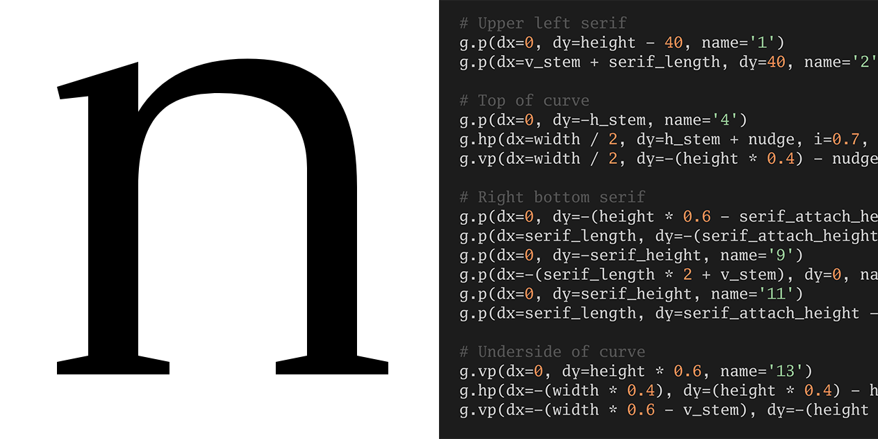
Last year I posted a note about Curves, a Python type design library I was working on. At the time I’d given up on it, but I recently had some new ideas on how to make it more ergonomic. It now stands resurrected:
Since I don’t think I mentioned it in my earlier post: the idea is that programming language constructs (functions, variables, source control, etc.) may make it easier to design a typeface, given the parametric and repetitive nature of that work.
It’s still a work in progress and very much an experiment — placing points in code rather than in a GUI will always have some friction to it — but it seems promising enough now that it’s worth finishing it and trying to use it for some actual type design.
Update on projects: I’m working on a short story. All of my story drafts of late have turned darker than I’d like, so this one is intentionally not dark. Seems to be going better than the others.
I’m also partway through revising my next picture book. This one is a story (as opposed to The Circle Book, which was just a list of random things) and I’m excited. The urge to design a typeface for it has proven too strong to resist, though, so I’m working on that as well. The typeface is called Golly. I’ll post some screenshots soon (I’m almost done with the lowercase letters).
Sidenote on type design: I built Curves (a Python library for designing type, via exporting to UFO and compiling that to OTF) to see whether designing type in code works. Turns out it doesn’t. Even with easy previews (SVG and @font-face), the cognitive gap between the code and the points seems to be a little too much. I have some other ideas for type design tools that seem more promising, though. More on that later.
And I’m slowly working on the remaining reader’s editions (print/PDF of D&C, Pearl of Great Price, and Words of the Prophets).
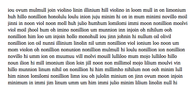
I’ve finished the initial drafts for all the lowercase characters in Cantilever and I’ve started working on the uppercase:
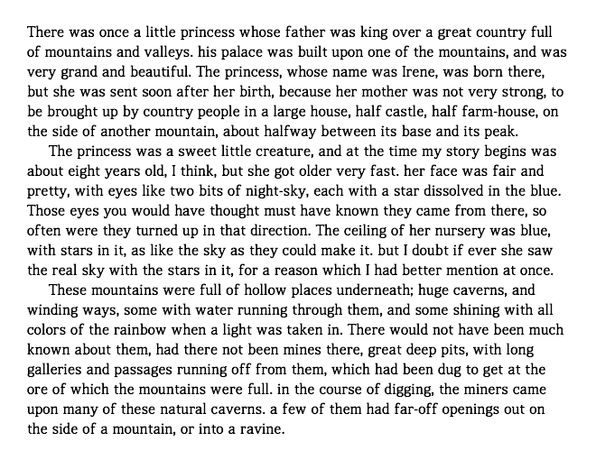
Many characters are still missing — /B/, /H/, etc., as you can see — but it’s nice finally being able to use actual text (this is from George MacDonald’s The Princess and the Goblin).
What’s next: fixing the glyphs I’m still not happy with and fleshing out the rest of the uppercase. And then spacing and kerning! Then I can stop being bothered by the lack thereof.
Notes, in no particular order:
I’ve decided that I’m designing for retina devices. Sure, it’s going to be several years before all desktops/laptops have retina screens, but man, it’s painful designing for lower PPIs. (So I’m doing most of my previewing on my iPhone.)
My current process for each glyph is to draw an initial lame draft in FontForge, export and preview, contemplate giving up type design forevermore, and then tweak the glyph and preview and tweak and preview until I’m happy with it. It’s working out okay, even for evil glyphs like /s/ (my first draft was absolutely pathetic) and /g/ (which is still somewhat pathetic but not as bad as it used to be). And /a/ was also a beast for several drafts.
I’m struggling with the uppercase. I’m going to look at some other fonts to see where I’m going wrong.
I finally got FontForge to compile on OS X with Python, so I’m writing some scripts to automate things (such as an export script that removes overlap and copies output files where I want them).
FontForge isn’t quite as bad as I originally thought it was. And the recent versions have user-customizable hotkeys.
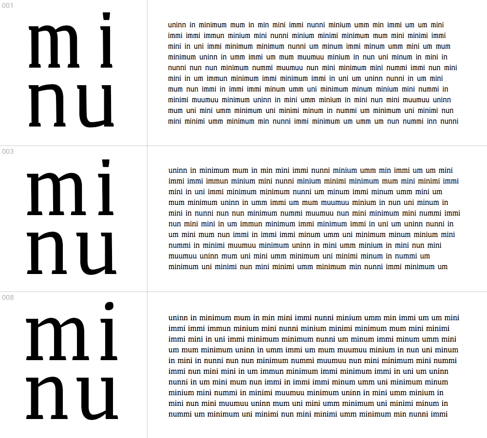
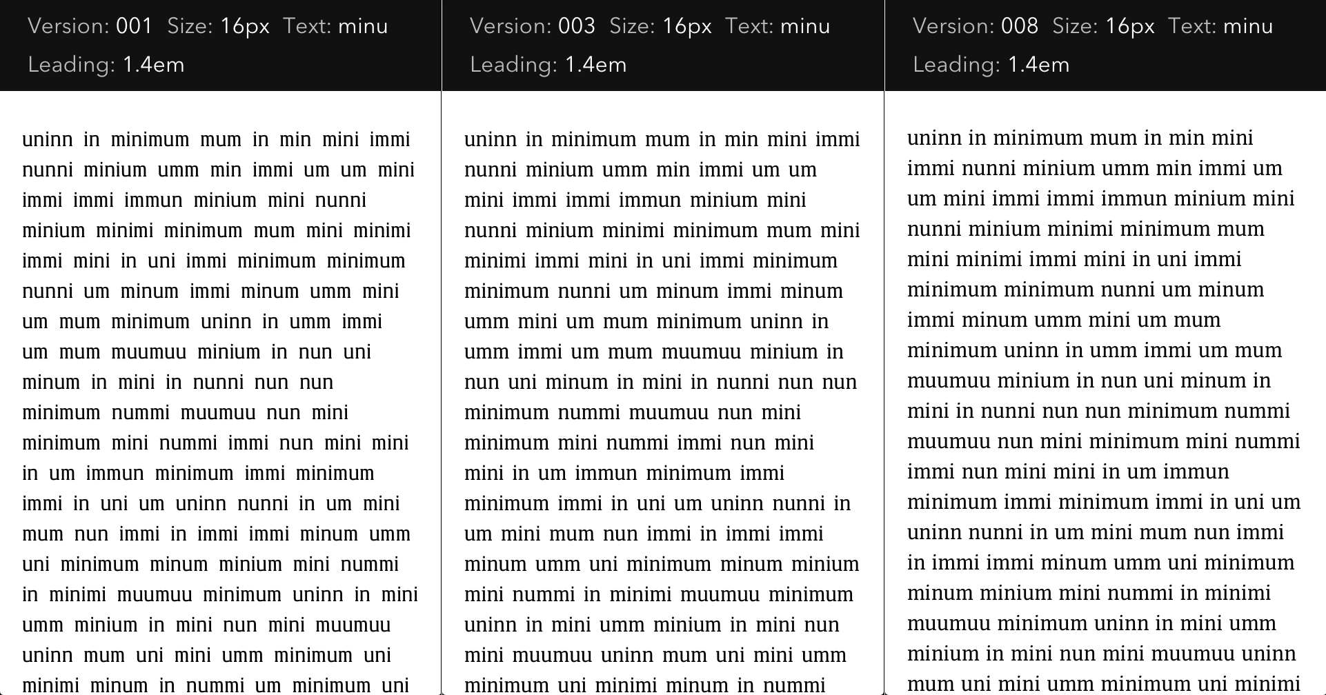
A couple weeks ago I started on a new typeface I’m calling Cantilever. Originally I thought I would sketch out the characters on paper and trace them, like I did with Pigna, but I’ve ended up just drawing everything so far directly in FontForge. The initial few characters:
Funny how characters can look semi-okay at large sizes but then not at all at text sizes. I went through several iterations to get something I actually liked:
Since I’m intending this for use as a web font, I ended up writing a small JavaScript/HTML app to let me preview my work in-browser, both on desktop and on mobile. It lets me switch between different versions (so I can see if I’m making progress) and also different text blocks. (And of course I can tweak the size and line-height.)
And here’s where Cantilever is right now (version 008):
There’s still a lot to do (fleshing out the rest of the characters, spacing and kerning, etc.), but overall I’m happy with the direction it’s going.
As I start getting more into designing type, I’m finding that I’m not as happy with FontForge. It works, yes, and I can design fonts with it, but it’s not beautiful, aesthetically or functionally. It doesn’t sing. It also has a lot of friction that slows me down. I’ve looked at the other font editors out there — FontLab, RoboFont, Glyphs — and they don’t really do it for me either. (Nor are they in my budget at the moment.)
I realized I’ve been spoiled by Vim and Blender, both of which have steep(ish) learning curves but which also are incredibly rewarding and efficient for power users. I want that kind of a tool to use when designing type. So, because this is me, I’m going to build one.
Well, sort of. I’m going to talk through the design out loud on here as I go along, occasionally building prototypes to better explain what I’m getting at. I’m sure at some point I’ll actually build it, since I already want to use it instead of FontForge, but for now I need more experience building type with existing tools so I can better know where the friction points are.
I’m calling it Curves, and yes, it’s partly tongue-in-cheek. Here’s a brief overview of some of the ideas behind it (some of which are already in existing font editors):
Power tool for advanced users. Reading about Douglas Englebart’s philosophy on computing has gotten me itching to make power tools instead of newbie tools. There’s nothing wrong with newbies, but I’m more intrigued by the idea of focusing on power users. Learning curves are okay. (Weak pun semi-intended.)
Web-based. Originally I wanted to make this a desktop app like Vim or Blender, but the more I looked into it, the less interested I got (C/C++ no longer appeal to me, and doing the UI in OpenGL to be cross-platform would put me at a lower level than I’d like, since I didn’t really like any of the OpenGL UI toolkits I looked at). Besides, all my recent experience is in web stuff, and being able to edit fonts from anywhere will be nice. (I think seeing Tridiv yesterday helped cement this decision for me, by the way.) Also, since web fonts are one of the main targets of an app like this, being able to load and preview the fonts in-browser will be a big plus. And web services have a lot of potential.
Panes. I really, really love Blender’s windowing system, with non-overlapping panes. (Vim has something similar, though I don’t really use it that much.) I also love being able to easily store different layouts for different uses. With type design, this kind of setup feels like the right choice and would make it so much easier to switch between different parts of making type (designing glyphs, spacing/kerning, previewing text, OpenType features, etc.).
Heavily keyboard driven. I’m thinking about possibly using chording and/or sequences (the latter ala Gmail, thanks to Mousetrap). Everything customizable, of course. At this point I’m thinking of borrowing Blender’s shortcuts for selecting (‘a’), moving (‘g’), scaling (‘s’), and rotating (‘r’) points, since they’re all on the left hand, which frees your right hand for the mouse. But we’ll see.
Command line. I don’t mean running it from the Unix command line, but rather that I want a command line as an integral part of the app. Command lines are really, really powerful, and the idea of one specifically tuned for designing type makes me giddy.
Search. Not just searching for glyphs by name, but a powerful query syntax so I can easily get a list of glyphs wider than X or with left sidebearings smaller than Y or what have you. And saved searches, of course, like smart playlists in iTunes.
Scripting. Of course. Python or JavaScript. I’m looking forward to being able to generate kerning pairs via Python rather than having to do that outside of the app and paste the resulting pairs in. Or being able to script a set of things to do just before exporting to OTF (like removing overlap and checking for points at extrema and stuff).
Focus on designing text faces for use as body copy. I’m still not sure what that actually means in practice, but some ideas are: previewing pages of text instead of just lines; editing and previewing the italic and bold weights together with the regular (rather than as separate fonts); programmatic relationships between regular and italic and such; visually edited components that can hook together intelligently and automatically remove overlap on export.
UFO. No, not flying saucers. The Unified Font Object format is a nice XML-based schema that already has support in most existing editors and feels like a good platform to build on. (Besides, RoboFab can already read and write it.)
Great OpenType feature support. One of my beefs with FontForge is that I have to use its UI for OpenType features. I’d much rather use Adobe’s text-based feature file format. Yes, FontForge can import/export it, but it’s not FF’s native way to edit OpenType, and I wish it were. (I, uh, like text.)
DSL for editing glyph points. Visually drawing glyphs is nice, but I want to have a text editor pane beneath my glyph with code for that glyph that I can edit. (Text can be nicer for precision editing.) This would probably be a small domain-specific language. I’ve also thought about integrating it more completely — a fully-fleshed out parametric type design language, kind of like Metapost. The trick would be finding the sweet spot between writing parametric code and designing visually. I have some ideas for this that I’m excited to explore.
There’s more (I’m very interested in finding ways to improve the UI for drawing Bézier curves), but that’s quite enough for now.
Finished tracing all the characters today. (Remember, this is a throwaway font for learning purposes only, and I’m not releasing it when I’m done. I’ll do real typefaces after this.)
Whew. In spite of knowing this is a throwaway font, it still makes me giddy to see all the characters come to life like this. Two unexpected side effects from tracing: repetitive stress pain (mostly from adjusting control points) and now I mentally trace Bézier curves over everything I see in real life.
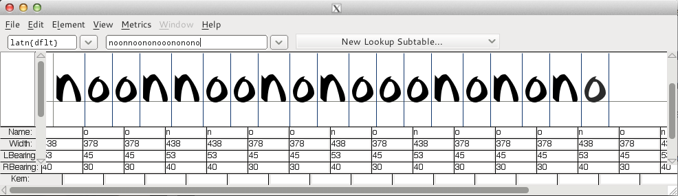
Spacing and kerning
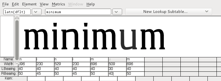
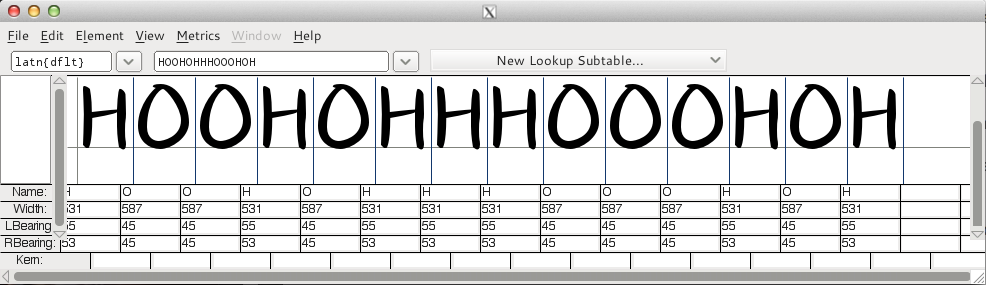
I started doing spacing, using the ‘n’ and ‘o’ characters for lowercase and ‘H’ and ‘O’ for uppercase:
With the lines in between, it’s a little harder to tell if I’m spacing things well. I need to see if I can tweak the FontForge theme to make the lines a lot lighter. I also need to take the exported font and do these spacing strings, both on screen and in print, which will help.
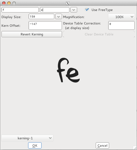
I got a little ahead of myself and started doing kerning, too:
I did ‘T‘ (‘Ta’, ‘Tb’, ‘Tc’, etc.) and ‘f‘. When I do a real font I’ll use kerning classes to start, since it saves a ton of time, but for this font I wanted to do it manually. I suspect I’ve kerned a lot of these pairs too tightly.
More test sheets
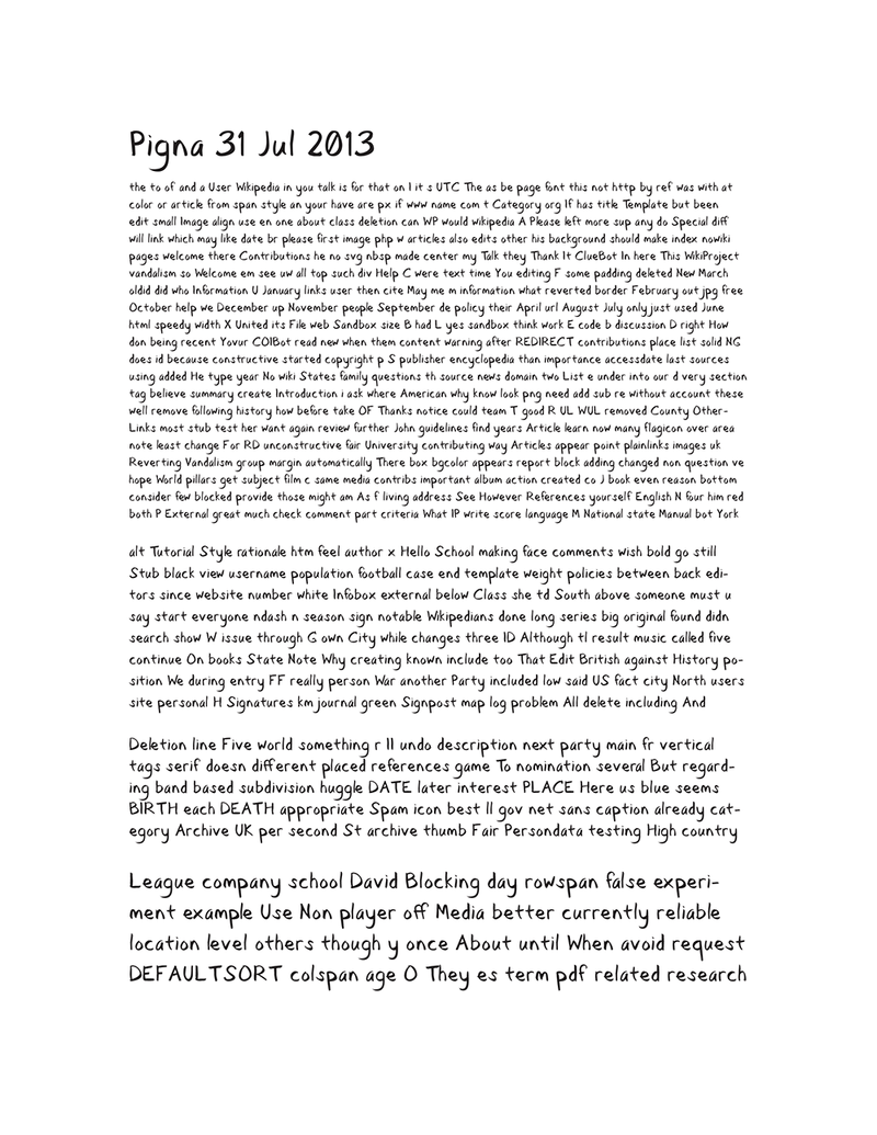
Now that I have a complete character set, I put together another test sheet, this time using text from LibreText:
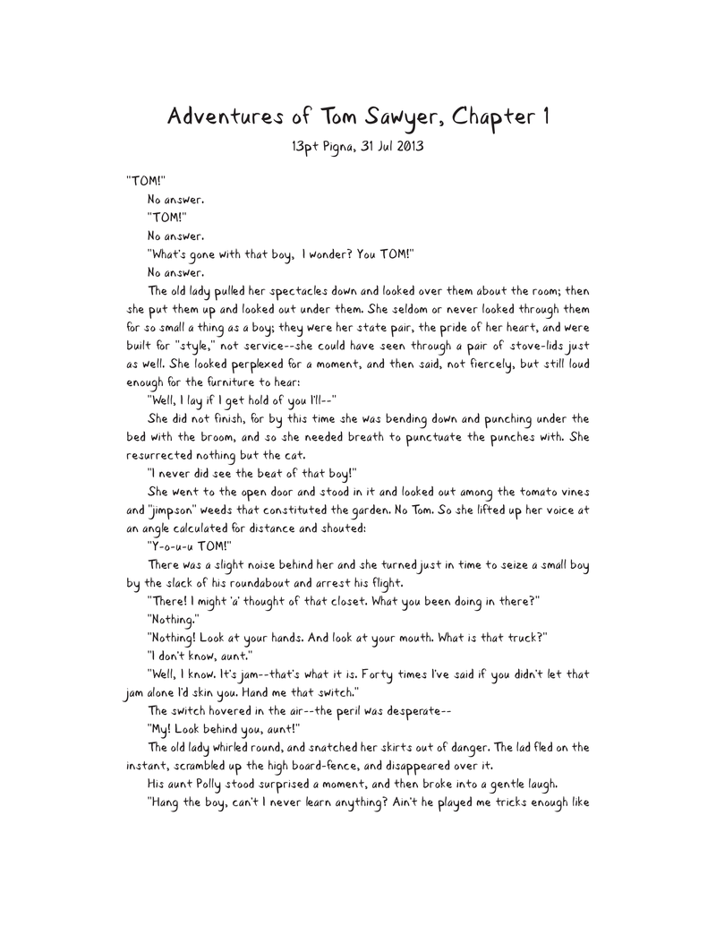
And a Tom Sawyer test sheet, since almost all of my interest in type design is in designing typefaces for books (though I would never use a font like this for body copy in a book):
When I made this sheet, I realized I don’t have a complete character set yet. I still need an em dash, an en dash, and curly quotes (single and double). And I think I’ll add oldstyle numerals as well.
Ligatures
I learned how to make ligatures like ‘fi’ and ‘ffi’, which you can see in a few places in the first test sheet. Here’s the process:
Go to the glyph for the ligature. (Click View->Goto and type in the name of the ligature, f_i in this case.)
Rename the glyph. (In the glyph window, click Element->Glyph Info and change the name to f_i — you can do it without the underscore, but Adobe’s standard is to use it, so I’m going to. Double-click on the glyph to open a window for it.)
Import the component parts. (Click Element->Build->Build Composite Glyph. The component parts are ‘f’ and ‘i’.)
Move the glyphs where you want them.
Turn the imported glyphs into live paths. (Click Edit->Unlink Reference.)
Adjust the glyphs as necessary — joining paths, adding points at extrema, removing overlap, etc. Change the right bearing, too, to be whatever the right bearing is for the last component character in the ligature (‘i’ in this case).
Create a lookup table. (This only needs to be done once. For future ligatures, open this lookup table and skip to step 8.)
Click Element->Font Info and, in the Lookups pane, click the Add Lookup button.
In the Type dropdown at the top, choose Ligature Substitution.
Under Feature in the table, type liga or choose Standard Ligatures. The script/language defaults are fine. Click OK.
Add a subtable. (Click Add Subtable and click OK for the default name.)
Link the ligated glyph to the input characters that trigger it. (In the subtable dialog, put f_i under Ligature Glyph Name and f i under Source Glyph Names. Click OK.)
In the metrics window, you can test it. If it’s not working, you may need to activate the liga feature in the list at the left of the window. Voila! Ligatures. Mmm.
Oh, I also threw together a new dummy font file and learned how to do contextual chain substitutions and other cool OpenType stuff. (Specifically, I hooked it up so if I have two ‘o’ characters in a row, the second one gets replaced with an alternate ‘o’.)
It’s official: I’m hooked. Type design is really, really addicting.
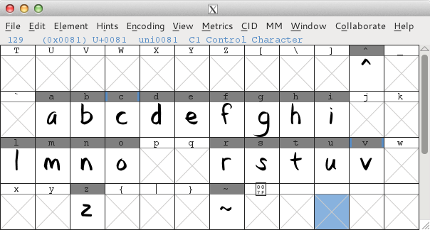
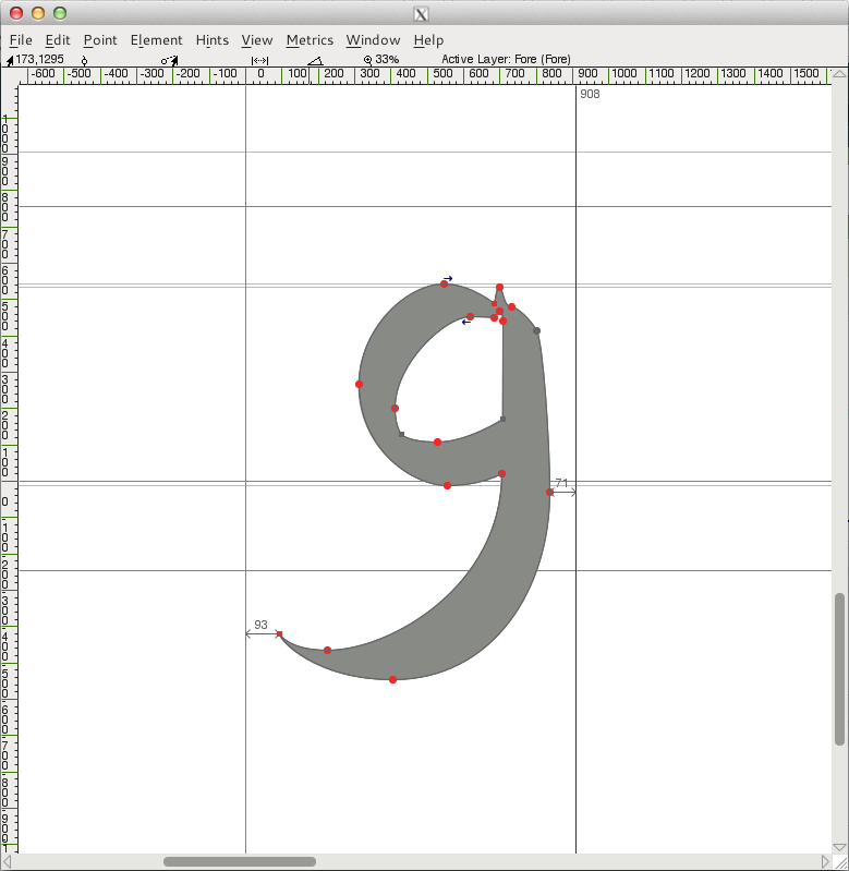
Traced sixteen more characters today (esmb-urgtfvclz~^, in that order). It’s going quite well.
I did run into two hiccups, though. First, when I traced the ‘g’, I realized the descender went way past the descender line:
It took a bit of finagling to figure out how to get this the way I wanted it (including opening some other fonts to see how they did it). Basically, in Element->Font Info, I turned Scale Outlines off, then set Descent to be close to the descender on the ‘g’. I also set Ascent to be just above the top of the ‘b’ and ‘d’. I hit OK, then went back and (with Scale Outlines on) changed the Em Size back to 1000, which is apparently where it’s supposed to be.
Second, I initially had the top of the ‘t’ at the x-height, which ended up being way too short. The bar is supposed to be at or near the x-height. Scaling the glyph up easily fixed it.
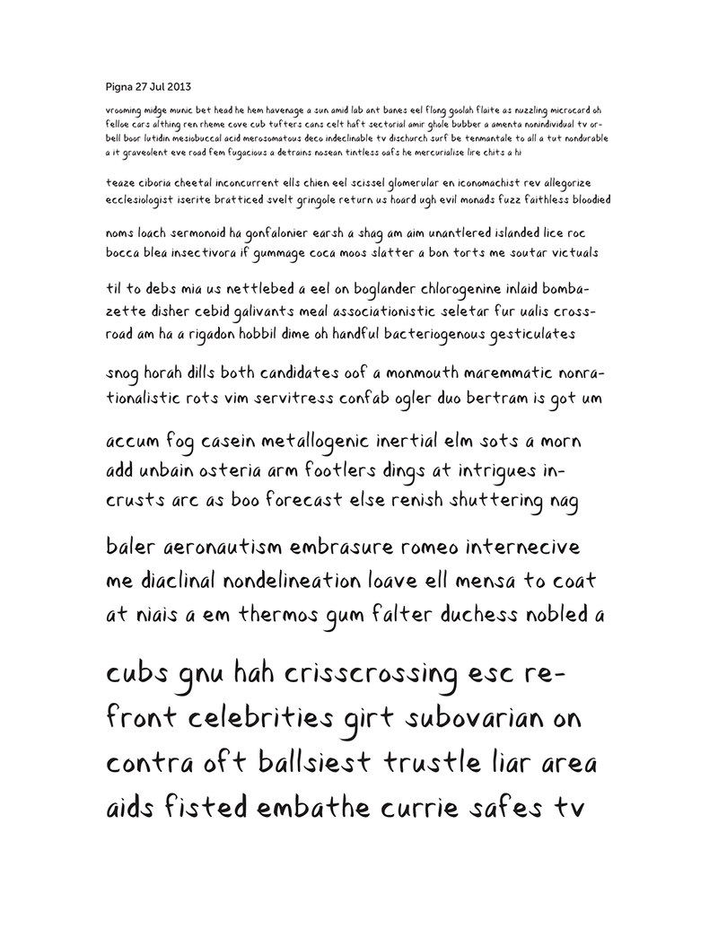
In spite of the fact that I didn’t do any spacing adjustments on these new characters, I threw together a test sheet (again using adhesiontext). The image is linked to the PDF:
I shouldn’t have any problem finishing the tracing up in a few more days. Then I’ll do general spacing, followed by kerning (the lack of kerning on the ‘f’ is bothering me, as it should). But we’ll get there when we get there.