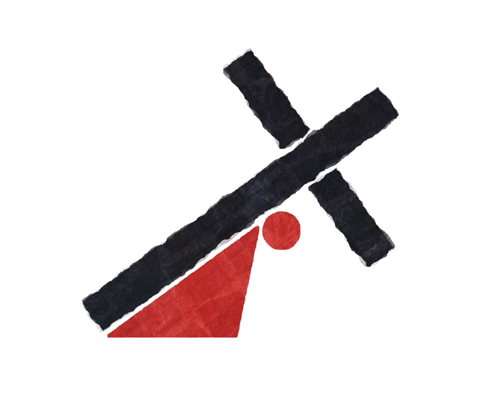
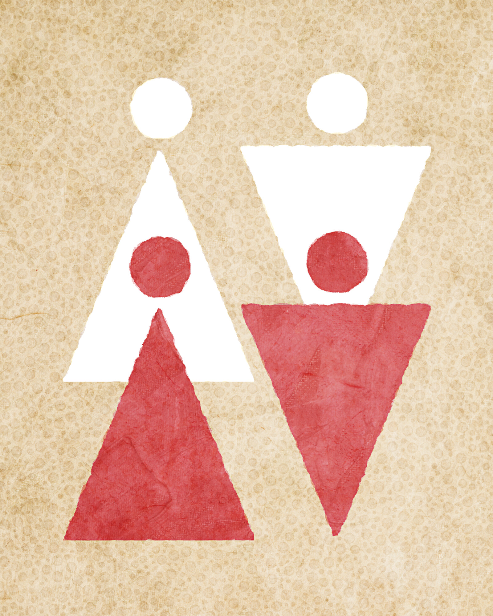
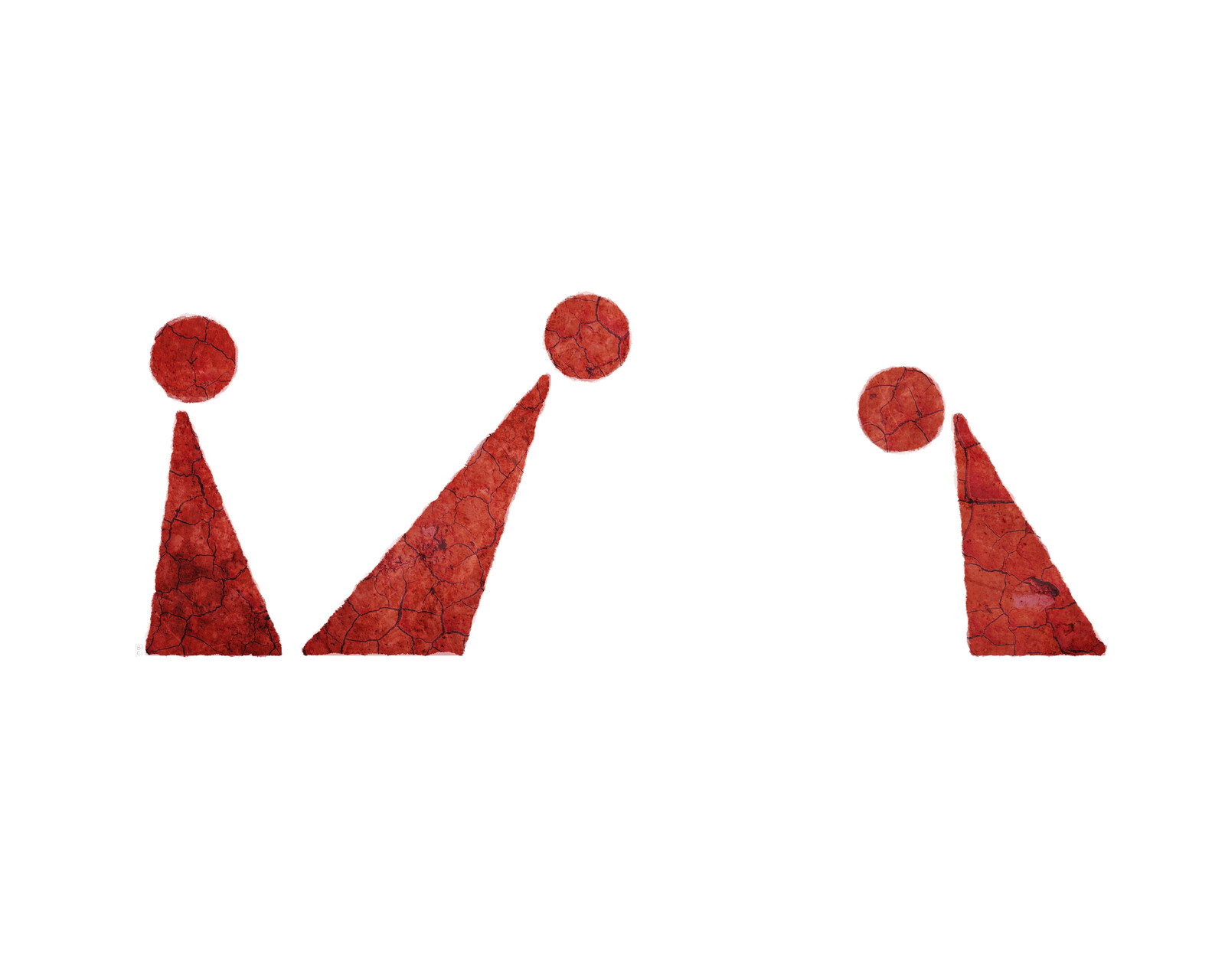
Before the World Was VI. Another take on the celestial yin & yang version.Follow Me. I really like the bolder colors here. One of my favorites.I’ve a Mother There III. I wasn’t sure whether I wanted to do another negative space piece but decided to go for it.In Their Own Image. Finally branched out to some other scriptures for my Heavenly Parents pieces. Initially this one looked too much like a restroom sign. Also, I don’t know that I’ve found the simplest way to represent this idea yet.A Beloved Daughter. I was reading Elder Renlund’s conference talk and realized I hadn’t done this yet.Prodigal Son II. Fairly close to the first iteration but without the unnecessary ground.
Other art
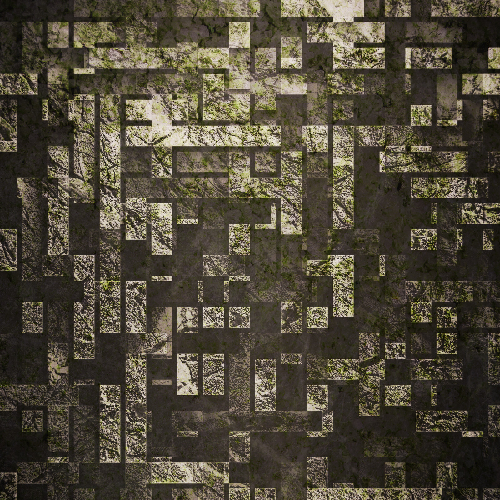
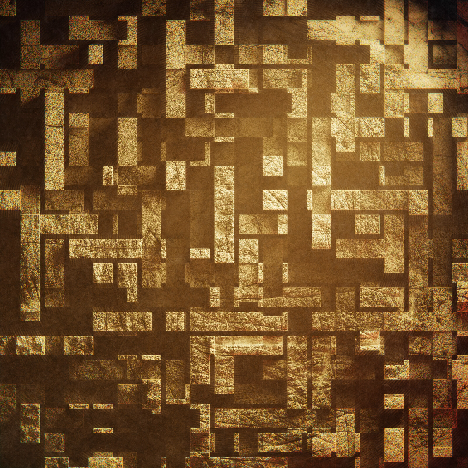
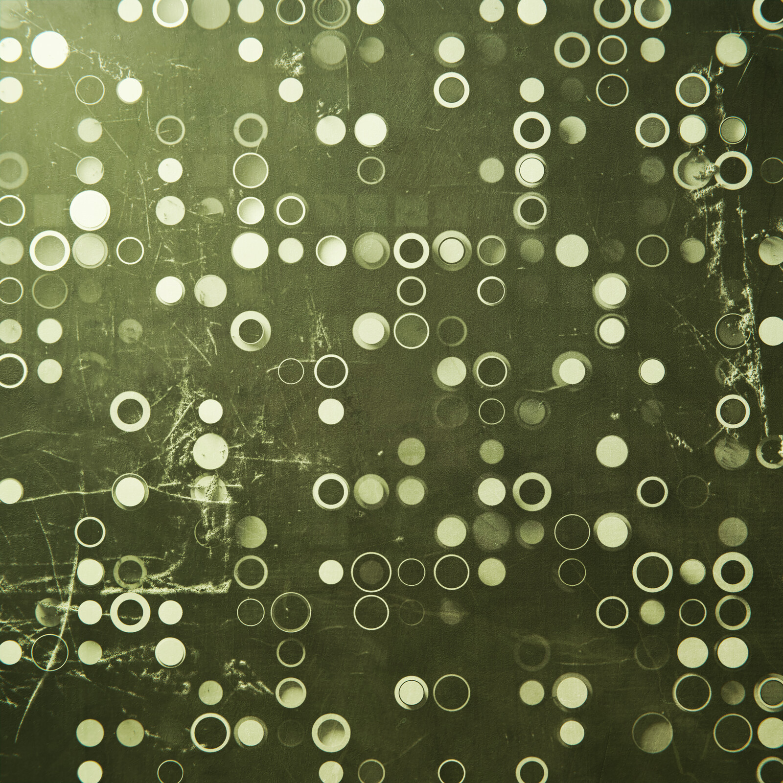
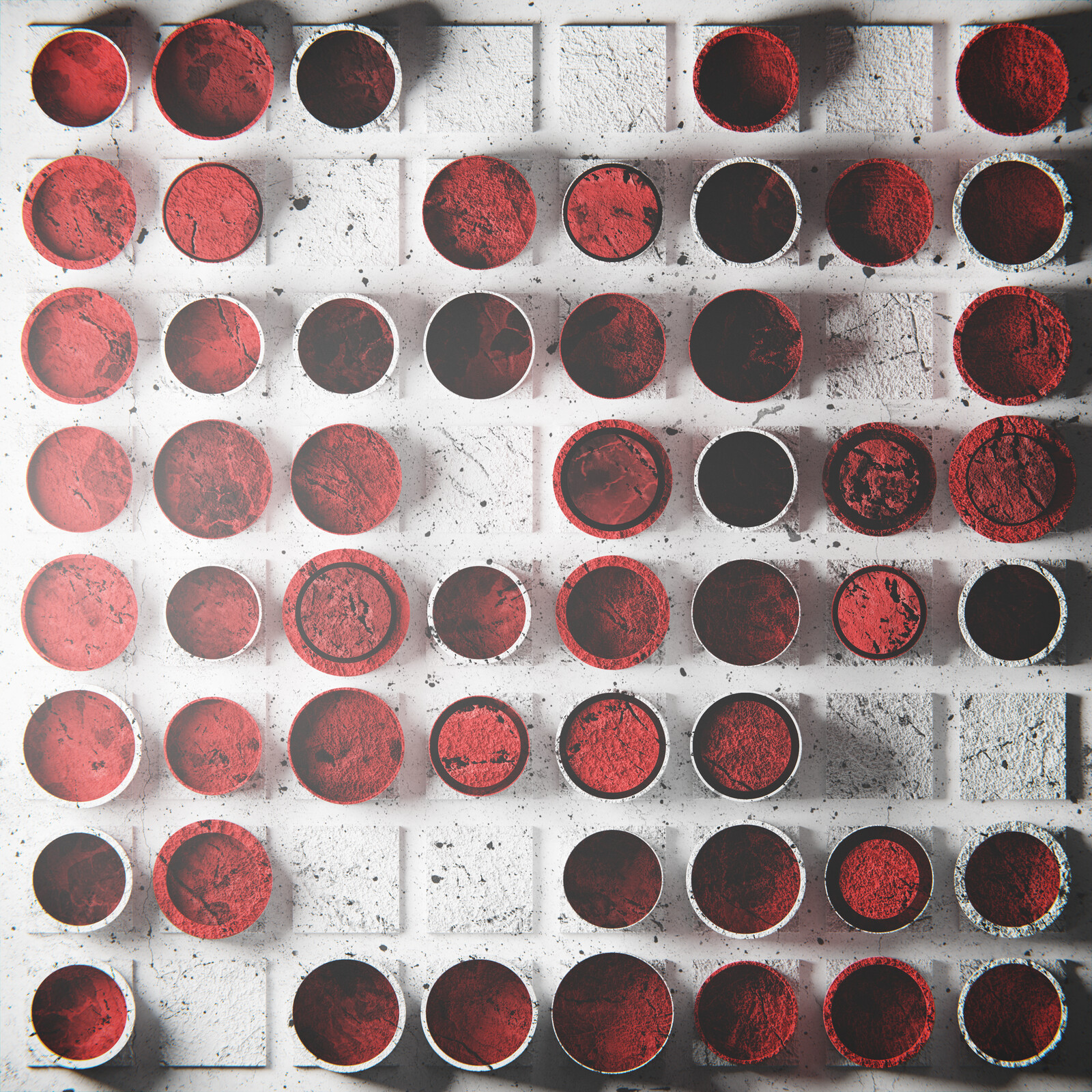
Lately I’ve been playing around with making meaningless decorative pieces in Blender, using displacement maps with (for the most part) procedural heightfields. For these I’ve generally textured the heightfield in Affinity Photo and sometimes also textured a separate color map. Looking forward to doing more work in this vein.
Pattern 001. This is the one that wasn’t procedural; I made the heightfield in Figma. While I like the way the sun lamp lights things evenly, it still feels maybe a little too harsh to me. I think of this piece as some kind of vintage fabric.Pattern 002 A. Kind of going for a Central American archaeological feel here. For this I wrote a Python script that generated rectangles on a grid in SVG for the heightfield. Switched to a spotlight lamp, and added some fog. I added the green in post.Pattern 002 B. Same script as 002 A, this time with different textures and lighting. Going for a Middle Eastern archaeological feel. I also added a slight bit of rippling and rotational blur on top to make it feel a little magical.Pattern 003 A. New script. Fairly pleased with how this turned out — all the different varieties that come out from random circles. (Since that’s all the heightfield is, really.) I added the lower-level squares on a last-minute impulse and I’m glad I did.Pattern 003 B. Same script as 003 A. I love love love the way the heightfield texture makes it look like things are growing, in a creepy way. Added depth of field to make things look more underwater. I’m happy with the old-photograph feel, too.Pattern 004. It still blows my mind that I can take a black-and-white heightfield and use it to generate art like this. Kind of cool how several of these look like they’re bowls even though the interiors aren’t actually rounded.
New artwork: The Gathering of Israel. For a few months I’d been thinking about how to symbolically represent this idea and eventually settled on a vector field (with artistic license rashly taken) as the best fit, at least for this version. The textures all generated in SVG via a small Python script.
Ziglings. Learn Zig by fixing small bugs in small programs. (Inspired by rustlings, though those exercises seem to be broader than just fixing errors.) A good way to learn a programming language, I think.
Blender 2.92 dropped recently. Geometry nodes look promising, and it’s crazy to see how all the grease pencil work has turned Blender into a viable 2D animation studio as well.
PEP 636. Pattern matching! In Python! Very much looking forward to this — I’ve loved using it in Rust.
A year and a half ago I started working on a REPL-based music composition environment called Trill. After a short amount of time I stashed the project for the time being, but since I can see myself working on it again someday, I figured it’s due a write-up.
The core idea here is a text-based REPL for composing music (and by music I mean more things like hymns and movie scores and folk songs, not as much pop or rock or electronic), with a focus on making the composition experience more aural and less visual.
An example session will hopefully help anchor the ideas:
> score mysong
> staff piano             # add a piano staff
> keysig c
> timesig 4/4
> keytime c 4/4           # alternate
> play v. v. v. iii....   # plays the note sequence (. = quarter note, .. = half note, .... = whole note)
> play v. v. v. iii-....  # - = flat (and v, iii are based on the key signature)
> play v/ v// v///        # eighth, sixteenth, thirty-second notes
> add .                   # adds what was last played to the active staff
> play V IV^ IV_          # play a V chord and then a IV chord one octave up and again one octave down
> pm vi.                  # plays the last measure plus whatever notes are specified
> add vi.
> staff violin            # adds a violin staff
> play @arpeggiate piano  # plays two measures of violin arpeggiation based on the piano staff (where @arpeggiate is a generative method)
> save
And some miscellaneous, unordered notes:
Rather than seeing the notes listed out (either in standard music notation or in text format), you basically only hear them (via play). This is the aural-over-visual part.
Duration is represented by the number of periods (cf. the play examples), as an experiment with making the length feel more visceral — a longer string of periods makes for a longer sound.
I’m also experimenting with using the relative scale notes (the Roman numeral notation) rather than absolute note names (C, D, E, etc.), to make transposing easier.
Not sure yet how dotted notes fit in here.
I threw in the idea of having some kind of generative functionality (@arpeggiate), but that’s pretty raw and not thought through at all yet.
The session transcript would also possibly function as the source for a song, and reloading it later would just skip the actual playing and instead just build the staff. Kind of nice to have the full history recorded, I think.
To be clear, I have no idea if any of these ideas are actually good. They’re just half-baked thoughts at this point. I did implement a very small proof-of-concept using FluidSynth and Prompt Toolkit, with the play functionality working, but that’s where I left off. (Writing about it now, though, has me excited again. Maybe this will be my homework-avoidance project for the semester.)
The main things I need to sort out when next I work on Trill are how to navigate a score and how to manipulate notes using textual commands and this aural-first system. Basically, some way to say “go to this part and play this much” and “bump this note up this much” or “make this note a chord.” Seems doable; I just haven’t gotten that far yet.
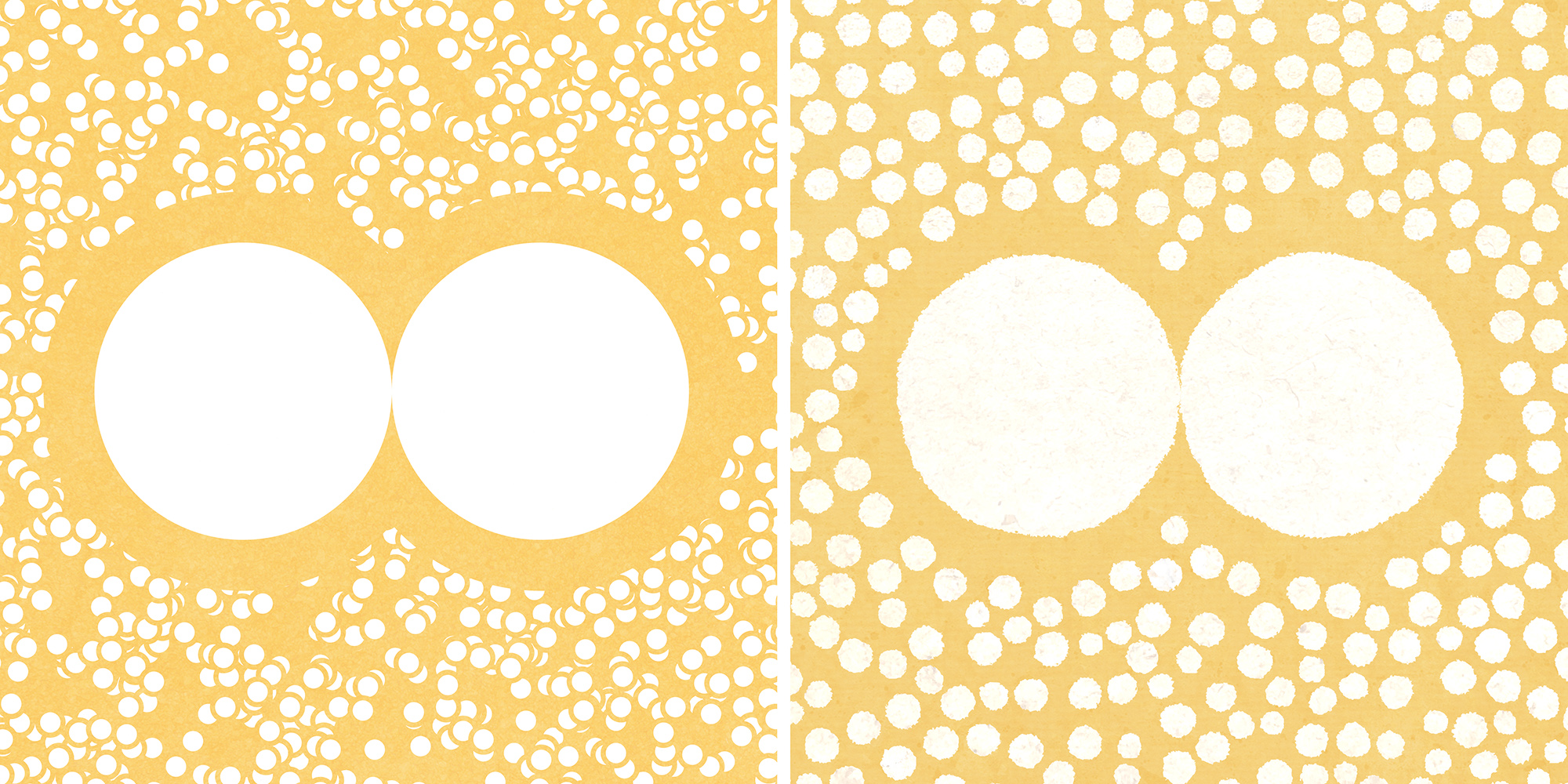
It’s (in my opinion) a much better execution of Before the World Was, which used a quick DrawBot script that didn’t pay much attention to placement.
This time, working off the Generative Artistry circle packing tutorial, I wrote a Python script that places all the circles so there’s no overlap, then outputs an SVG with the turbulence/displacement filters I wrote about not too long ago.
For comparison (original on the left):
I also went with a slightly less saturated background in this new version, and I put a little bit of texture on the circles themselves to make it feel slightly more painterly.
Brief backstory: when I’m doing my minimalist religious art, I usually sketch an idea out first by hand or in Paper on my phone, then mock them up in Illustrator to iterate on the concept. Once it’s satisfactory, I move to execution, either painting the piece in Procreate or using some of the brushes in Illustrator to get a more organic look. And finally I texture the image in Photoshop.
A couple months ago I got interested in exploring alternatives to Illustrator and Photoshop for both execution and texturing processes. And me being me, I wanted to try doing it in code, just to see what it was like. (Some things are easier in code, though I don’t know how often that would actually be the case with these.)
Note: this is still very much a WIP, and who knows if I’ll end up using any of it or not. But here’s the current state of things.
SVG
After reading somewhere that SVG has turbulence and displacement filters, I realized I could potentially use those for the execution part of the process, to distress the edges enough to make things more interesting. (And hopefully to be less repetitious than the Illustrator brushes I use.)
I put together an initial test using a few different settings, and it turned out a bit better than I expected. A sample of the code:
The background rectangle, the red figure, and the white figure all have different turbulence and displacement values. The red figure uses two sets of turbulence and displacement filters, which worked out fairly well, I think.
I used Inkscape render it out to a high-res PNG, since Illustrator wasn’t able to handle the filters. Eventually, if I keep going down this path, I’d hopefully be able to find a command-line tool that can do the rendering. (Maybe Inkscape has a headless option.)
Overall, this path seems promising. I don’t know that I’d use it all the time, but for certain things it may be handy. I still need to look into sane ways to round corners, and it seems that the other filters (dilation/erosion, convolution, etc.) may be helpful, too.
Grain
I’ve begun writing a Python script called Grain for texturing the final art image. The goal here is to see if I can streamline the process at all, and to see if this idea even works. Grain takes as input a text-based input file that looks like this:
Each block is a layer. Grain starts with the bottom layer (the executed base image) and goes up from there, adding each layer on top with the specified blending mode and opacity.
The :pattern roughdots command would generate procedural dots (not implemented yet), and the textures# bit in the :image command calls is a shortcut to my folder with texture photos.
So far, the results are disappointing. While the layering does currently work, it isn’t yet producing anything remotely publishable. I think there might be some discrepancies between blending modes in pyvips and in Photoshop. Hard to tell.
And, less importantly, it’s a little slow — partially from using high-res images, partially from Python. If the idea ends up working, I’ll most likely port this to Rust or Go, and probably also have scale things down for the exploration phase of texturing (with a final high-res export at the end).
I’ll keep tinkering with it from time to time and we’ll see how it goes.
I usually listen to music to provide some background noise (helpful with kids in the house), but sometimes music is still a bit too much of a distraction. White noise helps there, so I did some poking around and found Noisli, which is great. Then I realized (naturally) that I could fairly easily make my own local version, no network access required.
It’s called Atmosphere, a Python script that takes a config file like this:
And then mixes the looped audio together via Sox. The current version isn’t perfect at all — it can use more CPU than I’d like, and I think it might work better as a menu bar application than as a command-line script — but it works. I’ve been using it for several months now.
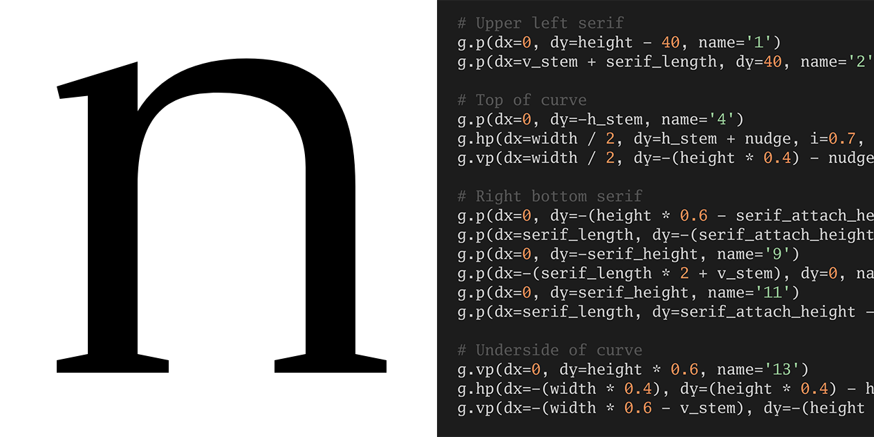
Last year I posted a note about Curves, a Python type design library I was working on. At the time I’d given up on it, but I recently had some new ideas on how to make it more ergonomic. It now stands resurrected:
Since I don’t think I mentioned it in my earlier post: the idea is that programming language constructs (functions, variables, source control, etc.) may make it easier to design a typeface, given the parametric and repetitive nature of that work.
It’s still a work in progress and very much an experiment — placing points in code rather than in a GUI will always have some friction to it — but it seems promising enough now that it’s worth finishing it and trying to use it for some actual type design.
Scanbook is a Python script I wrote to take page image scans and turn them into a nice black-and-white PDF for reading on my phone. I used to use Scanner Pro for this, but I’d rather do the processing on my laptop, and Scanbook happens to produce smaller PDFs. I’ve used it to scan a dozen or so of my journals; it works well enough for me.
This is, by the way, my first time publishing anything on PyPI. (Which means people can install Scanbook with a simple pip install scanbook.)