Yesterday morning I was thinking about sparklines and how they might be used in genealogy, and after a few quick sketches I came up with this:

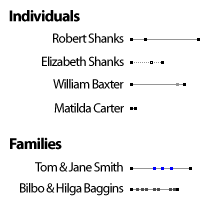
Here’s how it works for individuals: the first black dot is their birth. Each pixel is one year. The final dot is their death. Any middle dots are the person’s marriage(s). It’s nice because you can see at a glance how long they lived (in comparison to others), whether they married early or late (and how many times), and so on.
For families, the first dot is the marriage year. The last is the year the second parent died or a divorce year, whichever comes first. Any dots in between are children. Again, it provides a lot of information in a small space — how long they were married, how many children and how they were spaced, etc.
I originally thought of using different colors for the various dots (you can see a glimmer of this in the family sparkline for Tom & Jane Smith), but I’m now thinking it’d be better to leave them monochromatic so that they can still carry all the information when printed/displayed in black and white. (The line could be black instead of grey, of course.) Once the rules are understood (what each dot means), there’s no need for colors to differentiate them.
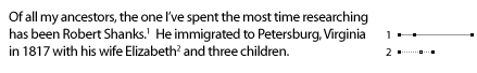
You could also use these when writing family histories:

If including them inline isn’t your style, you could always use footnotes or sidenotes:

I’m in the middle of figuring out if there’s a good, compact way to represent one’s ancestors via sparklines. I’ll post again if I come up with anything. Oh, and I haven’t written any code to generate these genealogy sparklines yet, but soon… :)
Any thoughts?
[tags]sparklines, genealogy[/tags]
Comments
What a brilliant concept. I LOVE it. I like to SEE information like that, it gives you a different perspective. I can’t wait to see more. The color thing is cool, but yeah, people aren’t probably gonna print their stuff in color – good call! :)
Thanks. :) I’ve looked at the possibility of (optionally) including years underneath the dots, but it may get too cluttered. (For example, what happens in the case of Matilda Carter up in the Individuals section? There’s not room for two years next to each other.) All things considered, I’m leaning toward leaving it as-is. Cleaner and still gets the information across. (The actual dates could be listed elsewhere.)
First time I have been here. Intriguing for an 80 year old with little knowledge but a will to learn. I’ll be back. Thank you!
Welcome, Patricia. :) The place has been a bit silent lately, but hopefully that’ll change soon.
This is a very good use of Sparklines. I especially like the idea of having little footnotes with corresponding sparklines for each person. I would suggest that the footnote sparklines be aligned so that the marriage dots for the husband and wife would be aligned. This way, not only can you see the two timelines in synchronous, you could also see who is younger and by how much, as well as who died first and by how much sooner than the spouse.
Additionally, a third sparkline of the marriage could be shown directly beneath the husband and wife’s sparklines.
- Michael
I like that idea of aligning the marriage dots. I’d say that the marriage sparkline should be placed in between the two lines rather than beneath them, though. (And it ought to be light, or else it should be dark and the other two lines light, for contrast.)
Throw in your two cents